Owning the ChargeX Admin Dashboards Experience
ChargeX is a German startup building modular, scalable EV charging solutions for fleets, residential buildings, and businesses. This is the story of how I led the end-to-end redesign and feature expansion of the ChargeX Admin Dashboard, uncovering new customer groups, identifying key admin personas, and building a scalable system that flexes to real-world workflows. Along the way, I introduced persona-specific features, reduced admin workload, improved decision-making, lowered support volume, and opened up new business opportunities for ChargeX.
My Role
I led the end-to-end design of the ChargeX Admin Dashboard, from uncovering new customer groups and persona needs to designing core workflows, new features, and a scalable system. I focused on aligning user goals with business strategy, unlocking growth opportunities, and building a strong foundation for persona-specific dashboards.
Team
As the solo product designer, I worked closely with product managers and the dev lead to stay aligned on both strategy and execution. I also collaborated with stakeholders, customer success, and sales to validate ideas, shape direction, and ensure the dashboard supported real admin needs and business growth.
Industry
B2B SaaS | E-Mobility, Electric Vehicle Charging
Company
ChargeX GmbH | München, Germany
The Problem
As ChargeX scaled, more types of organizations started using the dashboard, from fleet managers and car dealers to residential admins and hotels. But the existing Admin Dashboard wasn’t built for scale. It was overloaded, rigid, and hard to navigate, leaving admins dependent on our customer support team to complete even basic tasks. At the same time, new business needs such as the introduction of monthly billing were emerging, and the dashboard simply wasn’t equipped for them.
😵💫
Managing EV charging shouldn’t feel
like solving a puzzle every time you log in.
Why is this a problem?
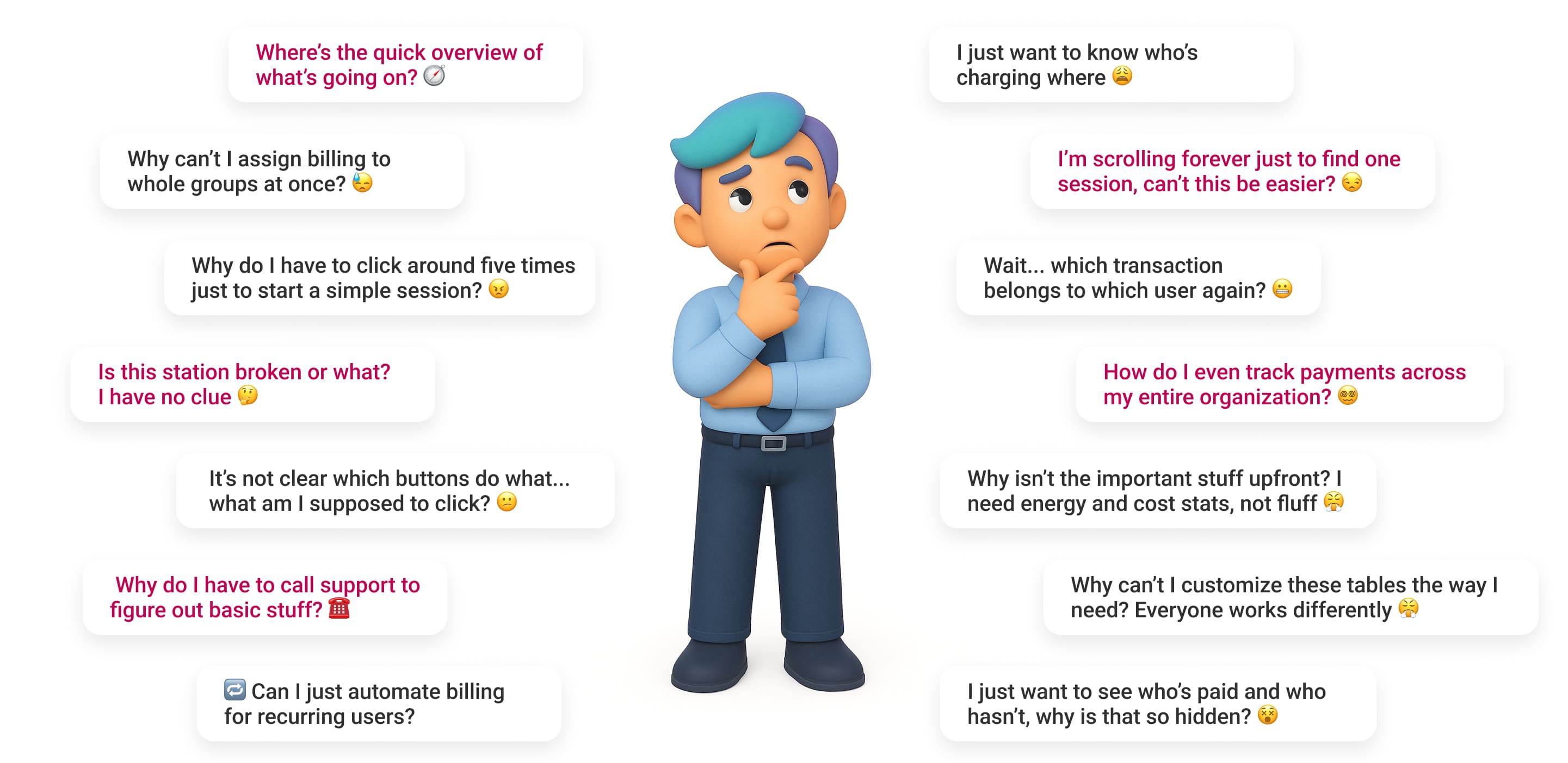
After several collaborative workshops with product leads, customer success, engineering, and stakeholders, we realized this wasn’t just a UX issue, it was a growth blocker. Support ticket volume was high, and admins couldn’t act without help. We mapped internal data, complaints, and feedback into a unified direction, asking ourselves:
🔸 Why are admins still contacting support for basic actions?
🔸 What stops them from managing users and sessions on their own?
🔸 How long does it take to find critical info like session status or payment state?
🔸 Can they get a quick overview of the charging network at a glance?
🔸 Why can’t they assign billing rules per user group more easily?
🔸 Why is the same dashboard trying to serve everyone, and failing most?
🔸 Can we design one dashboard flexible enough to scale across personas?
These questions shaped our entire direction, we weren’t just fixing UI. We were redefining how dashboard design can empower admins and unlock business growth.
Thoughts that live rent-free in our admins’ minds 🧠
Through that process, we identified a pattern of unspoken admin pain, the constant friction, delays, and mental load caused by lack of visibility, flexibility, and control.
🤓
Before jumping into solutions,
we had to lay the groundwork
Meet the People Behind the Dashboard Decisions
Before designing anything, I had to understand who I was designing for (our targeted personas). Workshops, interviews, and cross-team collaboration led me to three distinct personas, each with different needs but one shared goal: managing EV infrastructure without headaches.

Meet Clara,
The admin behind tenants and residential houses.
Clara is 45, based in Hamburg, and manages EV charging for residential building. She's not deeply technical, but she’s the go-to person when tenants have charging issues, and needs tools that just work.
What matters to Clara
- Managing multiple user groups efficiently
- Clear billing for residents or customers
- Customizing data views to her needs
- Easy report exports for meetings
- Knowing exactly who charged where

This Is Who I Optimized For Here
Meet Markus,
The admin behind SME and Fleet charging chaos.
Markus Weber is 50, lives in Munich, and manages charging for his company’s employees and EV fleet. Efficiency is everything. He ensures the infrastructure works like clockwork for his team.
What matters to Markus
- Fast overview of sessions and usage
- Automating monthly billing by user group
- One-click session starts
-Managing many users with minimal clicks
- Avoiding dependency by fixing issues on his own

Meet Tom,
The admin behind hotel manager with guests.
Tom is 40, running a busy Berlin hotel with growing demand for guest EV charging. He’s not into technical hassle, just smooth operations and top-tier guest experiences during check-in and check-out peaks.
What matters to Tom
- Guests always find available stations
- Monitoring live sessions at a glance
- Simple tools for hotel staff use
- Clear billing tied to guest stays
- Reliable, stress-free charging flow
No More Guesswork!
Let’s Map the Right Features to the Right People
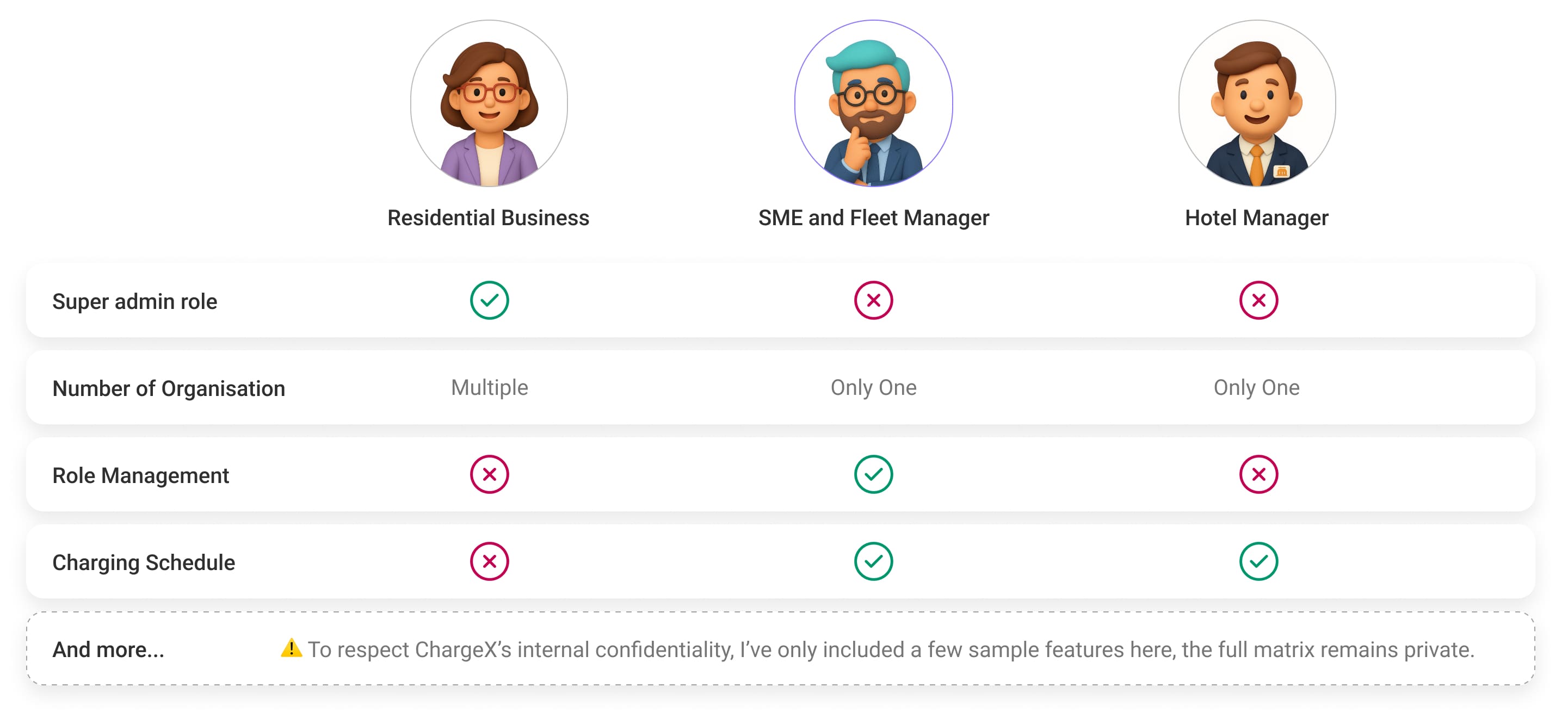
Before diving into solutions, we needed clarity on what each persona actually needed from their dashboard. So, I created a Role-Based Feature Matrix to map out the core features, access levels, and priorities for each group. This gave us a clear picture of where their workflows overlapped, and where they didn’t.
Since SMEs and Fleet Managers were our first target, this matrix helped the whole team align on what features we should prioritise for the initial release. It was also a helpful reference to plan future expansions for other personas like Hotels and Facility Providers.
And Finally
Let’s figure out what really matters first!
With so many new features and improvements on the table, it was clear we needed to zoom out and see the big picture. So, with the team, we built a MoSCoW Prioritisation, a simple but powerful way to split our features into Must-Haves, Should-Haves, Could-Haves, and Won’t-Haves for this first release targeting SMEs and Fleet Managers.
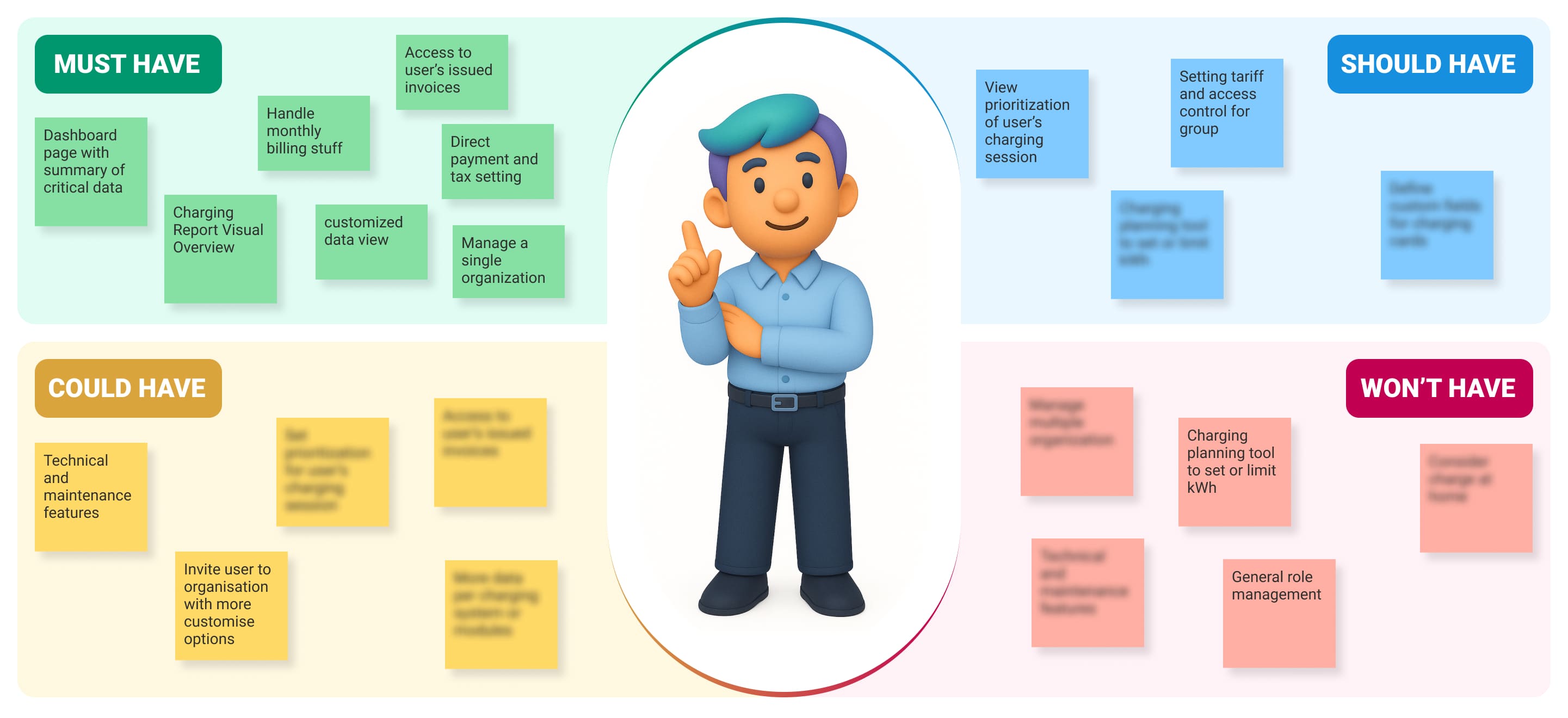
To make sure I was making the right calls, I worked closely with PMs, stakeholders, and developers, blending user needs, business goals, and technical feasibility into one aligned roadmap. This helped us stay grounded, avoid scope creep, and move forward with clarity and confidence.
All of these steps gave me the clarity I needed to make confident, user-focused design decisions.
🤩
Now, let’s translate real admin pain points
into tangible design moves!
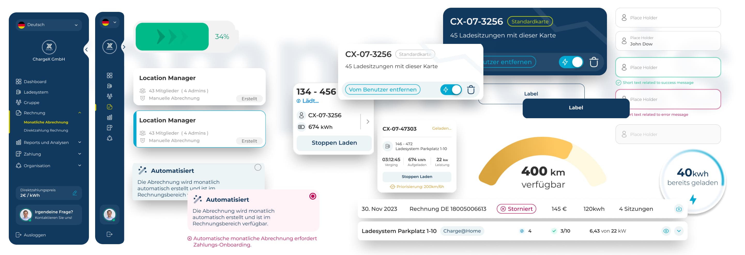
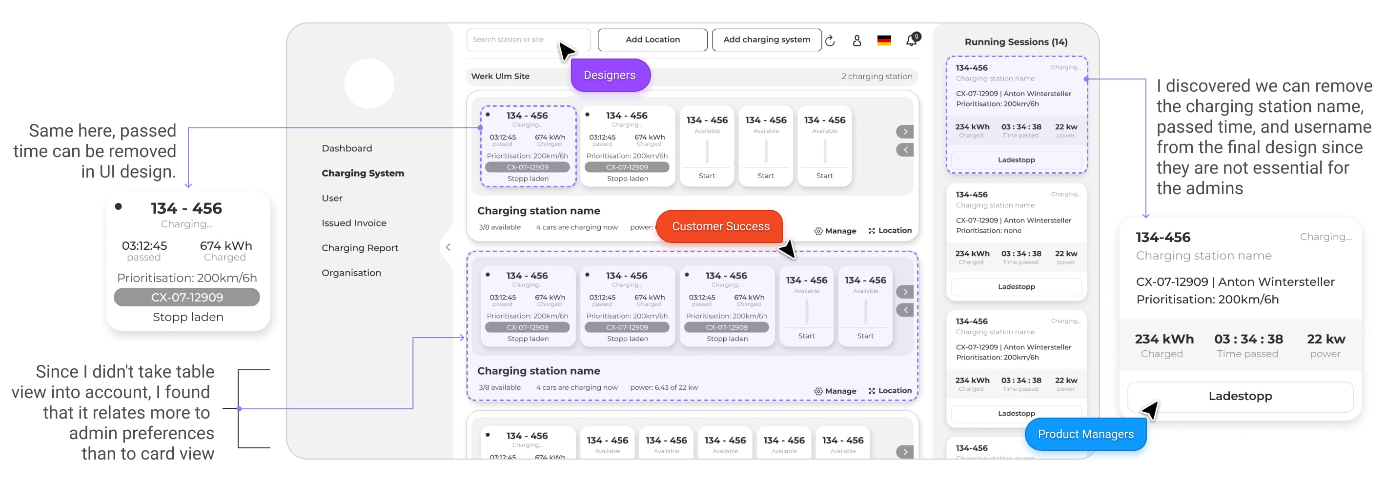
✖️ Fixing the chaos in station management
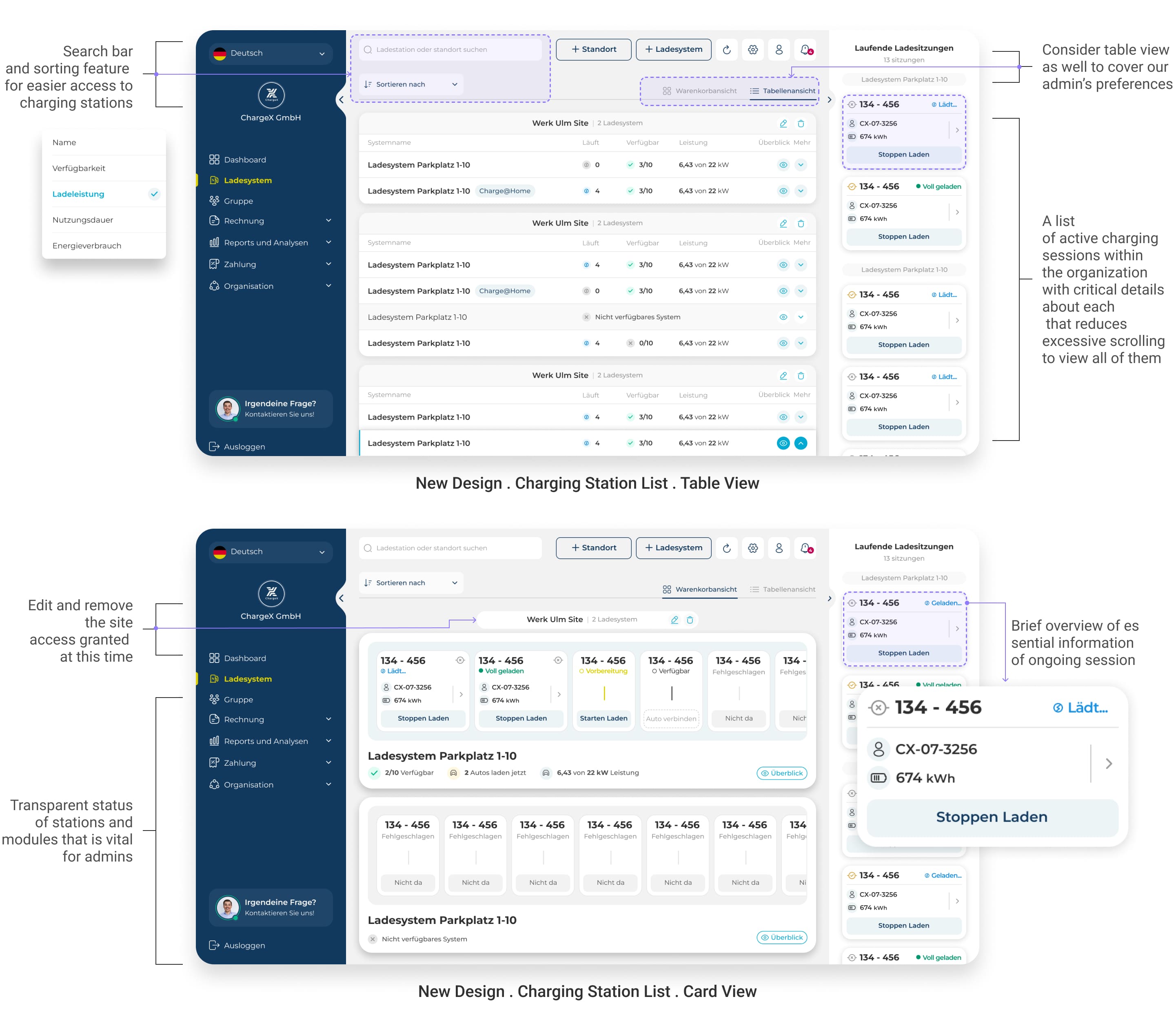
The old charging station list just didn’t scale. No search, no filters, no sorting, just one long scroll. If you wanted to know who was charging, you had to manually dig through the entire list. And even then, the data was vague and incomplete.
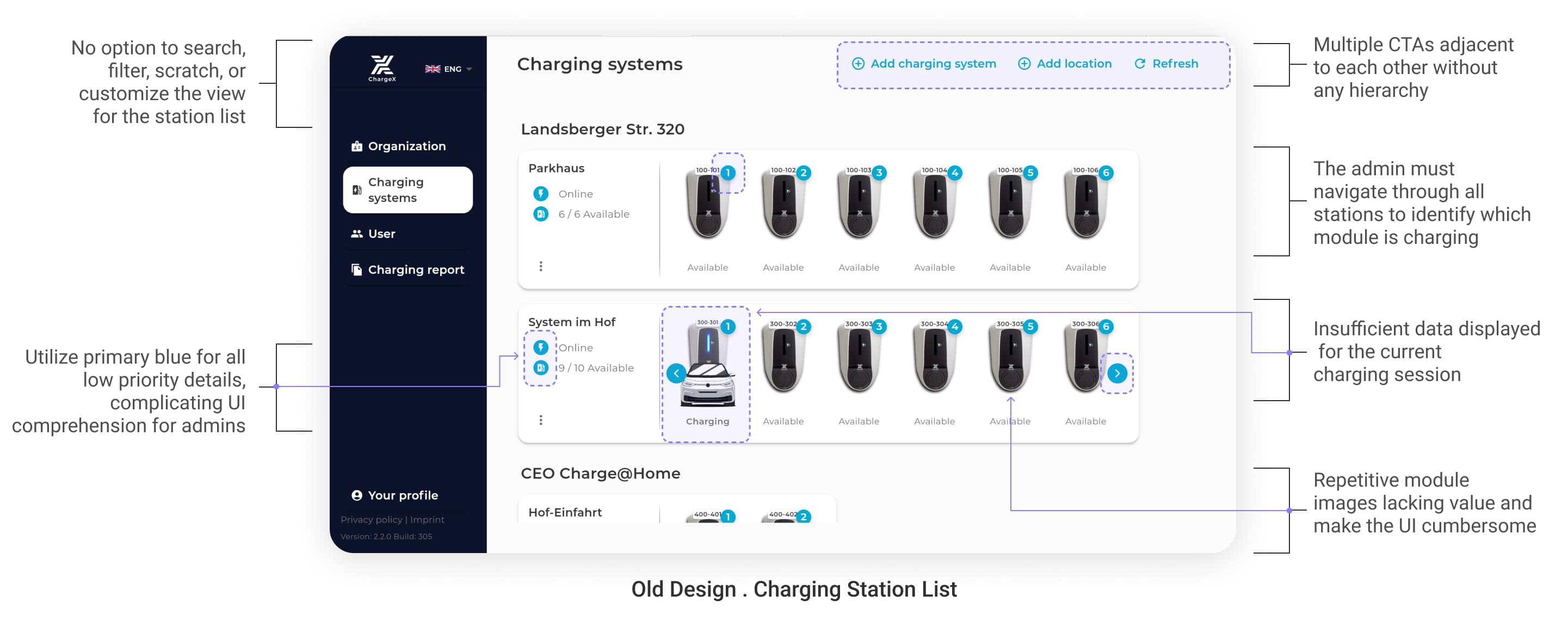
💡 What I picked up while wireframing
During wireframing and feedback rounds, I learned that some admins, especially those used to traditional interfaces, preferred a table view over modern card layouts. At the same time, conversations with the customer success team made it clear: admins don’t want overload, they want clarity.
When it comes to ongoing sessions, what matters most is quick, visible access to the essentials:
the charging card, energy already charged, session status, and a clear Stop Charging CTA. Everything else just clutters the view.
✔️ So here’s what I did
To fix this, I designed two flexible view modes, a clean card layout and a structured table view, so admins can choose what works for them.
I also added search and sort to help admins navigate long station lists effortlessly.
Most importantly, I made sure ongoing session info is surfaced directly in the station list:
charging card, energy in kWh, session status, and a clear stop button, no clicks needed.
On top of that, I made station and module statuses visually distinct and easy to scan, so admins no longer have to guess what’s available, broken, or in use.
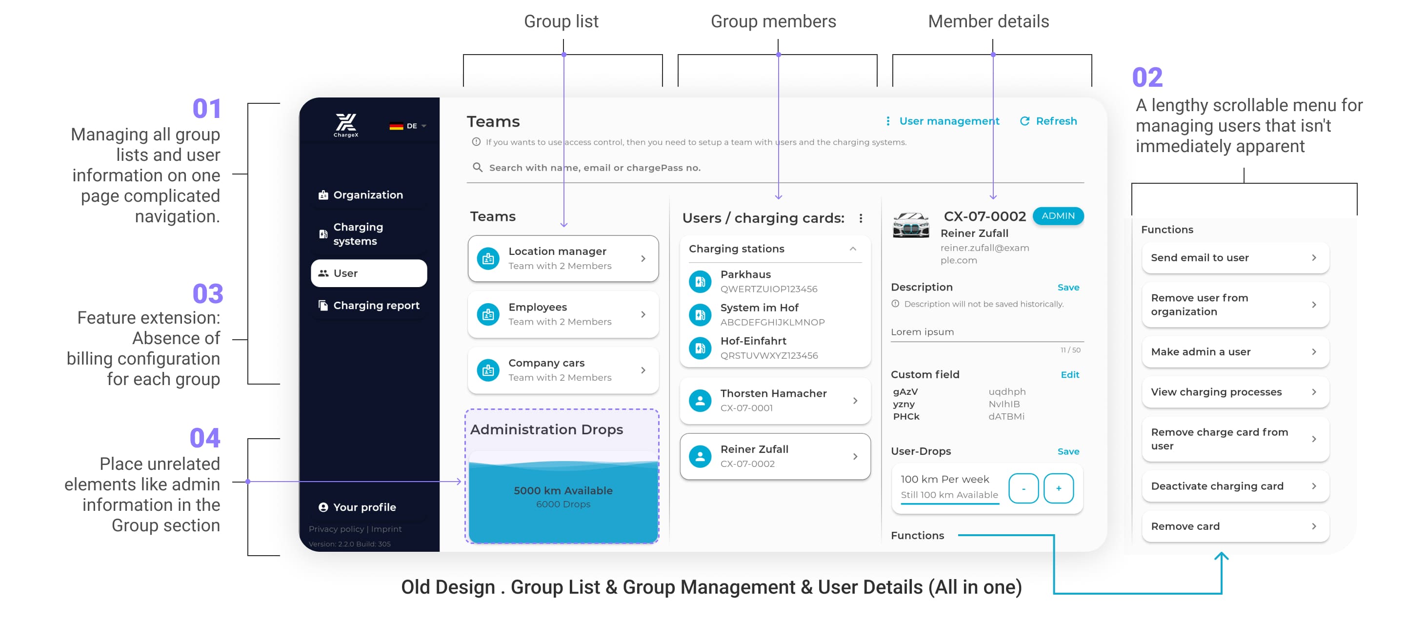
✖️ Group & User Management
Where everything was mashed into one messy page !
This was also the part where I introduced the monthly billing system
Admins were left navigating a wall of links and tabs, with zero structure and endless scrolling.
Here's what made it painful:
1️⃣ Everything from groups, users, cards, lived on one long page
2️⃣ No visual hierarchy in menu items, everything looked equally important (or unimportant)
3️⃣ There are no tools for monthly billing or station assignment.
4️⃣ Place unrelated elements like admin
information in the group section, caused admins confusion.
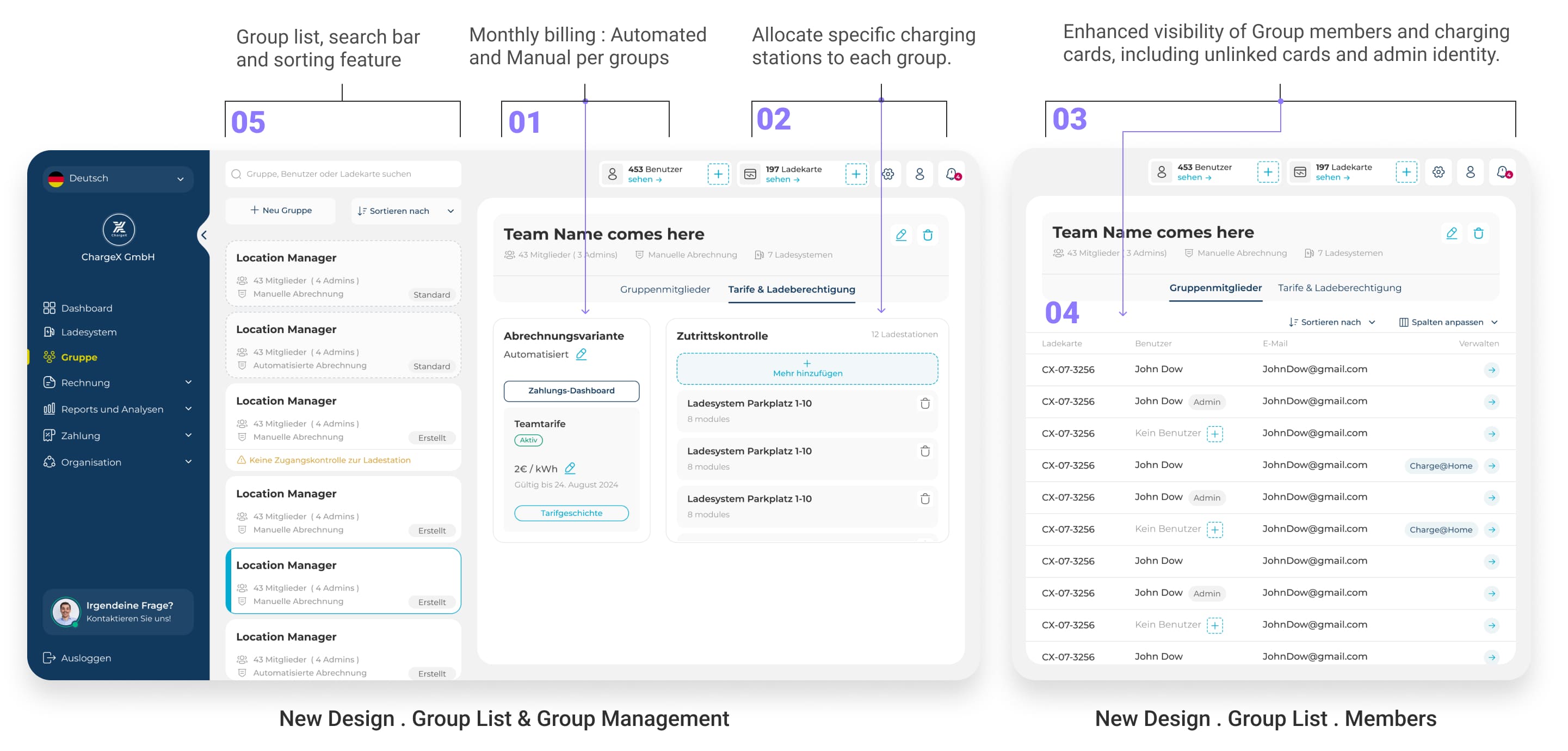
✔️ So I gave group management its own home
To fix that, I designed a dedicated Group List page where every group is now easy to find, view, and manage.
For each group, admins can now:
1️⃣ Assign automated or manual monthly billing
2️⃣ Allocate specific charging stations
3️⃣ View group members and their charging cards, even cards without a user
4️⃣ Work in a table view, just like they preferred
5️⃣ See a clean group list, search among groups and sort for quick group finding
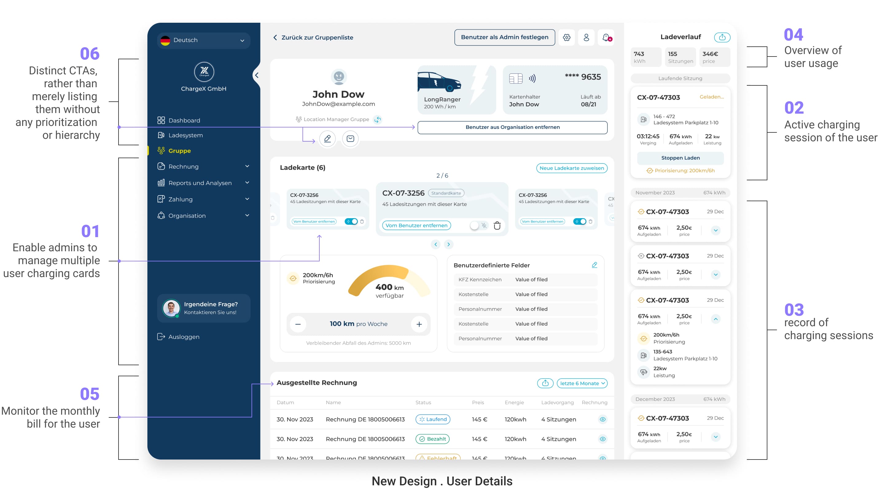
✔️ And gave users the detail view they deserve
User management got its own focused space too. In the old setup, all user options were dumped into a list with no hierarchy. Admins had to dig through a stack of options to find the right action. Now, each User Detail page shows exactly what matters, and hides what doesn’t.
Admins now can:
1️⃣ Manage multiple charging cards per user which before we have considered this option in user app
2️⃣ Monitor any active charging sessions of user and stop them
3️⃣ Get a clear session history of user charging sessions and create report out of them
4️⃣ See an overview of usage at a glance which admins requested us these little statics which is critical for them
5️⃣ Track and download the user’s monthly bill which is part of our new added feature
6️⃣ Take action through distinct clear CTAs, not buried menu links like the old design that take time to decipher
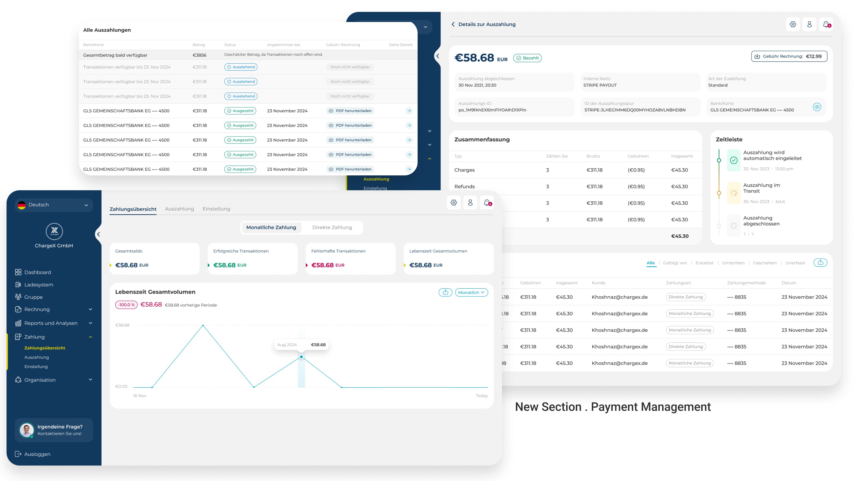
✔️ One more piece to the puzzle:
giving admins control over payments
After introducing monthly billing, it was clear we needed a dedicated space where admins could actually manage it. So I designed a completely new Payment section, where they can see a full overview of transactions, track payout lists and details, and fine-tune payment settings for their organization.
⚠️ But...:
This was uncharted territory, so we knew it couldn’t be perfect from day one. That’s why we’re testing it closely with real admins, learning from their feedback, and iterating fast to make it better with every insight.
🥲
Ok, group management finally made sense
But is our mission done yet? Not quite.
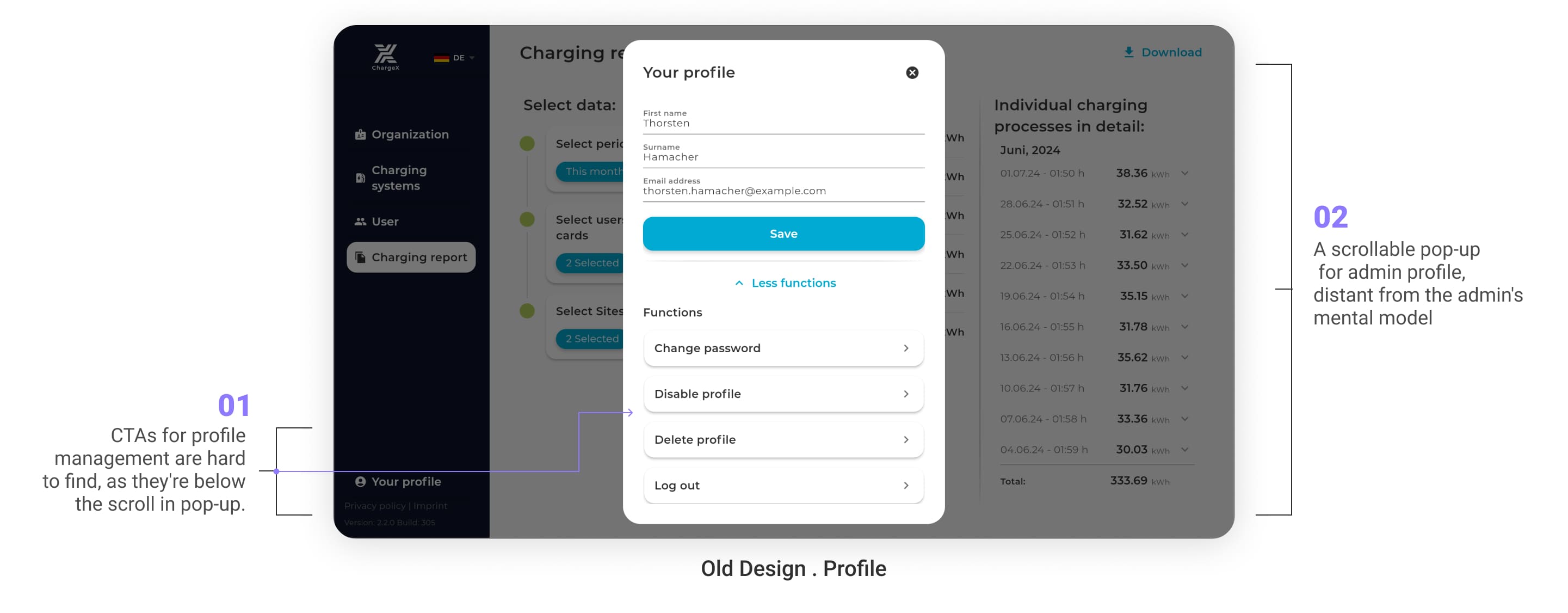
✖️ When your own profile feels like a mystery
The old profile experience? It was tucked away in a scrollable pop-up, hard to find, hard to use, and completely disconnected from the rest of the dashboard.
1️⃣ CTAs for profile settings were hidden below the scroll
2️⃣ A scrollable pop-up for admin profile,
different from other dashboard products and far from the admin's mental model
3️⃣ Profile management felt like a detached side room instead of part of the main flow
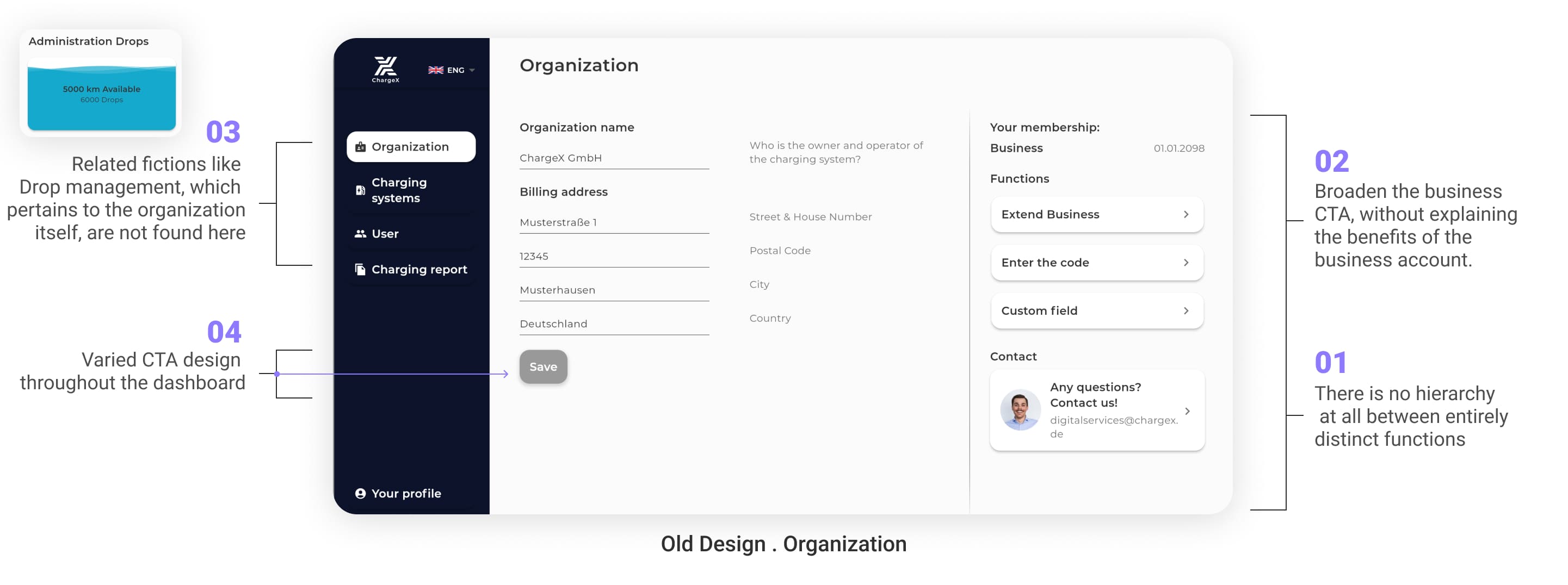
✖️ And the organization page? A jumble of mismatched parts
Inside the old organization section, totally unrelated tools sat side-by-side with no logic or flow.
1️⃣ No visual hierarchy between major and minor functions across page, so we could not bold important features
2️⃣ Important CTAs like “Extend Business” didn’t explain why you’d want to, so admins rarely feel like renewing their accounts without any clear reason
3️⃣ Related features like Drop management were stored in group section instead of here, but admins expect to find it here
4️⃣ CTA styles varied from page to page, in case of color, size and priority making things hard to recognize or trust
🤯
There was no story here
Just buttons and sections stacked on top of each other.
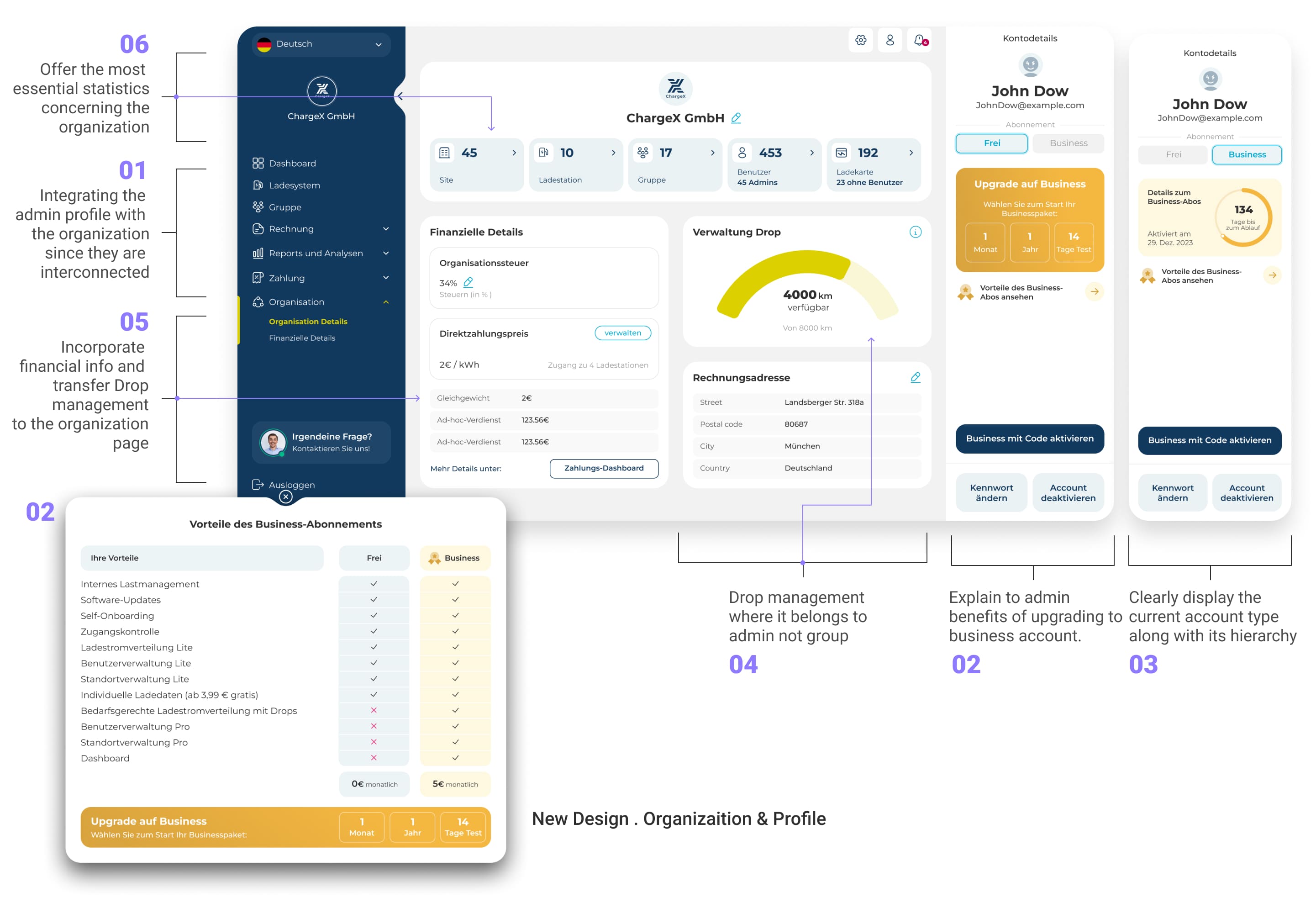
✔️ So I brought it all together, with purpose
In the redesign, I connected the dots between profile and organization, and built something far more valuable. Now, each User Detail page shows exactly what matters, and hides what doesn’t.
What I did are:
1️⃣ I merged admin profile with organization settings into a single, intuitive space
2️⃣ I explained the benefits of upgrading to a business account, not just pushed it
3️⃣ Clearly surfaced the current account type and its level
4️⃣ Moved Drop management where it belongs , inside organization controls
5️⃣ Introduced financial insights now that monthly billing is live
6️⃣ Brought key organization stats to the top of the page, where they can inform real decisions
🥲
So…what about reports?
Because insights are nothing if they’re buried
✖️ The old reporting experience
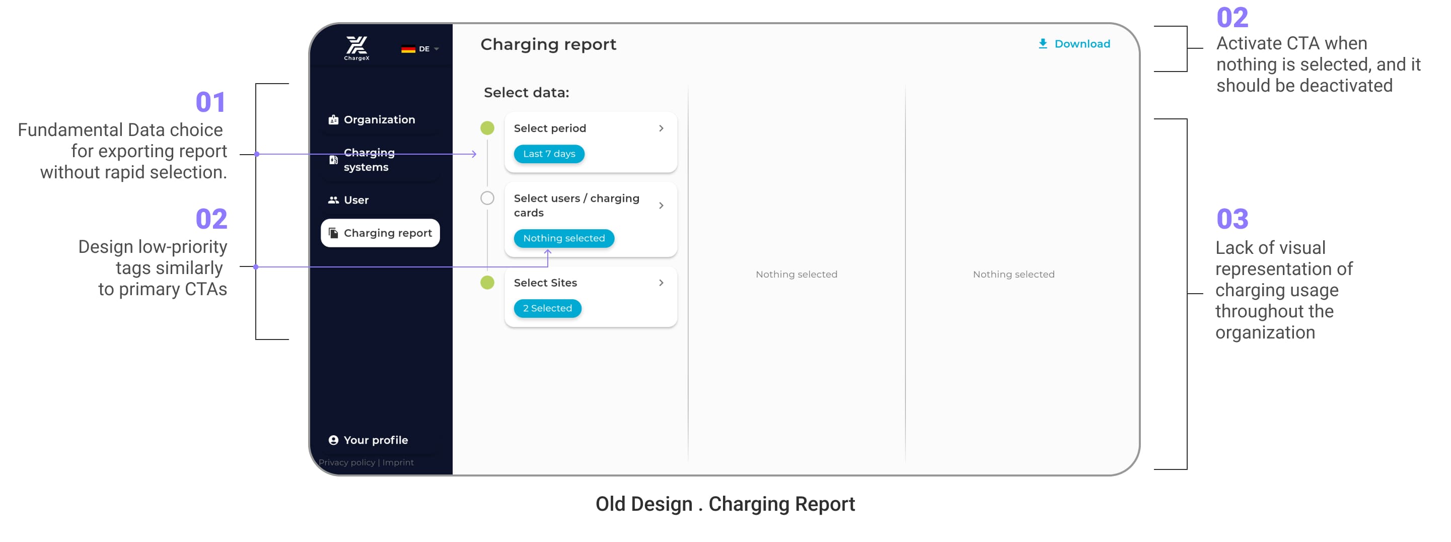
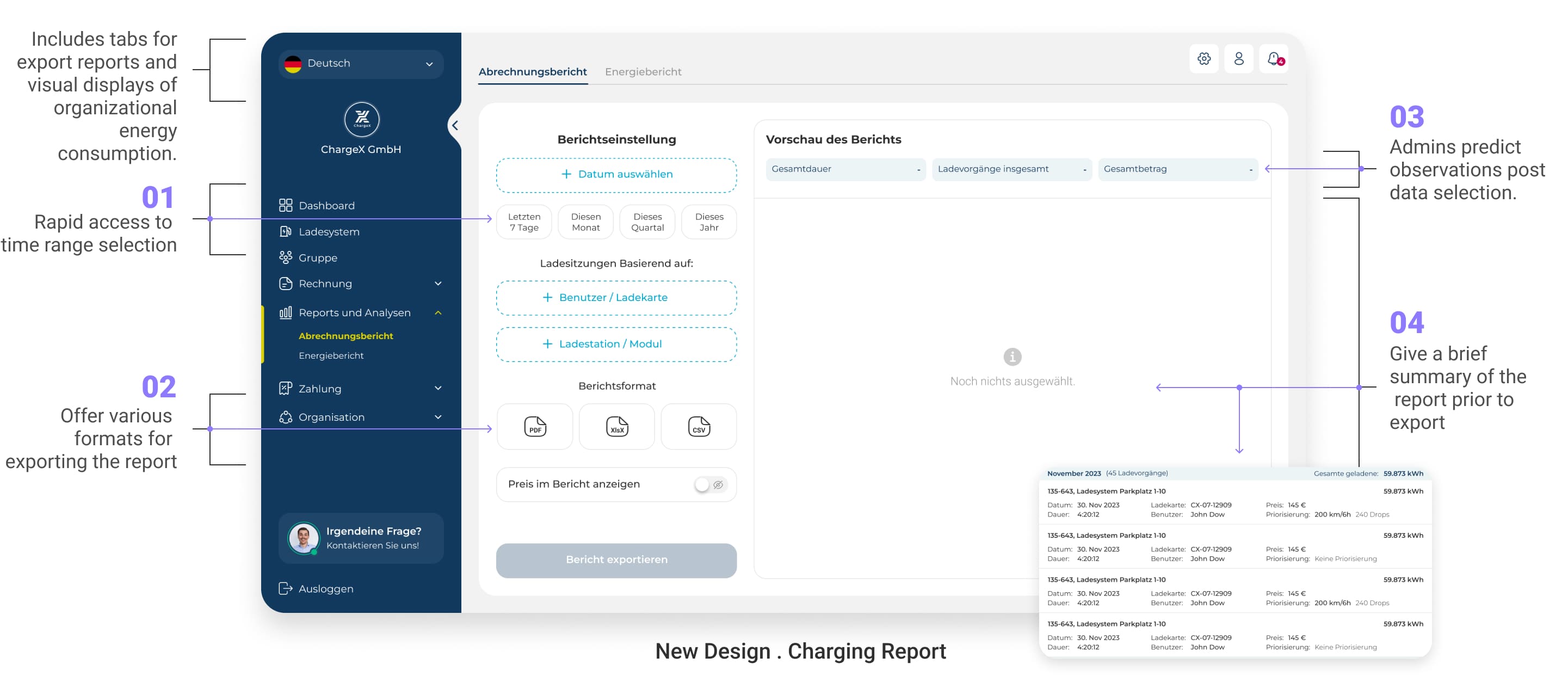
Now that profile and organization management finally felt structured, there was one more area begging for attention, the report section. It held potential for deep insights, but the experience didn’t match the value of the data inside. It was time to unlock it. Admins had to navigate a cluttered export tool that lacked structure, rapid selection, or any kind of visual help.
1️⃣ Admins were only able to use basic data selection, no quick filters for fast exporting
2️⃣ Critical UI issues like the same styling for CTAs and tags or enabling a CTA when it should be disabled caused confusion during selection
3️⃣ No charts, graphs, or visual cues, just plain numbers
4️⃣ Admins couldn’t preview what they were exporting, which was a big need for them
--------> The result? Valuable data left untouched, or misunderstood.
✔️ To fix this, I split the reporting section into two focused tabs
In first tab, I make the report exports feel less like a guessing game
Admins used to export data hoping for the best, with no preview, no filters, and no real control. So I flipped the experience:
1️⃣ Gave admins quick time range selectors so they don’t waste time picking dates
2️⃣ Let them choose from multiple formats like CSV, XlsX or PDF depending on what they need
3️⃣ Even prior to choosing data, the admins can predict what they will observe, making it effortless for them to use the dashboard
4️⃣ And introduced a preview summary, so they know exactly what’s getting exported
In second tab, I turned raw numbers into real-time insight
To help admins make sense of all the charging data, I designed a set of visual reports that reveal trends, patterns, and activity at a glance. No more spreadsheets — just clear, actionable insights they can actually use.
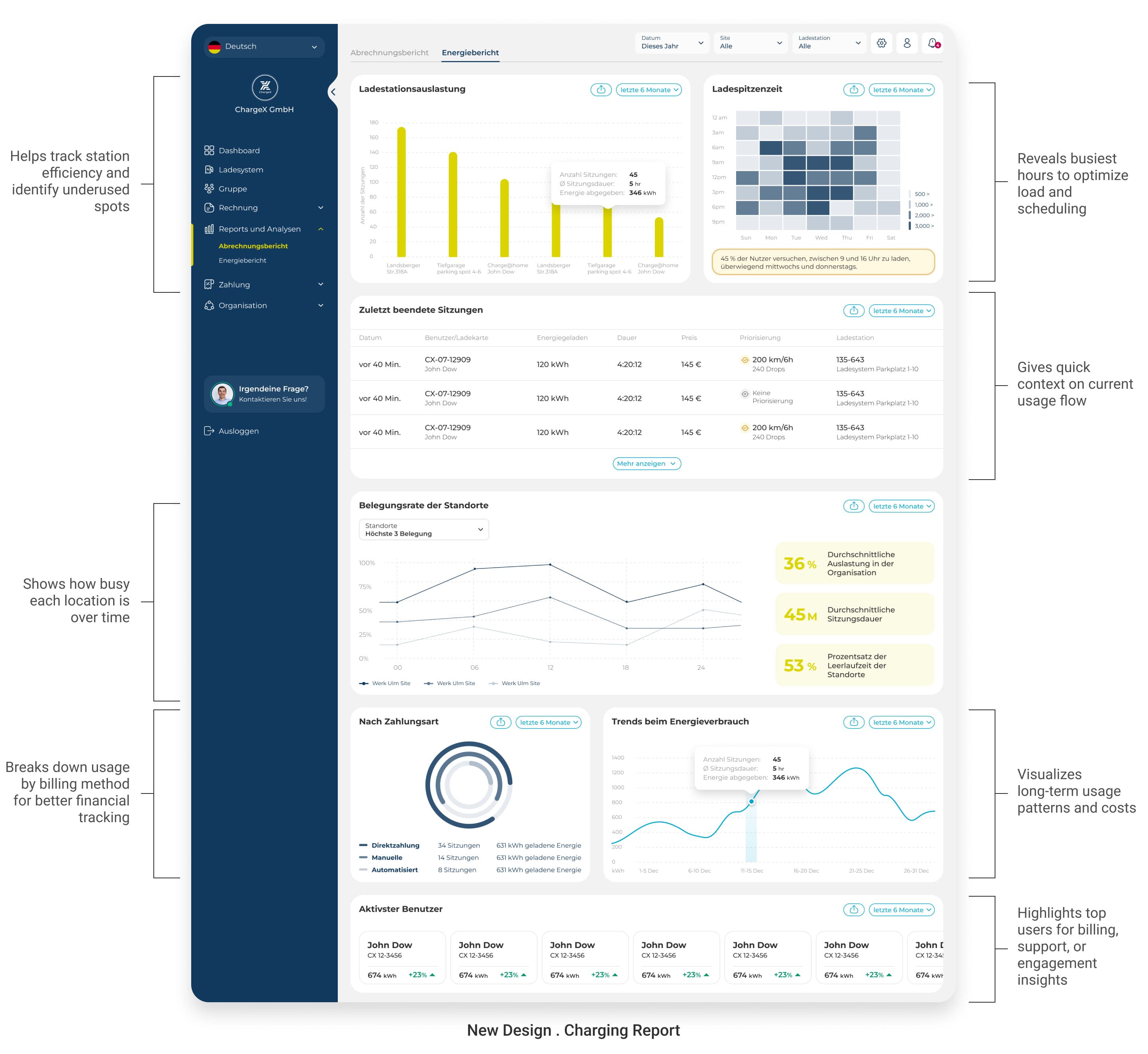
✅ Now, admins don’t just export data, they understand it. And that’s exactly what good reporting should do.
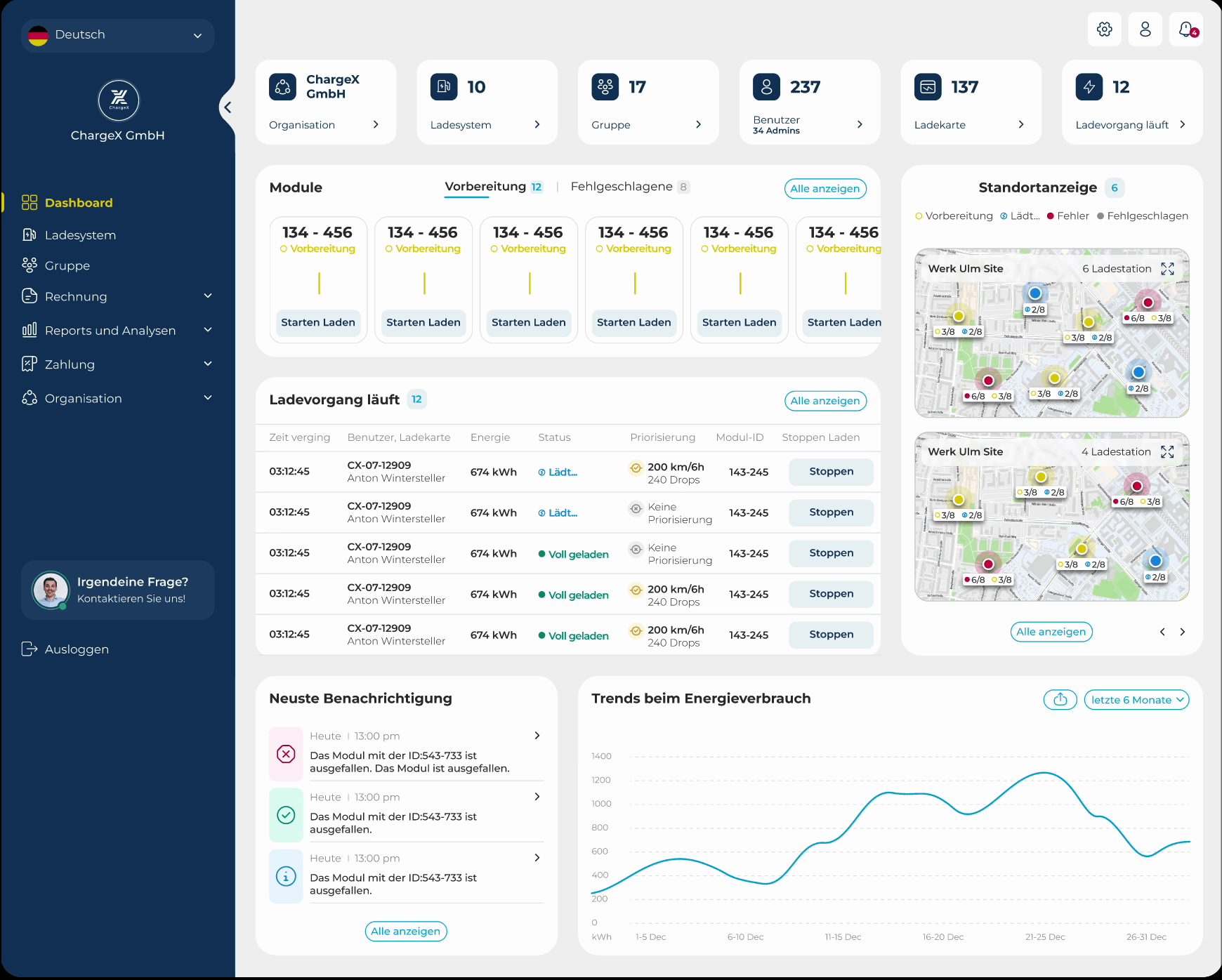
✔️And finally, the boldest change I made:
a real overview that admins actually need
One thing was clear from the beginning, admins didn’t just need tools, they needed perspective. Jumping from section to section just to understand what’s happening wasn’t sustainable, especially for busy teams managing large networks.
So I introduced something the old system never had: a real dashboard, a true control center. Now, instead of hunting down updates, admins get a clear, real-time view of their organization the moment they log in. They can instantly spot which modules are ready to charge, which ones have errors, and what sessions are running right now, no digging required.
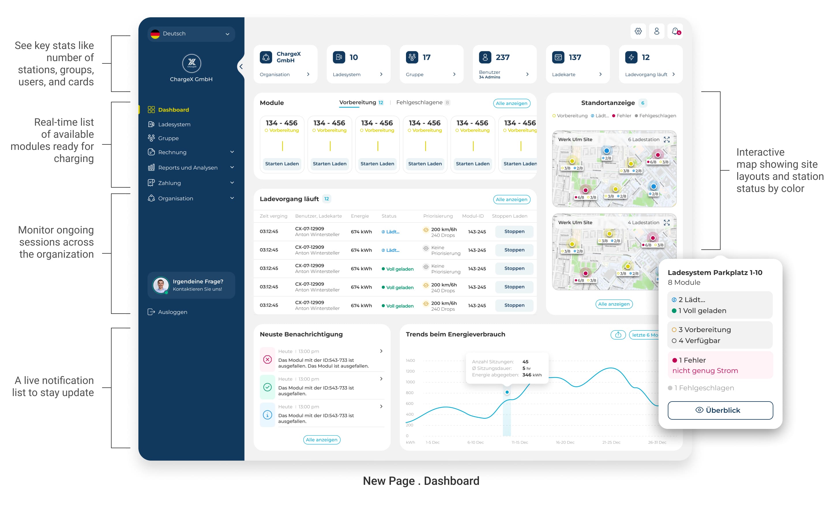
Over time, as we iterated with the team and gathered more feedback, we added even more value, like a live map view of sites and stations, color-coded by status, and a quick snapshot of energy trends and system notifications. It’s not just a new screen. It’s a whole new way of working smarter, not harder.
🤓
Where we are now, and what’s still ahead ?
What this case study covers, and what’s next
This case study focused on the Must-Have and a handful of Should-Have features we prioritized for the first release, based on our early MoSCoW roadmap. But with such a complex system designed for three distinct personas, this is only the beginning. I’m currently working on wireframes for additional features that climbed the priority list post-MVP, features that will complete the bigger picture in future iterations.
From internal feedback to real-world testing
While many of the designs shared here have gone through several internal loops, including design reviews workshops, and team feedback, that’s only half the story. We’ve now started usability testing with real admins , especially for brand-new features that didn’t exist in the previous version. Because no matter how solid something looks on paper, the real validation comes from real users. And that’s why this project remains a living, evolving process, not something we just wrap and ship.

What we expect this work to unlock
While the new dashboard is still under development, everything we’ve learned so far, from research to early and internal testing, points to big impact.
Here are some projected impacts:
📈 Unlocks new customer groups through tailored, persona-specific dashboards
🧩 Supports sales with sharper, more customized solutions for each admin type
⏱️ Reduces admin task time and improves operational efficiency
🤝 Decreases reliance on customer support by enabling autonomous workflows
😀 Boosts user satisfaction with cleaner, more intuitive interfaces
🚀 Strengthens ChargeX’s position in a competitive EV market through scalable design
👀
Take a look at behind the scenes!
Building not just screens, but a system for the future
While working on the ChargeX admin dashboards, I wasn't just focused on making things look good for today.
Behind the scenes, I spent time building a scalable design system, setting up smart components, variants, and clear foundations that could grow with ChargeX's future needs.
This approach made it way easier to maintain consistency across the dashboards, reduced chances of errors, and gave developers a much cleaner handoff for faster implementation.