Lixer started as a raw idea, a healthier, more social way to quit smoking, and this is the story of how I brought it to life.
I led the end-to-end design of a social platform that helps people quit smoking through community support, custom e-cigarette aromas, gamified flows, and local café partnerships. From concept to product, my design turned a vague vision into a meaningful experience that empowers users and connects small businesses, making healthier habits feel personal, social, and real.
Impact:
Visual Identity
First bold brand for safety & control
Design System
Reusable UI kit built from scratch
Trust
Interfaces that feel reliable daily
User Experience
Simple flows for smart home control
My Role
As a freelance product designer, I led the full design process, from shaping the initial concept to delivering a complete, user-centered experience. I applied a data-driven and user-centered approach to define key features, craft end-to-end flows, and turn a raw idea into a meaningful product that solves real problems.
Team
I worked remotely with the founder and collaborated with a small cross-functional team including a developer and a business strategist to align product goals, technical feasibility, and business growth.
Industry
B2C, B2B | Healthtech , Social Platforms , Lifestyle
Company
Karakoo GmbH | Wiesbaden, Hessen, Germany | June 2020
Starting from zero, and building something that truly helps
When I first joined the Lixer project, there was no app, no flows, no screens, just an ambitious idea:
⁉️ Could we create a digital space that not only offered a healthier alternative to smoking, but also made quitting feel personal, social, and… maybe even fun?
That was the challenge. And this is the story of how I brought it to life, from loose concept to a fully designed platform grounded in real human needs.
So what were we trying to solve?
Smoking isn’t just a habit, it’s emotional, social, and deeply ingrained in people’s routines. Most people trying to quit don’t fail because they don’t want to, but because support is scattered, motivation fades, and alternatives feel clinical or hard to access.
And that’s where Lixer stepped in, not just as a tool, but as a supportive system combining:
A social network for sharing quitting journeys
A recipe-sharing hub for custom e-cigarette aromas
Café pickup points for local flavor delivery
Gamified motivation, progress tracking, and support
🙂 🙌
We wanted quitting to feel like a journey, you don’t have to take alone.
How we grounded our ideas in real user needs
To make sure we weren’t designing in the dark, I led both qualitative and quantitative research.
We started with 30 open-ended interviews, real people with real stories of frustration, repeated failures, and the desire to change, if only they had the right kind of support.
Here’s what they told us:
🧠 “I don’t know enough about healthier options to trust them.”
🚪 “It’s easier to buy a cigarette than to find something better.”
😩 “I want to quit… I just can’t stick with it.”
🤷♂️ “I’ve tried everything. Nothing works long term.”
These stories shaped our early hypotheses, that motivation needed external fuel, education had to be built in, and accessibility would be key.
To validate our assumptions,
we ran a follow-up survey with 30 more people. The results confirmed our direction:
85% said easy access to healthier alternatives made quitting more likely
80% said they'd welcome an app with real guidance and community support
75% said smoking negatively affected their lives, but they lacked consistent help
45% had tried (and failed) to quit more than five times
👩💻
What The Data Told Me?
Let's Turning Insight Into Design Decision.
After gathering a mix of qualitative and quantitative data, it was time to make sense of it all. What I needed now was a clear, human-centered foundation that would guide every design decision moving forward. So, I rolled up my sleeves and started shaping raw insight into usable UX documents.
👋 Meet the People We’re Designing For
To keep our direction grounded, I developed two core personas:
Meet Frank,
The Lixer User
Frank is 33, lives in Frankfurt, and has been trying to quit smoking for years. He’s already failed several times and feels the impact on his health, focus, and daily energy. He’s tech-savvy and eager to try anything that gives him real motivation, especially if it doesn’t feel like a chore.
What matters to Frank
- A healthier, realistic alternative to cigarettes
- A way to track and visualize his progress
- A supportive community he can turn to
-Feeling seen and celebrated when he makes progres
Meet Sarah,
The Café Partner
Sarah owns a cozy café in Berlin and believes in small steps toward big change. She’s excited about offering Lixer aroma pickups in her shop because it aligns with her mission of promoting healthier choices in her community.
What matters to Sarah
- Attracting mindful, health-conscious customers
- Easy setup and support from Lixer’s team
- Playing a role in helping people quit smoking
- Seamless integration with her café’s daily flow
👉 In this case study, we’ll focus on Frank, the everyday Lixer user. The café partner experience, like Sarah’s, will be explored in a future phase once we expand the B2B side of the platform.
👀What Frank Showed Us (Without Saying It Directly)
To move from assumptions to true understanding on a deeper level, I created an empathy map grounded in everything we heard during our research. This helped me not just design for Frank (our core user) but actually think like him.
This empathy map grounded the emotional tone of my entire design. It reminded me that Frank isn’t just quitting a habit, he’s rebuilding his life, one craving at a time. Every feature had to meet him with understanding, not pressure.
First, I Had to Make It All Make Sense
Before designing any screens, I needed to figure out how to organize the core features. So I ran a card sorting session to understand how users would naturally group things like recipes, community, rewards, and cafés.
This helped me build a clear information architecture, one that felt logical, intuitive, and scalable. It meant that users could explore the app without overthinking, and we could grow the product without breaking the experience.
Then I Mapped the Journey
With the structure in place, it was time to design how users would move through it. I created a user flow that followed our main persona’s path, from signing up to finding recipes, connecting with others, or earning points.
This helped me spot any dead ends, reduce unnecessary steps, and make sure key actions like rating a recipe or finding a café were never more than a tap or two away. It made the entire journey feel smooth, purposeful, and emotionally rewarding
🎨
We Had the Pieces,
Now It Was Time to Build the Real Thing!
Here's What It All Came Together To Look Like
With all the insights mapped, structures sorted, and flows defined, it was finally time to turn ideas into interface. Every button, scroll, and screen you’ll see next was shaped by real user stories, real struggles, and the motivation to make quitting smoking feel not just possible, but personal and empowering.
Because motivation fades fast
Users said quitting lacked positive reinforcement. So, I built a reward system where users earn points, track achievements, and unlock upcoming milestones. Progress is visible right from the home screen, including weekly highlights like “Top User of the Week” and tips for leveling up.
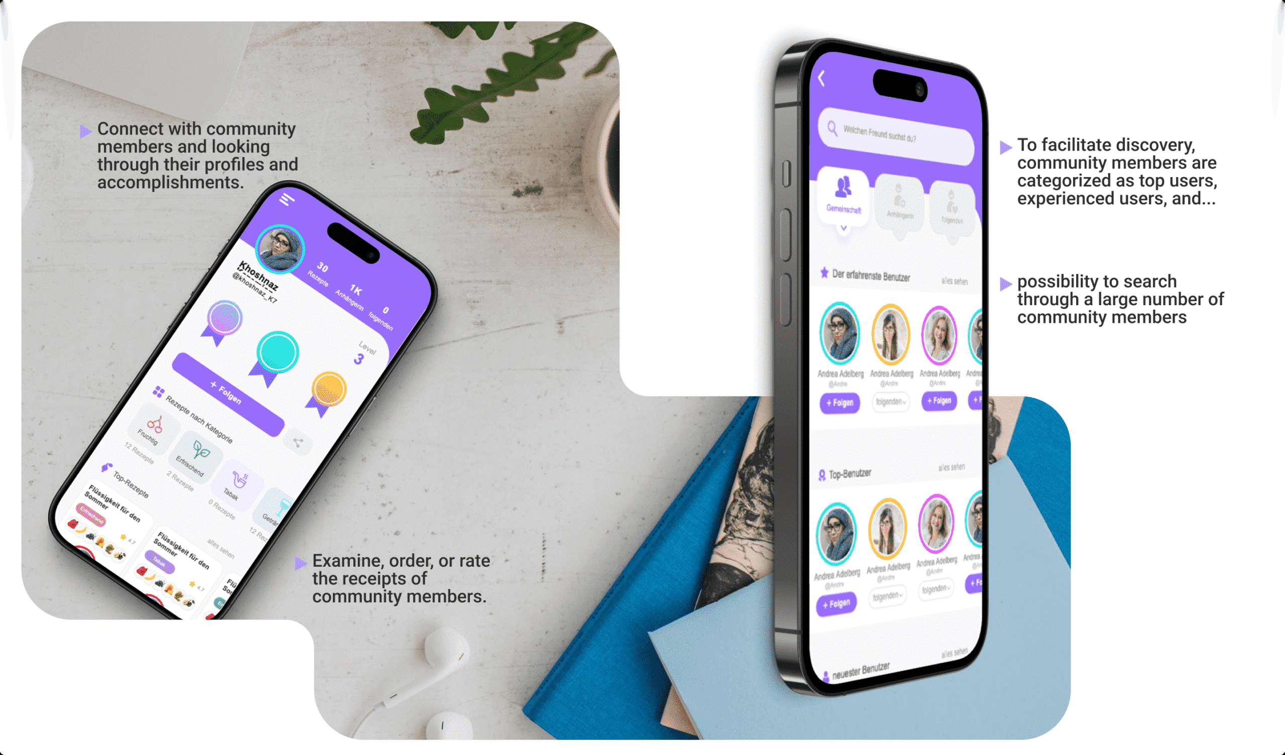
Because social accountability matters
Based on feedback around emotional support and social accountability, I created a community layer with real connections: users can search, connect, and explore each other's profiles, progress, and accomplishments. I categorized members as Top Users, Experienced Users, and more, making the space feel alive and navigable.
Because Frank loves customization
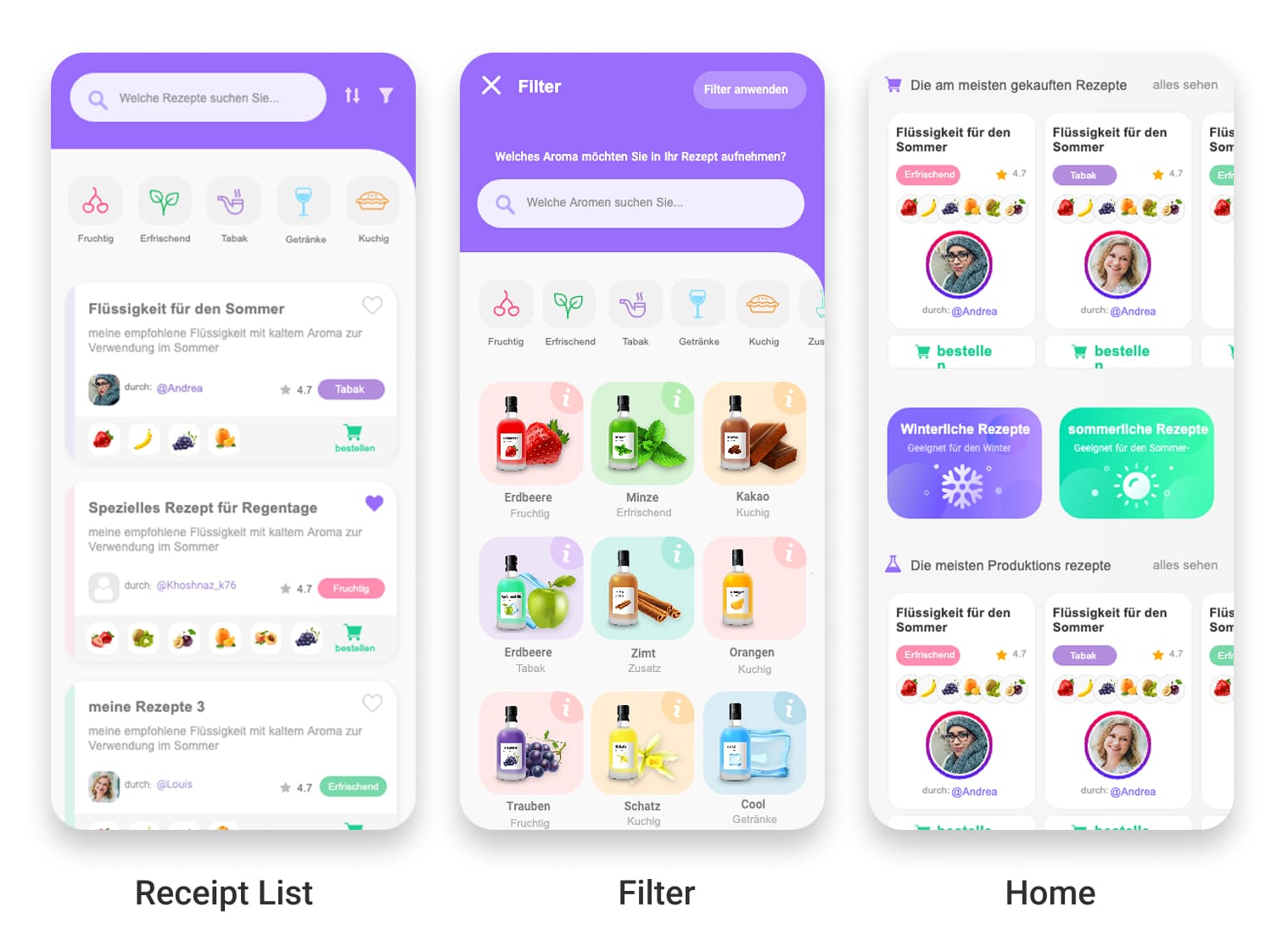
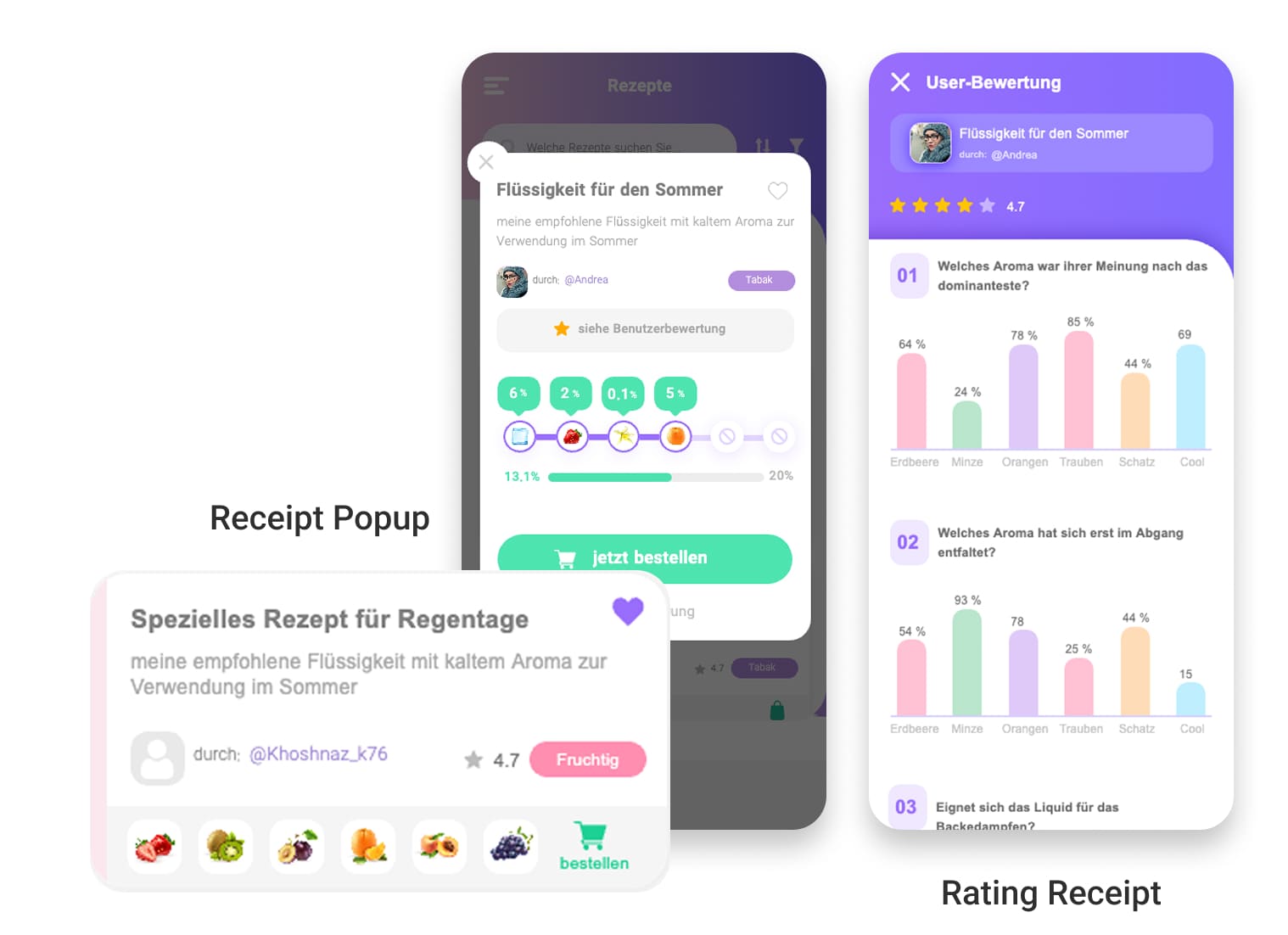
Users didn’t just want to create aromas, they wanted to explore, customize, and understand them. So I designed a full recipe-sharing flow:
✔️ Users can browse thousands of custom “scent recipes”
✔️ Each recipe shows ingredients, levels, tester reviews, and ratings
✔️ Seasonal suggestions are promoted right on the home screen
✔️ Recipes are fully customizable — users can tweak to match their taste
✔️ After trying one, users can leave reviews and earn points for contributing
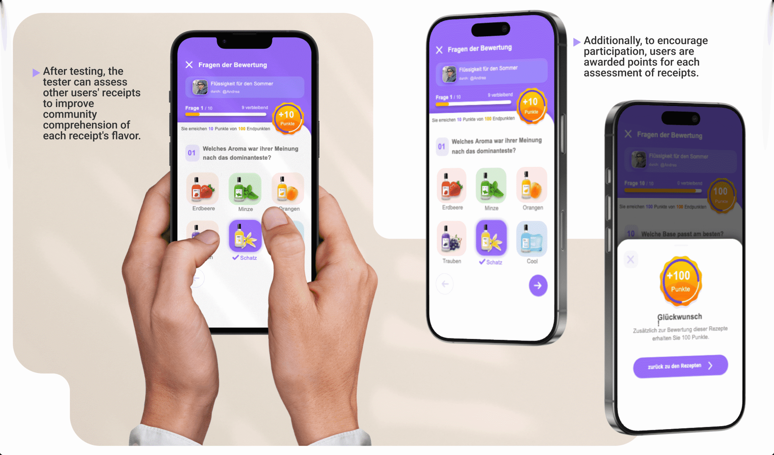
Because encouragement fuels change
To deepen community knowledge and boost engagement, I introduced a feature where users can test and evaluate others’ recipes, helping others understand flavor profiles more clearly. Every review earns points, turning feedback into a rewarding, collaborative loop.
🕵♀️
Now it is time to put design in front of real people!
Testing What We Built, and Learning from Every Click
Once the first version of the app was clickable, I knew it was time to put it in front of real people. I ran remote usability tests over Skype using the prototype, asking users to think out loud as they explored Lixer for the first time. And just like that, the gaps started to show as described below:
“I don’t get how the points work…”
The points and reward system felt confusing and overwhelming.
→ So I redesigned it with progress bars, clear milestone previews, and reward badges that made the journey visual and satisfying.
“There are too many recipes. I don’t even know where to begin.”
Users felt lost in the sea of aromas and lacked direction.
→ I designed a new filter and discovery page, organizing recipes by aroma families (fruity, herbal, spicy…) and seasonal categories. Combined with a new search bar and “Top Picks” based on ratings, it’s now easy to find just the right flavor for any mood.
“I want to rate a recipe after I’ve actually tried it.”
Rating on the spot didn’t make sense for testers.
→ So I added a bookmarking feature and delayed evaluation system. Users can save recipes, try them, and come back to rate when it’s real.
👀
Wrapping Up This Meaningful Chapter
From Idea to Impact
Lixer started as nothing more than a vision, a rough sketch of an idea to make quitting smoking more personal, social, and hopeful. I joined as a freelancer to help shape that vision, and ended up designing the foundation of something with real potential to change lives.
Built with Empathy
From uncovering user struggles to building flows that ease emotional hurdles, I crafted an experience rooted in empathy, one that meets people where they are, and moves with them through the ups and downs of change. I also designed with the future in mind, laying the groundwork for expansion, B2B integration, and continued community growth.
Passing the Torch
Now that this chapter is complete, I leave the team with a platform brought to life, ready to evolve, grow, and carry the mission forward. My part is done for now, but the journey for Lixer (and its users) is just beginning. 💙
Looking to purchase
Designer Assistance 01, 02, 03?
Please send me an email with your request, and I’ll provide you with instructions on how to buy the designer assistance files.