How I Turned a Fragile Onboarding Into a True Self-Service Experience, Cutting Setup Time in Half and Enabling Independent Error Recovery
ChargeX is a large-scale EV charging infrastructure platform powering smart charging systems across physical sites.
This is the story of how I end-to-end transformed a confusing, support-heavy onboarding experience into a streamlined, intuitive flow for B2B site admins, and rebuilding the flow around the edge cases, not just the happy path.
B2B SaaS | E-Mobility, Electric Vehicle Charging . Admin Portals
Company
ChargeX GmbH | München, Germany
The Problem
Self-service onboarding wasn’t truly self-service, it was fragile, hard to recover from, and weakened user trust from the very first interaction.
On paper, ChargeX had self-service onboarding. Admins were expected to configure stations, connect devices, and get the system running independently. But in reality, many of them got stuck and contacted support to complete the setup.
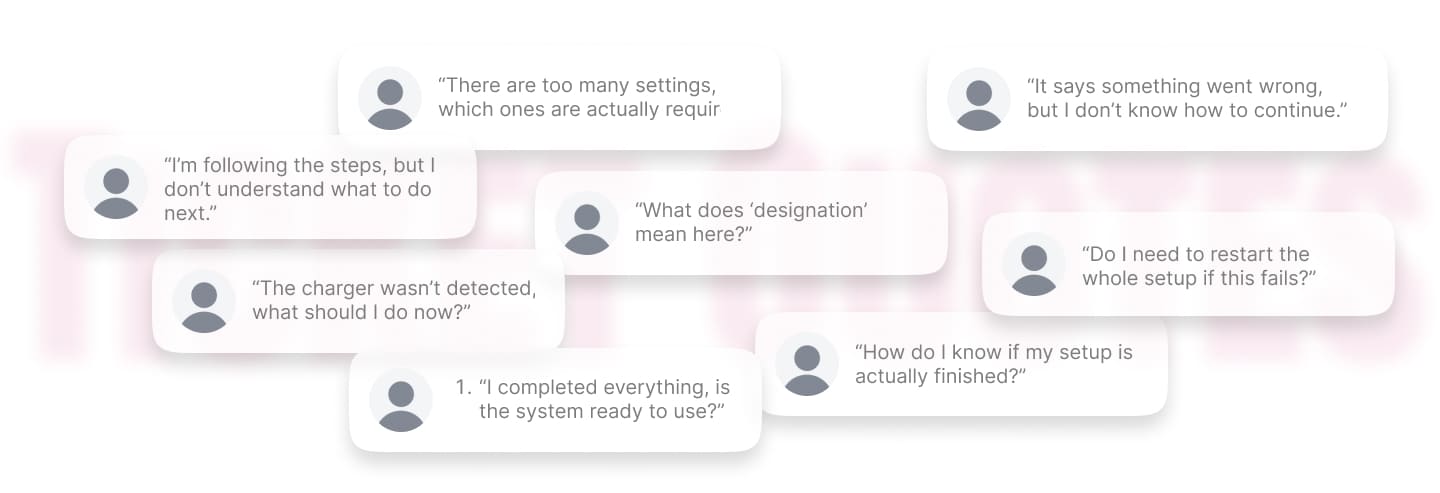
When I reviewed support tickets and session recordings, I found that the problem wasn’t limited to failure scenarios. Even when everything worked, the structure of the steps didn’t always make sense, and the copy and interface often left users unsure about what to do next.
And when something did go wrong, like a device not being detected, there was no clear recovery path. Users either repeated steps randomly or stopped and contacted support, which not only slowed activation, but also reduced confidence in the system during their first experience.
So the real challenge wasn’t just fixing individual screens. I needed to rethink both the happy path and the edge cases, making the flow clearer when things worked, and resilient when they didn’t.
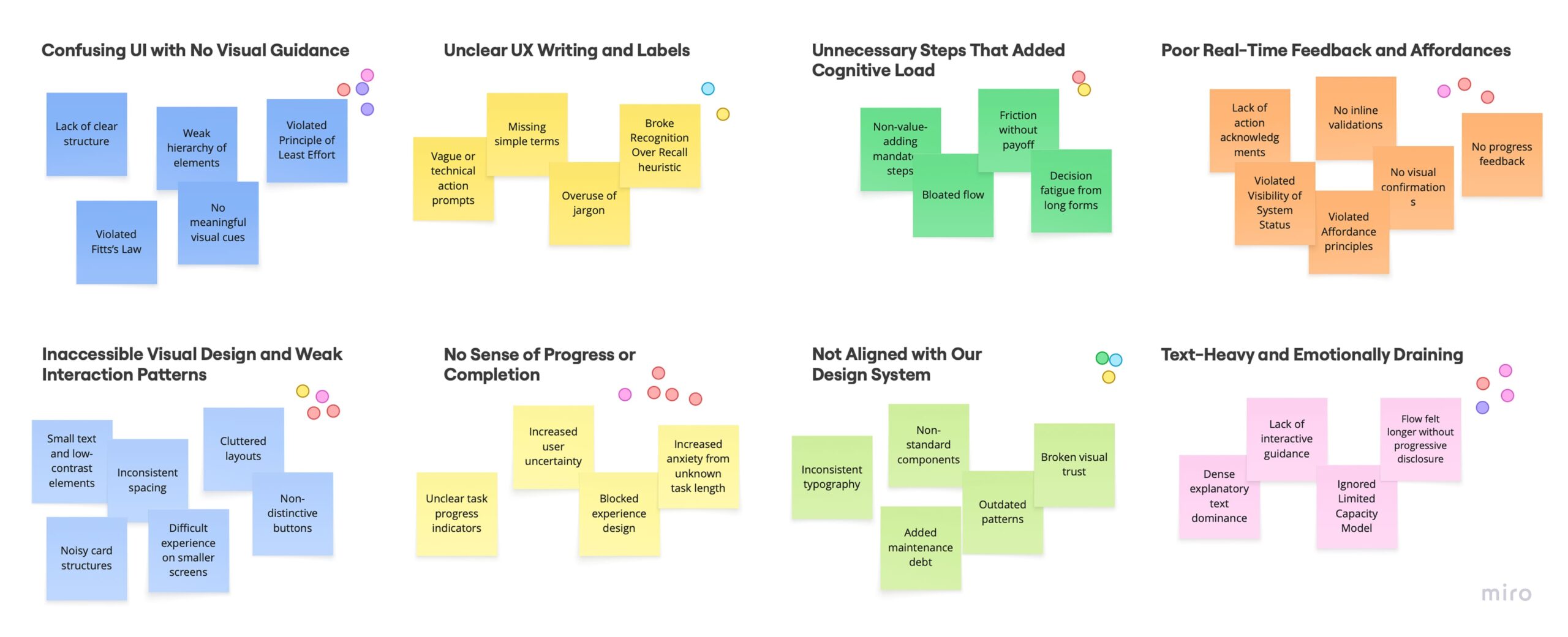
Example of support tickets
🧐
Before redesigning, I needed to understand exactly why admins were struggling and where the breakdowns happened !
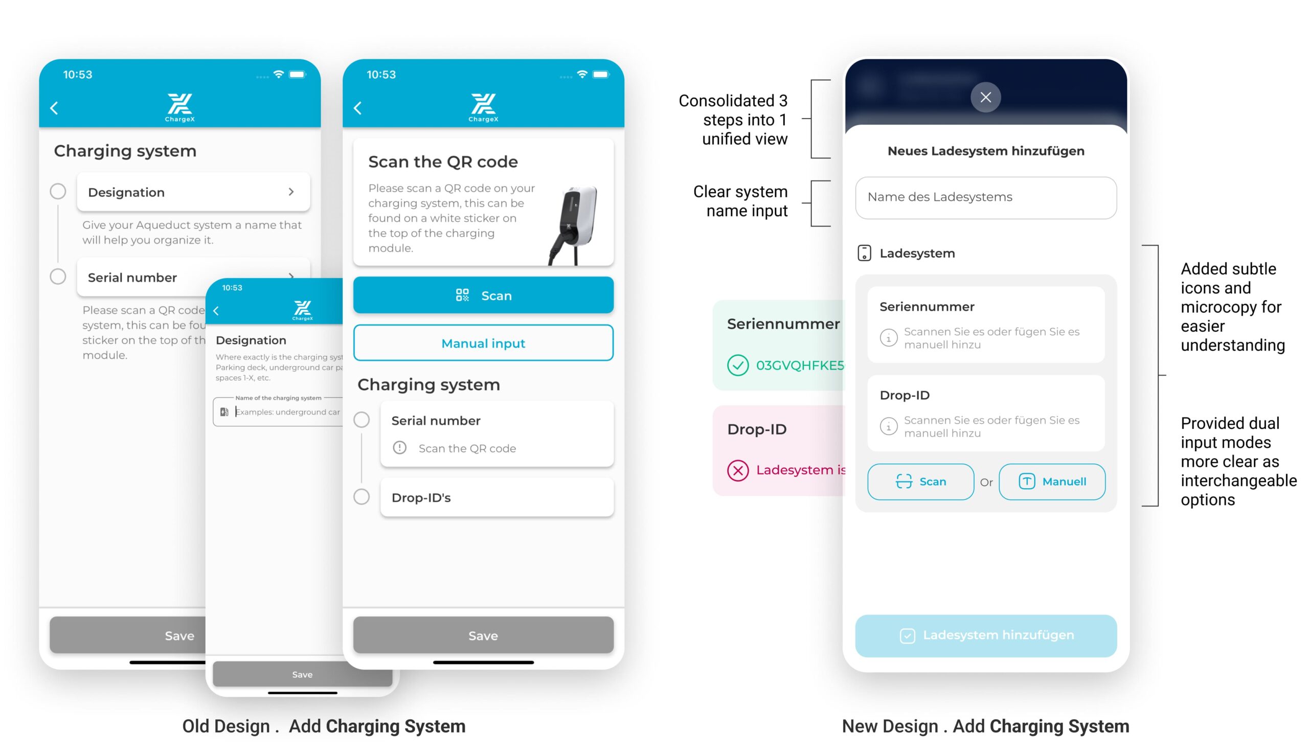
I analyzed the onboarding funnel and found a 37% drop at Step 3, making Charging Setup the biggest structural breakdown.
Working with our data analyst I mapped the onboarding funnel from entry to completion. The clearest signal was Step 3: Charging Setup, 37% of admins exited here. That made Step 3 my priority, especially since this step combined both technical setup and user decision-making.
I reviewed session replays and found that ~60% of users couldn’t recover from errors, confirming missing recovery paths and unclear step flow.
I observed repeated pauses, backtracking, and retries. Even when users followed the happy path, the step order and instructions weren’t always clear. But the biggest issue appeared when something failed, like device detection, where users had no clear way to recover.
Roughly 60% of users who encountered an error were unable to recover independently, often retrying steps randomly or leaving the flow.
This Was Hurting the Business, Too !!!
In parallel conversations with Support, Sales, and Ops, I Discovered How Onboarding Was Draining Revenue, Conversion, and Trust
💬 Support was spending about 35 hours a week on onboarding questions that should have been handled in-product.
⏳ Stalled setups kept chargers idle, pushing out revenue activation for us and our clients.
📉 Sales showed that prospects who stalled during onboarding were 27% less likely to convert.
🤝 The first impression of our “self-service” product felt hard and that chipped away at trust.
🤓
So, I needed to redesign onboarding for users who hit problems, because that's when trust is actually built or lost.
So, I translated failure patterns into structural decisions and aligned the team on what needed to change first.
I facilitated a working session with PMs and engineers where I shared the synthesized patterns from the data, especially the repeated breakdowns around unclear steps, missing recovery paths, and overloaded configuration screens.
Together, we reviewed the themes, discussed trade-offs, and prioritized which structural improvements would have the biggest impact on onboarding reliability. This helped us align on rebuilding the flow structure, focusing first on staged setup, clearer feedback, and built-in recovery paths, rather than patching individual screens.
I also mapped the full flow including failure scenarios before designing, because most breakdowns happened when things went wrong.
Before opening a design tool, I mapped every step of the existing flow alongside every known failure mode from the ticket and session data. This wasn't just a happy-path audit, it was a failure-mode inventory. For each point where something could go wrong, I asked: what does the user see? What can they do? What do they understand?
The answer, consistently, was: nothing, nothing, and nothing. That map was what showed me the scope of the redesign, and gave me the evidence to make the case for rebuilding the flow structure rather than patching individual screens.
Before - Happy path only
⚪️ Connect device
No feedback on connection state
🔴 Device not detected?
Dead end, no error state, no recovery path
⚪️ Configure settings
All options exposed at once, including advanced ones
🔴 Step fails?
Generic error or nothing, user repeats randomly or contacts support
⚪️ Confirm setup
Unclear what "done" means, no activation confirmation
After - Resilient by design
🟣 Connect device
Live detection feedback, user knows exactly what's happening
🟢 Device not detected?
Contextual troubleshooting inline, fix it here, no support needed
🟣 Essential setup only
Complexity staged, advanced config available after system is running
🟢 Step fails?
Specific, contextual guidance right where the failure happened
🟢 First session confirmed
Clear activation moment, user knows the system is live
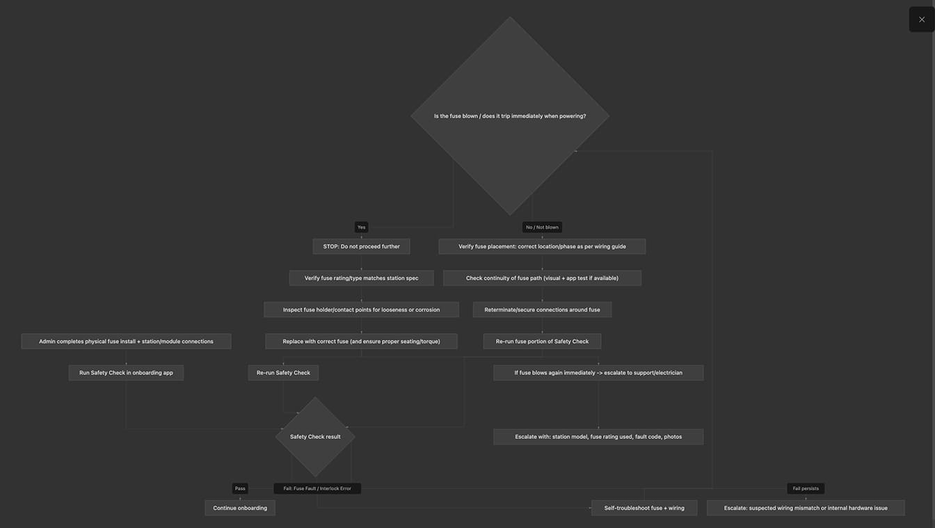
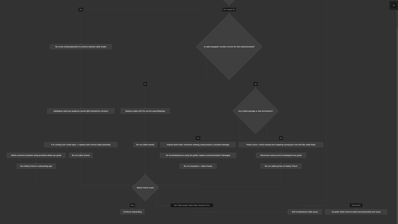
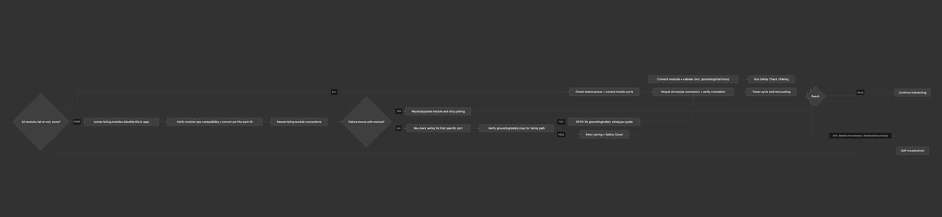
Example of the top three highest-risk failure modes, including built-in self-troubleshooting loops
Modeled using AI-assisted workflow synthesis (Cursor + Claude Opus)
Stakeholders wanted to show everything upfront, I pushed back because the data showed it was slowing users down, not helping them
Midway through the redesign, there was real tension with stakeholders about how much configuration to expose in the initial flow. The argument for showing everything was reasonable: the options were technically available, and some power users would want them immediately.
But the session recordings told a different story. Users who encountered advanced configuration options early spent significantly longer in the flow and were more likely to abandon or contact support. The cognitive load of deciding which options mattered was creating friction before users had even understood the basic system.
Option A — The default path
Expose all configuration options upfront
- Power users can configure everything immediately
- No second step required to access advanced settings
- Technically simpler — one flow, not a staged one
- Data showed new users spending longer and abandoning more
- Cognitive overload before any value was experienced
- Trust wasn't established before complexity was introduced
Option B — What I pushed for
Stage complexity, essential first, then advanced
- Users reach a working system faster
- Trust is established before complexity is introduced
- Advanced options remain accessible — just not foregrounded
- Reduces abandonment for the majority without limiting power users
- Creates a clear "you're done" moment as a foundation
- Onboarding flow is easier to maintain and extend as features grow
How I evaluate and made the call
I brought the session recording data directly into the stakeholder conversation. Rather than debating UX philosophy, I showed the actual behaviour: users who encountered advanced options early spent more time deciding what to skip than actually setting up the system. The data reframed the question from "should we hide features?" to "when is the right moment to introduce them?" That distinction mattered, it made the staged approach feel like progressive disclosure, not removal.
The agreement we reached preserved flexibility for power users, advanced settings were still accessible from day one, just surfaced after the initial setup was complete. No capability was removed. The sequence was what changed.
😎
Instead of jumping into UI, I first needed proof that the new step architecture and recovery flows would work end-to-end.
So, I turned the new onboarding structure into a functional prototype to test the flow before designing UI.
My goal wasn’t visual polish, it was to test whether the new step order and inline troubleshooting actually allowed admins to complete onboarding independently, even when something went wrong.
I used my custom GPT to write a detailed, reusable prompt + markdown spec for instant prototyping
I wrote a markdown design spec using a custom GPT I built for myself. I described the prototype end-to-end—flow logic, step gating, inputs, validations, edge cases, and success/error states. My GPT turned that spec into ready-to-use prompts tailored for prototyping AIs.
This let me validate the core logic, staged setup, error recovery, and progress feedback, in days instead of weeks.
I ran quick usability sessions to confirm admins could finish onboarding, before opening Figma or starting dev
Using the functional prototype, I ran short task-based sessions with internal domain experts who hadn’t seen the new flow before.
These sessions helped me validate key assumptions about the new structure:
→ Admins preferred selecting from existing assets instead of re-adding information repeatedly.
→ Jumping between steps was necessary for reviewing inputs without losing progress.
→ Step transitions weren’t always obvious, confirming the need for clearer progress indicators.
👉 These insights helped refine the structure before investing time in visual design.
🫣 But Usability Testing Wasn’t Enough ! Dogfooding Needed.
Because edge cases were highly technical, usability testing alone wasn’t enough to validate real-world reliability.
While usability testing helped validate the main flow, many of the highest-risk failures involved technical edge cases, like device detection issues or configuration mismatches ,that couldn’t be fully simulated in controlled sessions.
To validate those real-world scenarios safely, I moved to staged rollout testing.
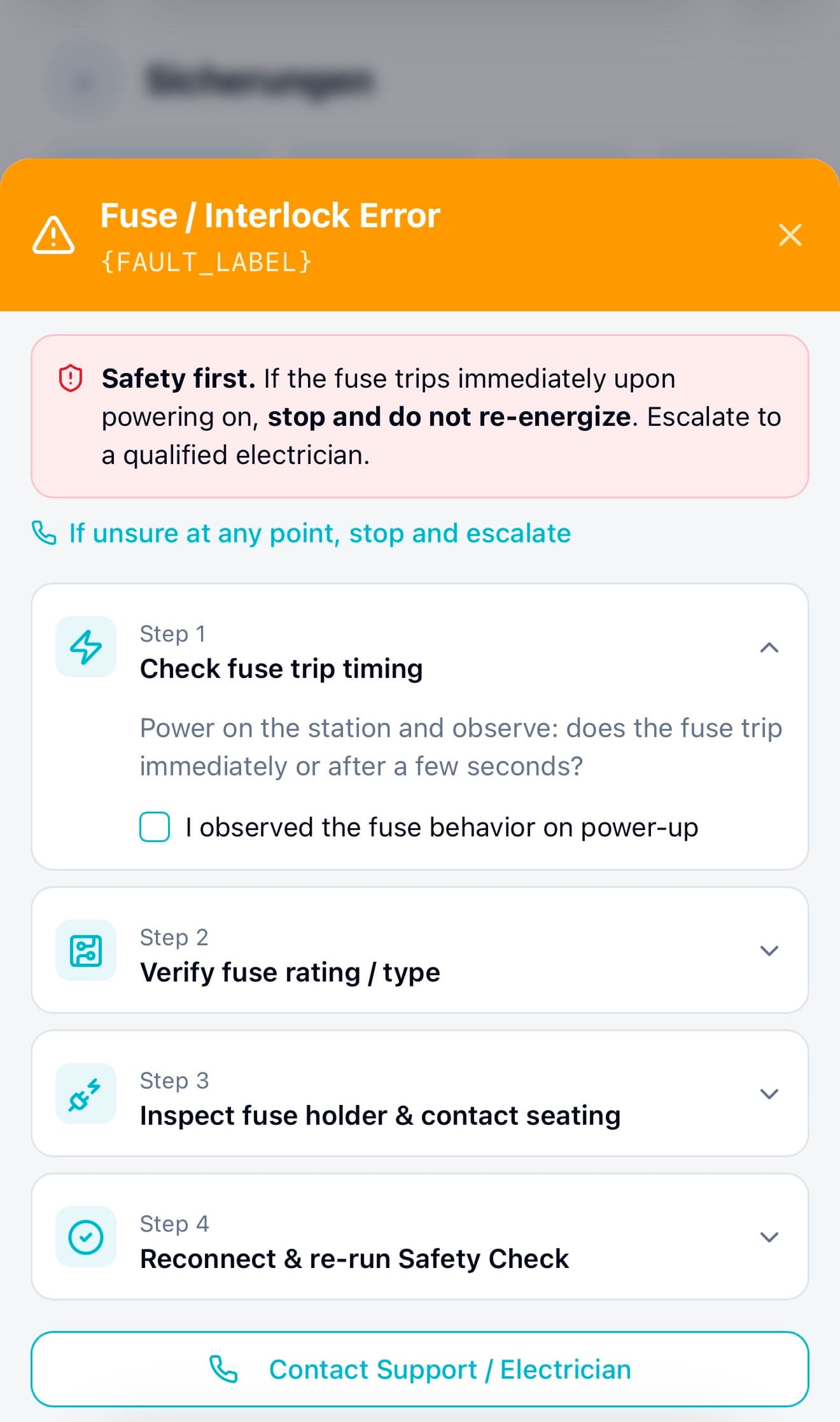
First, I moved troubleshooting inside the flow, so a failed step became a recoverable moment, not a dead end
One of the biggest design decisions I made was moving troubleshooting directly into the onboarding flow. Instead of sending users to documentation or support, each failure now surfaced clear, step-by-step recovery guidance right where the problem happened. Users didn’t have to leave the flow or guess what to do next, they could fix issues in the moment and continue.
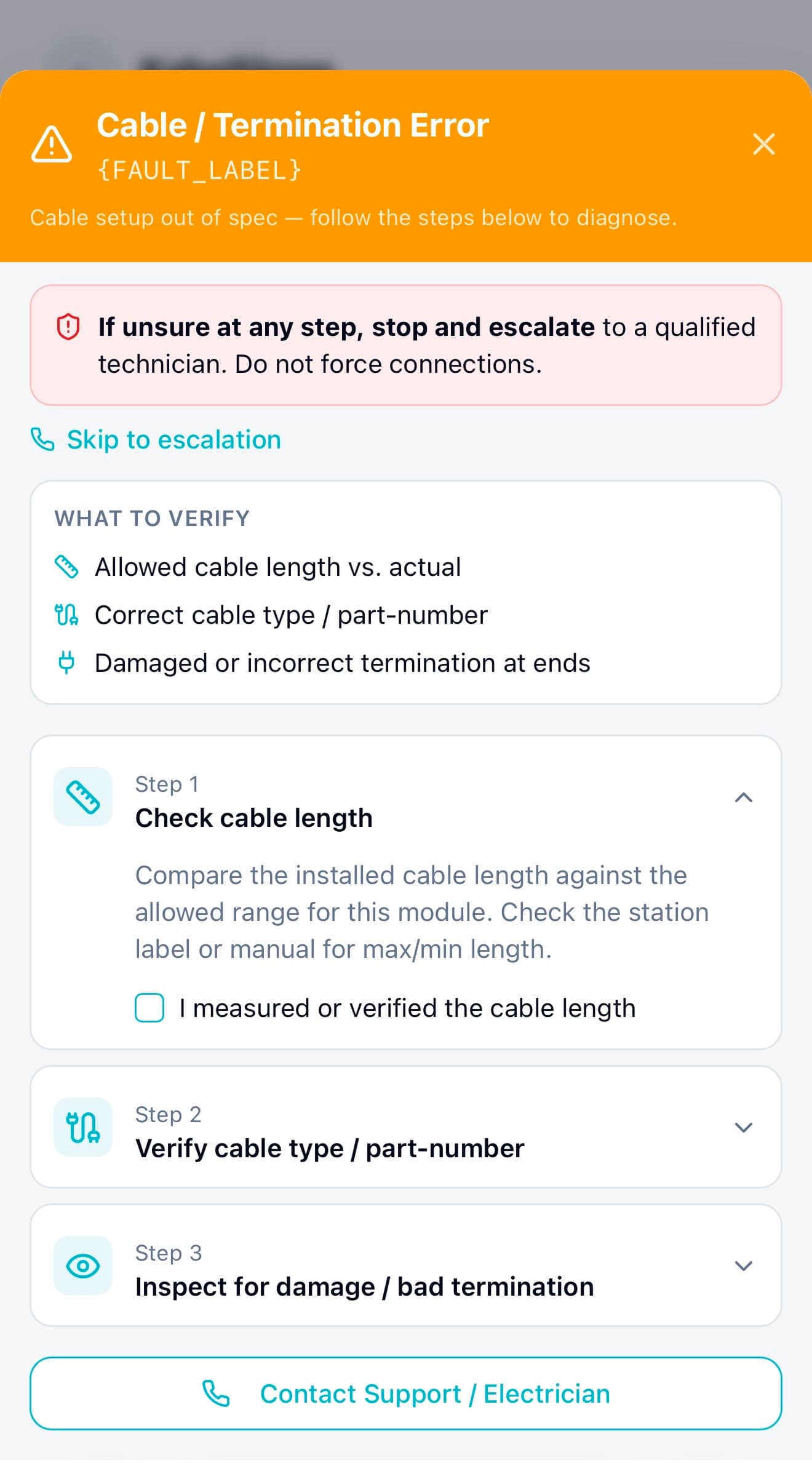
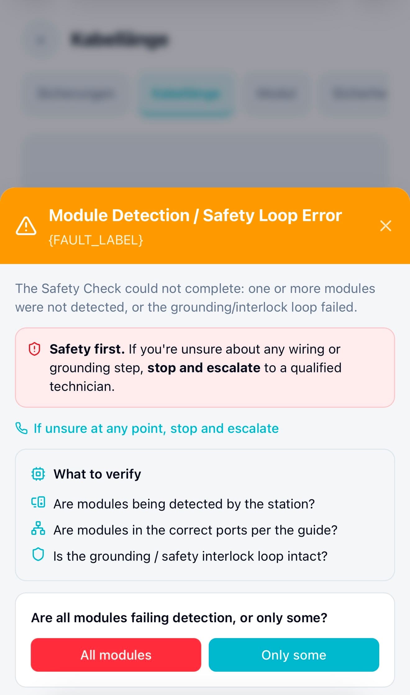
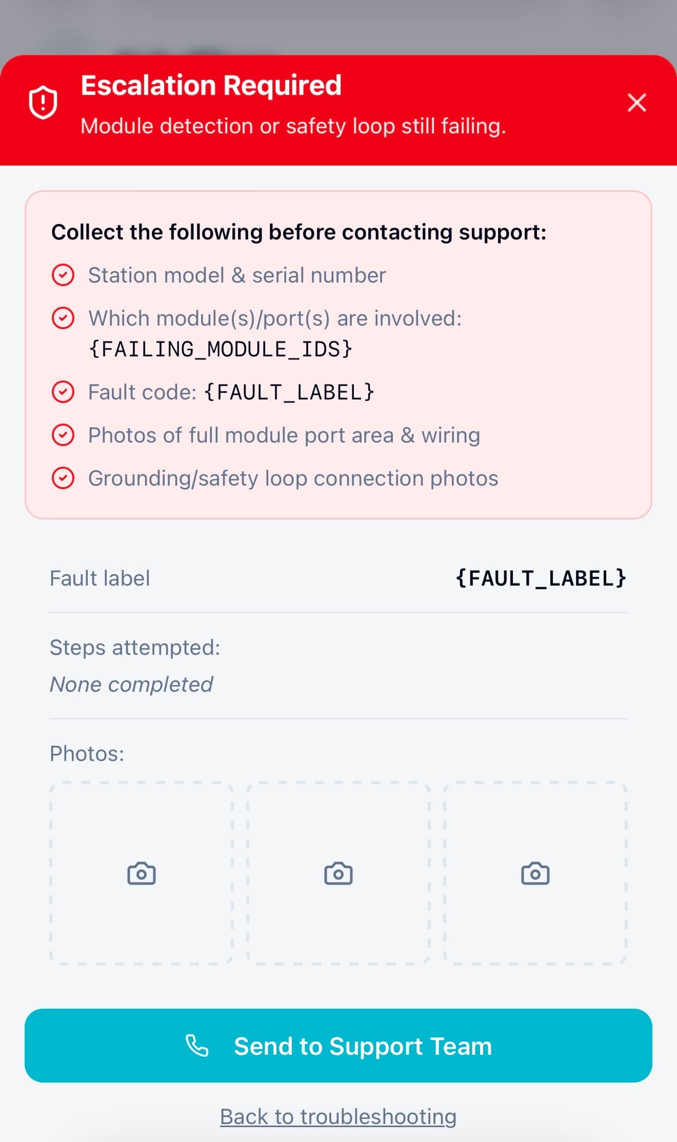
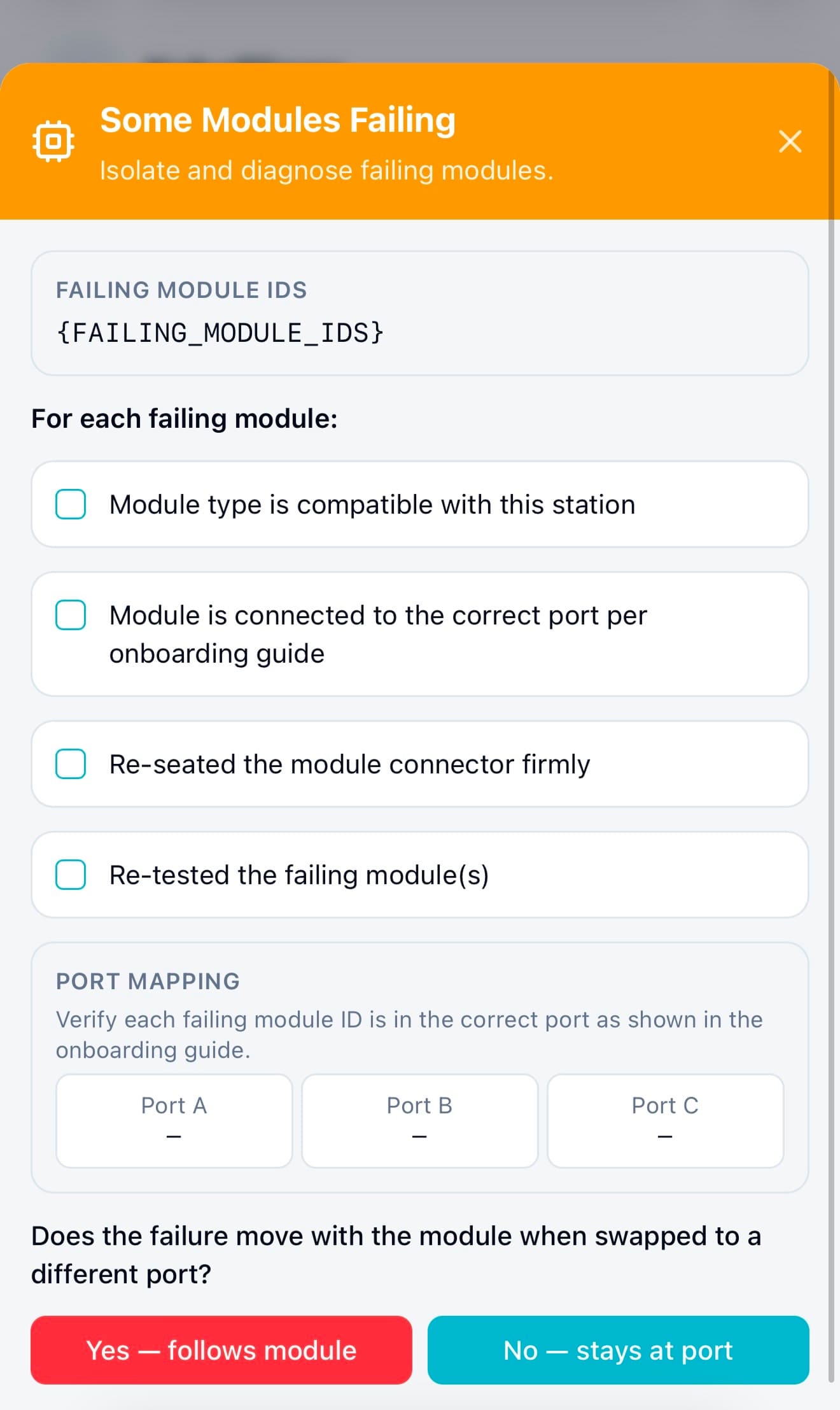
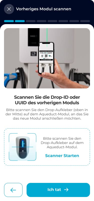
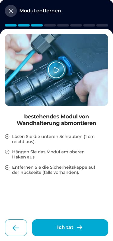
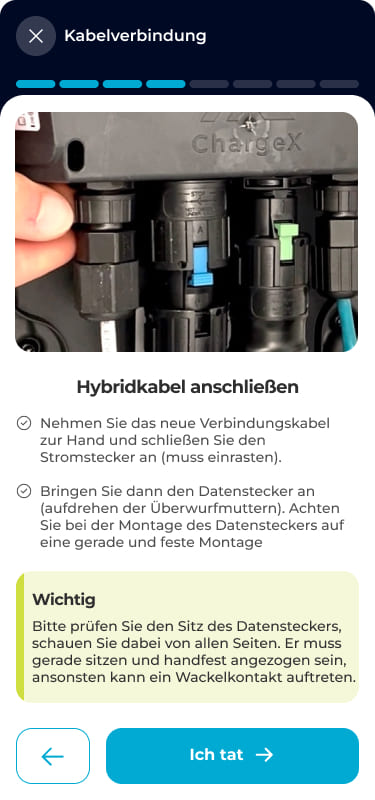
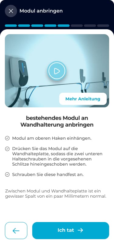
Example: When a module wasn’t detected or safety checks failed
In the main setup flow, admins followed guided steps to connect and verify hardware modules. These steps helped them scan devices, confirm wiring, and complete required safety checks, making sure the system could detect every module before moving forward.
So I introduced guided recovery paths to handle failures without leaving the flow
👇
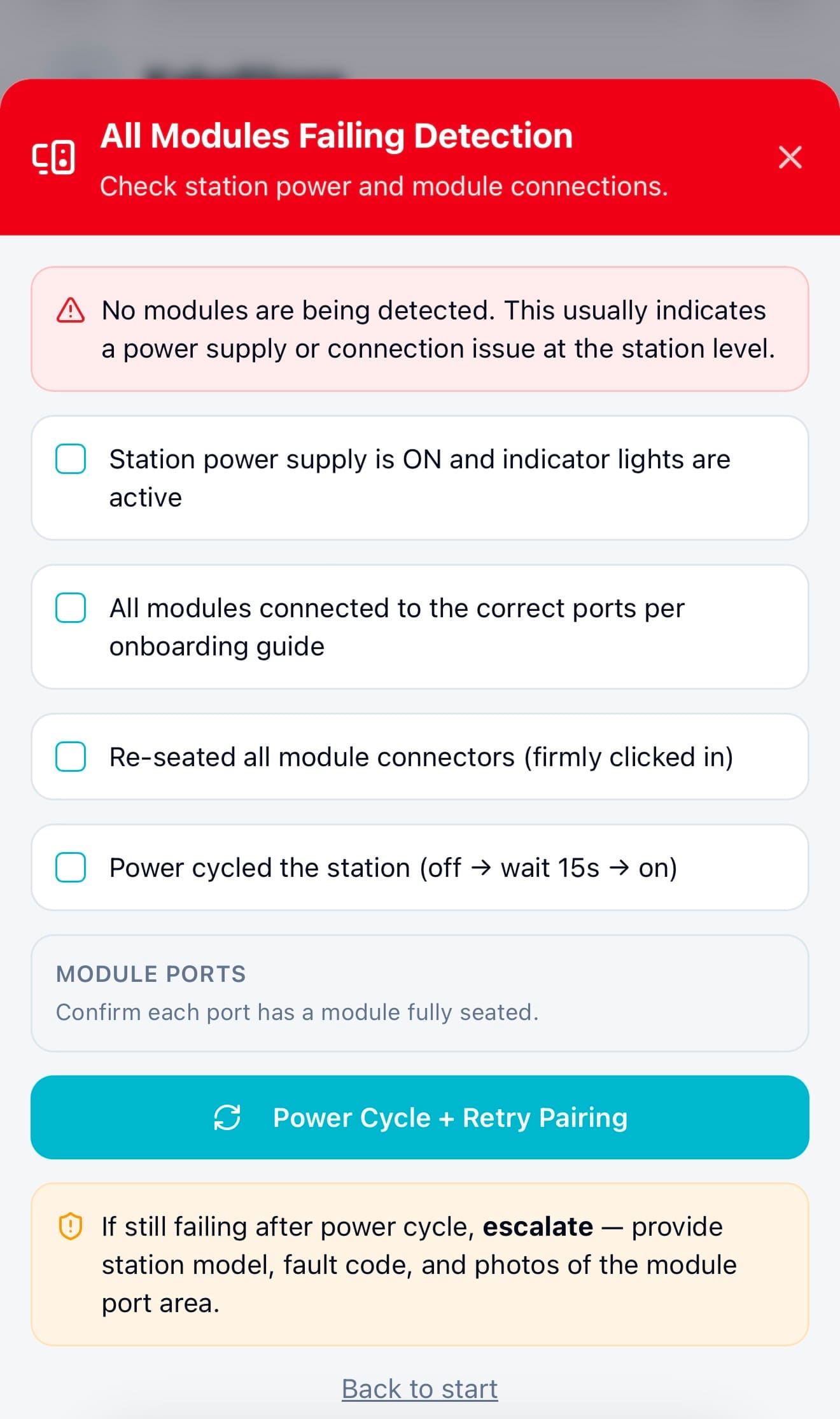
When a module wasn’t detected or a safety check failed, instead of hitting a dead end, admins now saw structured recovery steps directly inside the flow. The system guided them through checks, like confirming connections, isolating faulty modules, or retrying safely, before escalating to support if needed.
This decision to design recovery directly into the flow was one of the key changes that helped increase independent error recovery from ~40% to ~85%, and reduced the need to contact support.
Mockup 01 . Module Detection
Mockup 02 . All Failing
Mockup 03 . Escalation Required
Mockup 04 . Some Failing
Then, I released the new flow + in-line troubleshooting behind a feature flag to a small internal group to safely test real failure scenarios.
Instead of exposing the redesign to all users at once, I rolled out the new onboarding structure to a small group of internal admins using a feature flag.
This 2-monthes dogfooding phase allowed me to test:
- Real device detection failures
- Actual configuration edge cases
- Recovery paths under real system conditions
→ All without risking disruption to production users and gave me confidence that the new structure and troubleshooting logic worked reliably in real-world conditions before broader release.
🥰
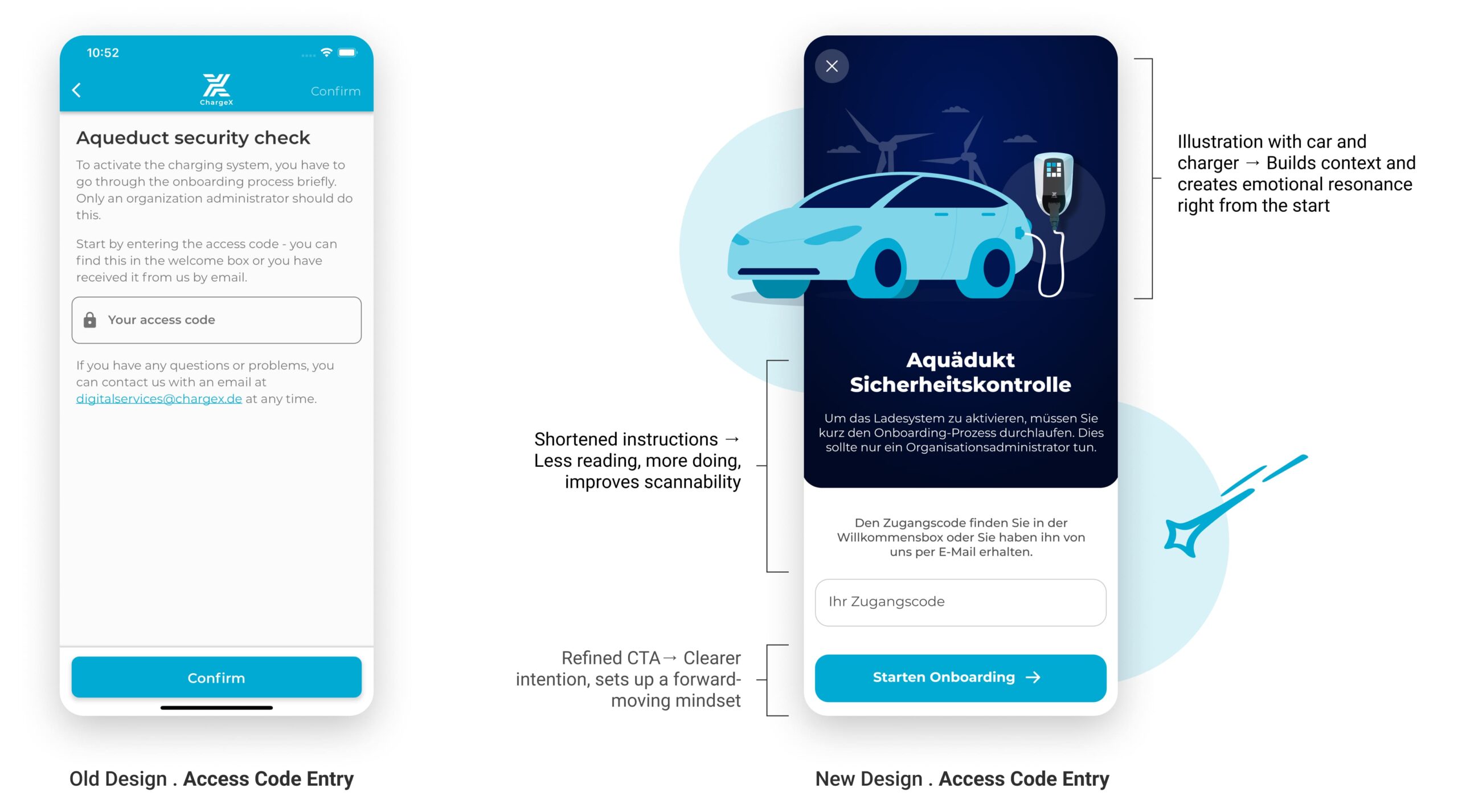
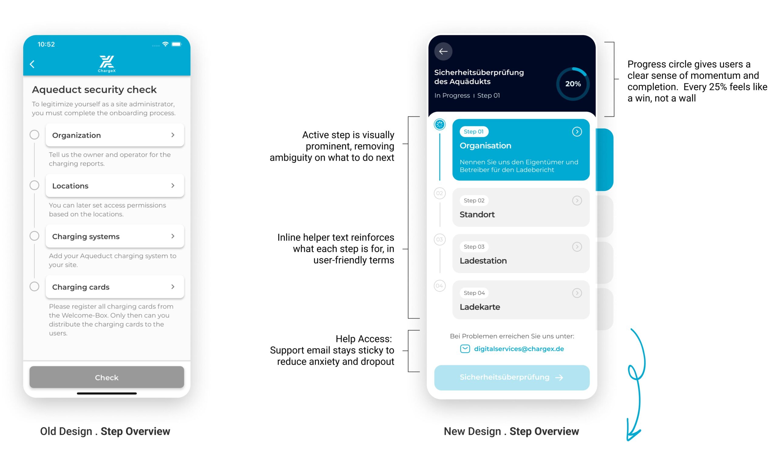
After validating the flow in real-world conditions, I finalized the UI. Here’s how the new flow compares to the old one.
I Introduced Visual Storytelling to Build Trust from the Start
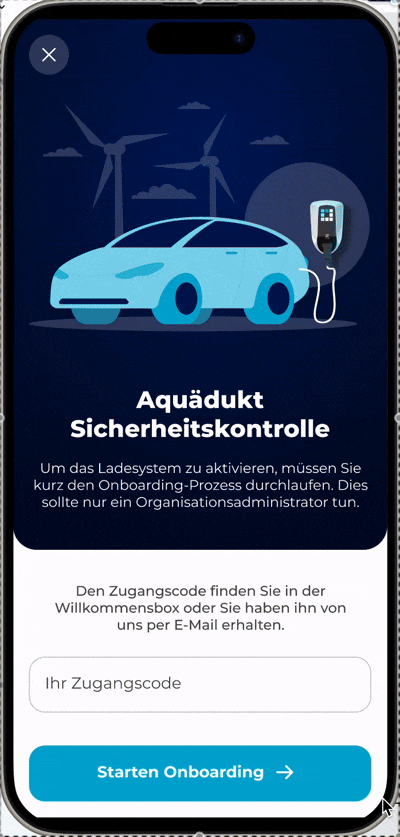
In the redesigned version, I focused on creating an immediate sense of orientation, trust, and relevance. I introduced visual storytelling, refined the hierarchy of content, and replaced the generic "Confirm" button with a clear, action-driven CTA. The tone is now welcoming but authoritative, helping admins understand why they’re here, and what comes next.
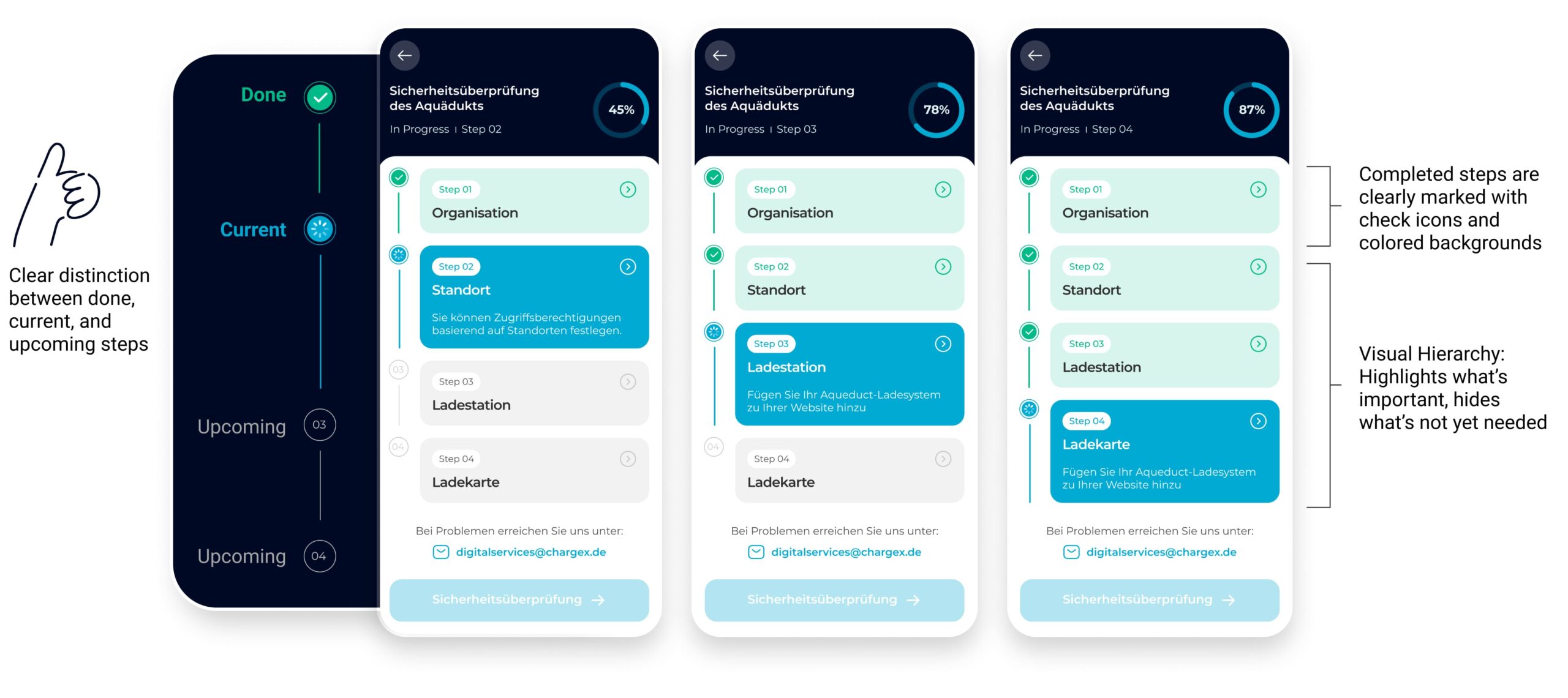
Lean tests showed people missed step changes, so I turned the flat list into a guided journey
In the coded tests, four participants said they couldn’t tell when a step had changed, and several wanted an easy way to jump back and edit. I redesigned the flow as a guided journey: clear step transitions, a visible sense of where you are/what’s next/when you’re done, and global step navigation to review or edit without losing progress.
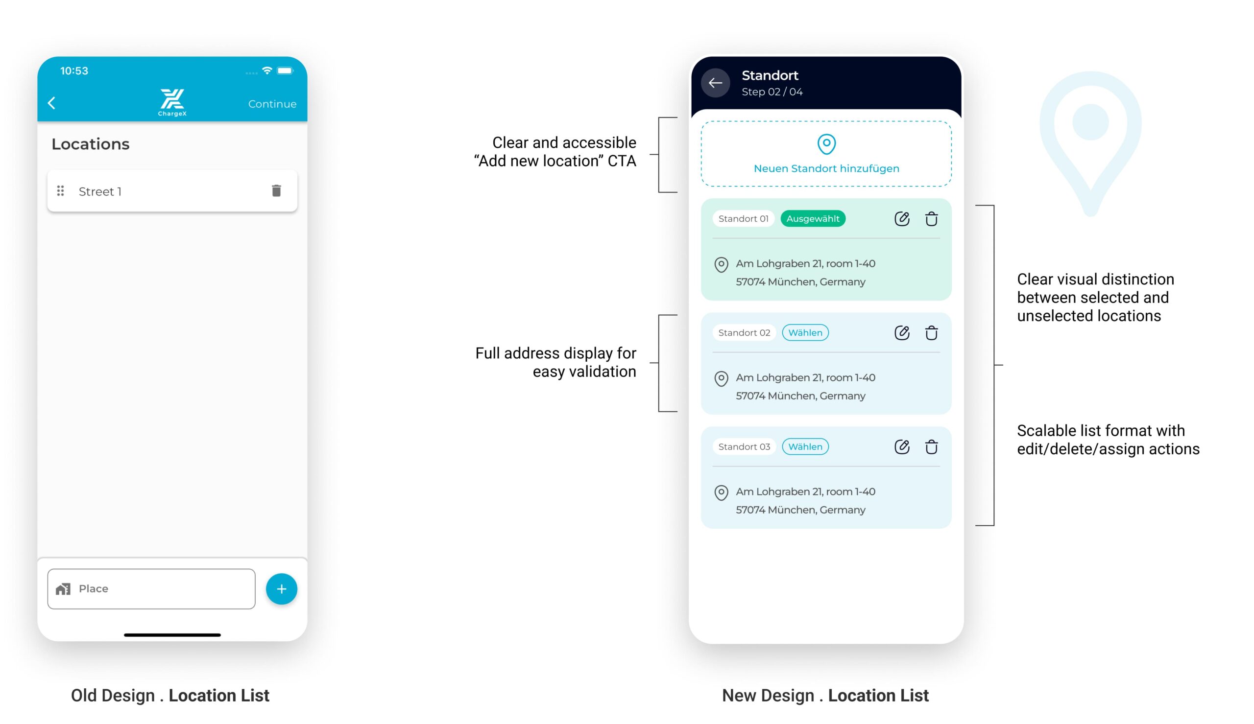
Tests showed experienced admins wanted to pick an existing site, so Location became “pick or add,” with clear guardrails
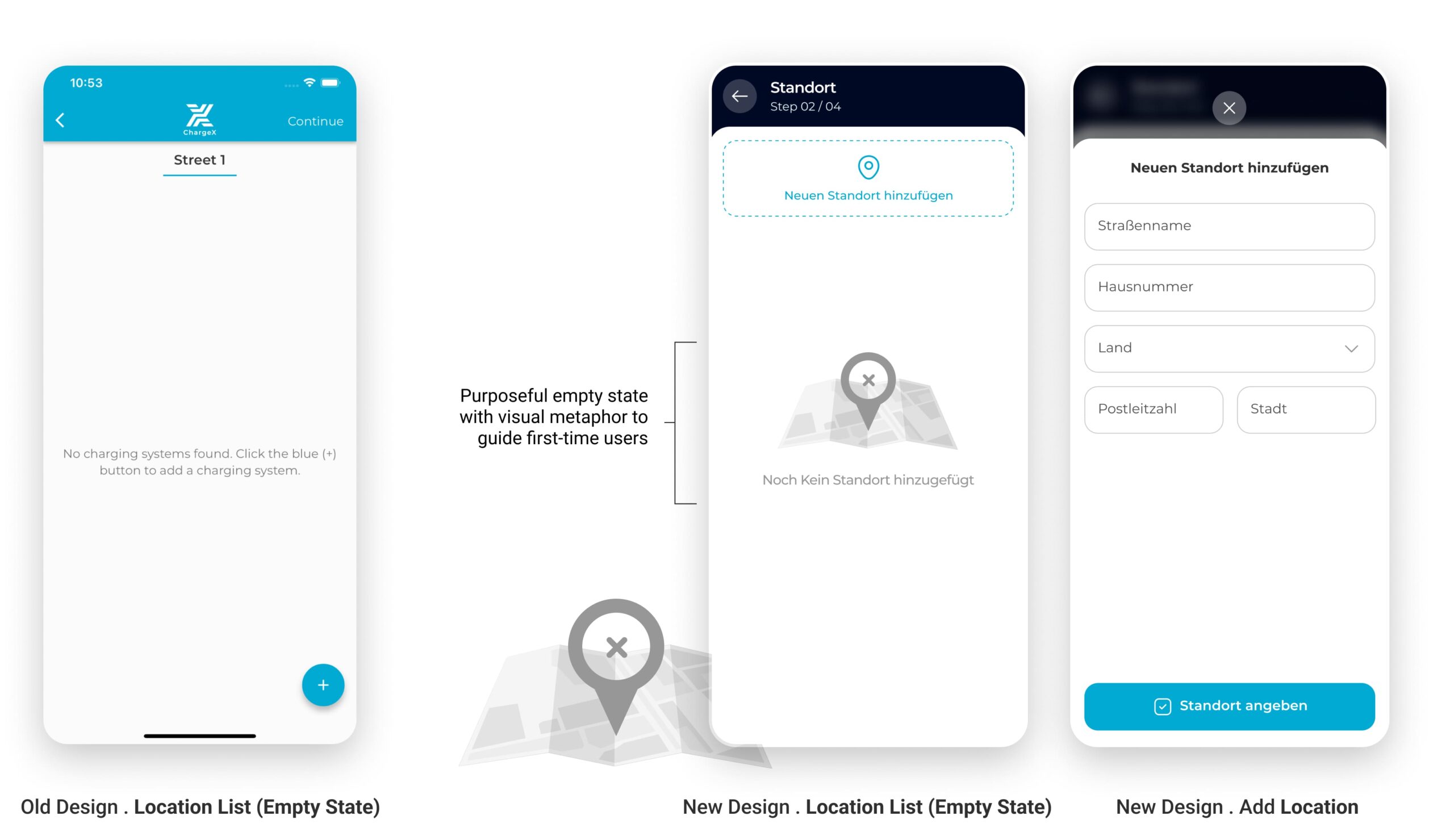
In the sessions, multi-site admins expected to select an existing location instead of re-entering it from scratch, while new admins were fine adding a first site. I reworked Location into a simple choice: use an existing site (when one exists) or add a new one. I added a clear address confirmation, a safe delete with confirmation, and a plain empty state that explains what the step is for.
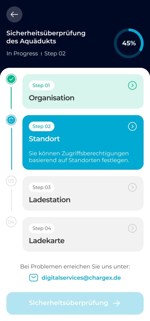
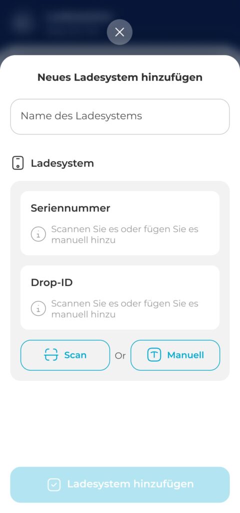
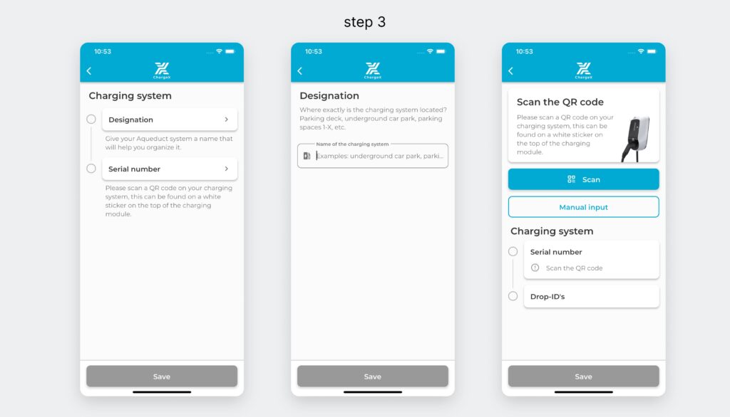
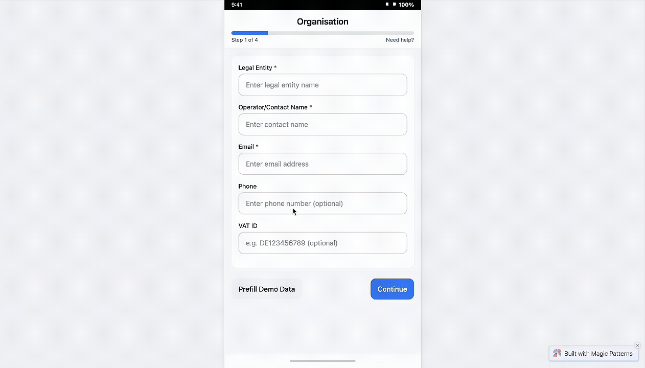
37% dropped at Step 3, so I made it one guided workspace with clear path choices
In the redesigned step, I strategically collapsed multi-screen flow into a single, well-structured screen. By removing unnecessary segmentation and combining related inputs, users now complete this task in one cohesive action. Clear grouping, icon-guided inputs, and dual options (Scan or Manual) reduce friction and make even first-time configuration feel intuitive.
This approach also improves technical accuracy by guiding admins toward correct input formats.
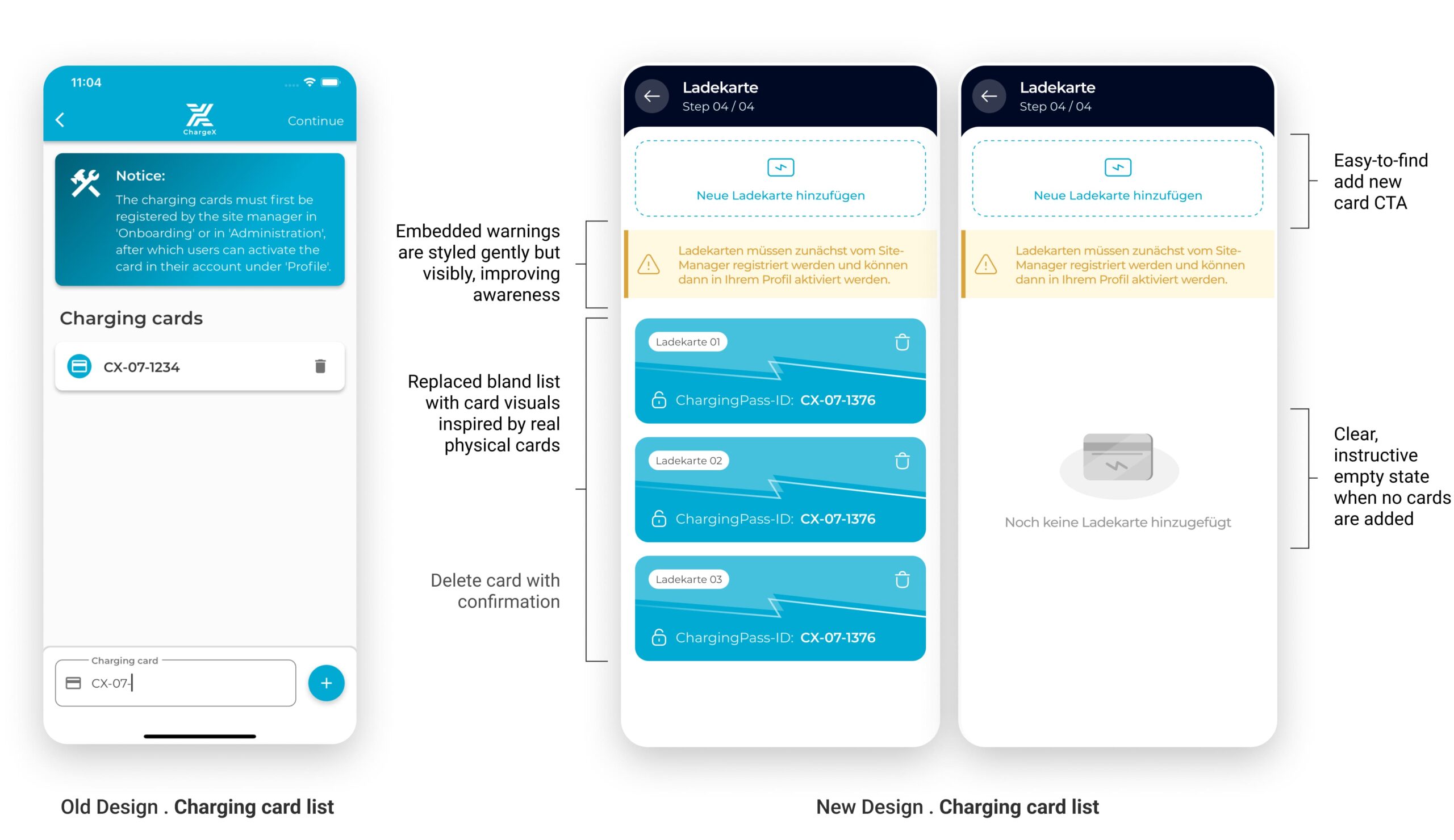
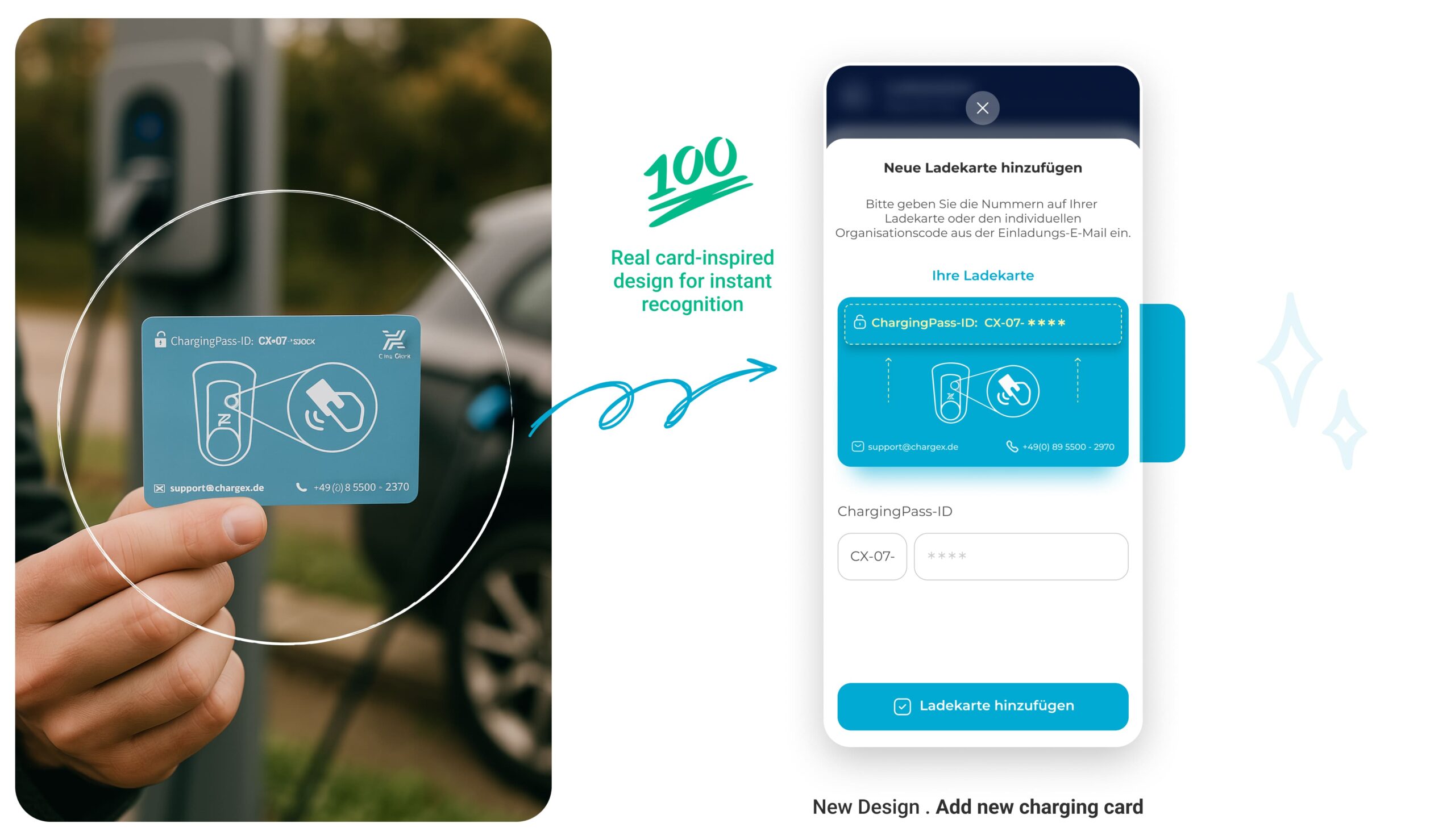
I Turned a Static Charging Card List into a Visual System that Mirrors Real Cards
I reimagined this step by grounding the digital experience in something admins already know and trust: the physical charging card. By mimicking the actual card’s look, color, and structure, I bridged the physical-digital gap, making the system feel more intuitive, reliable, and self-explanatory.
No more guessing which card is which. Now, every card looks like a card.
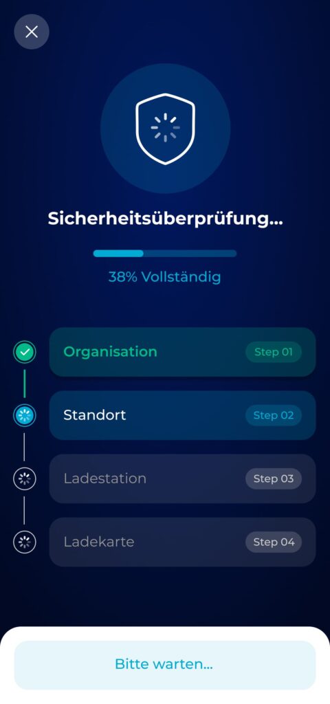
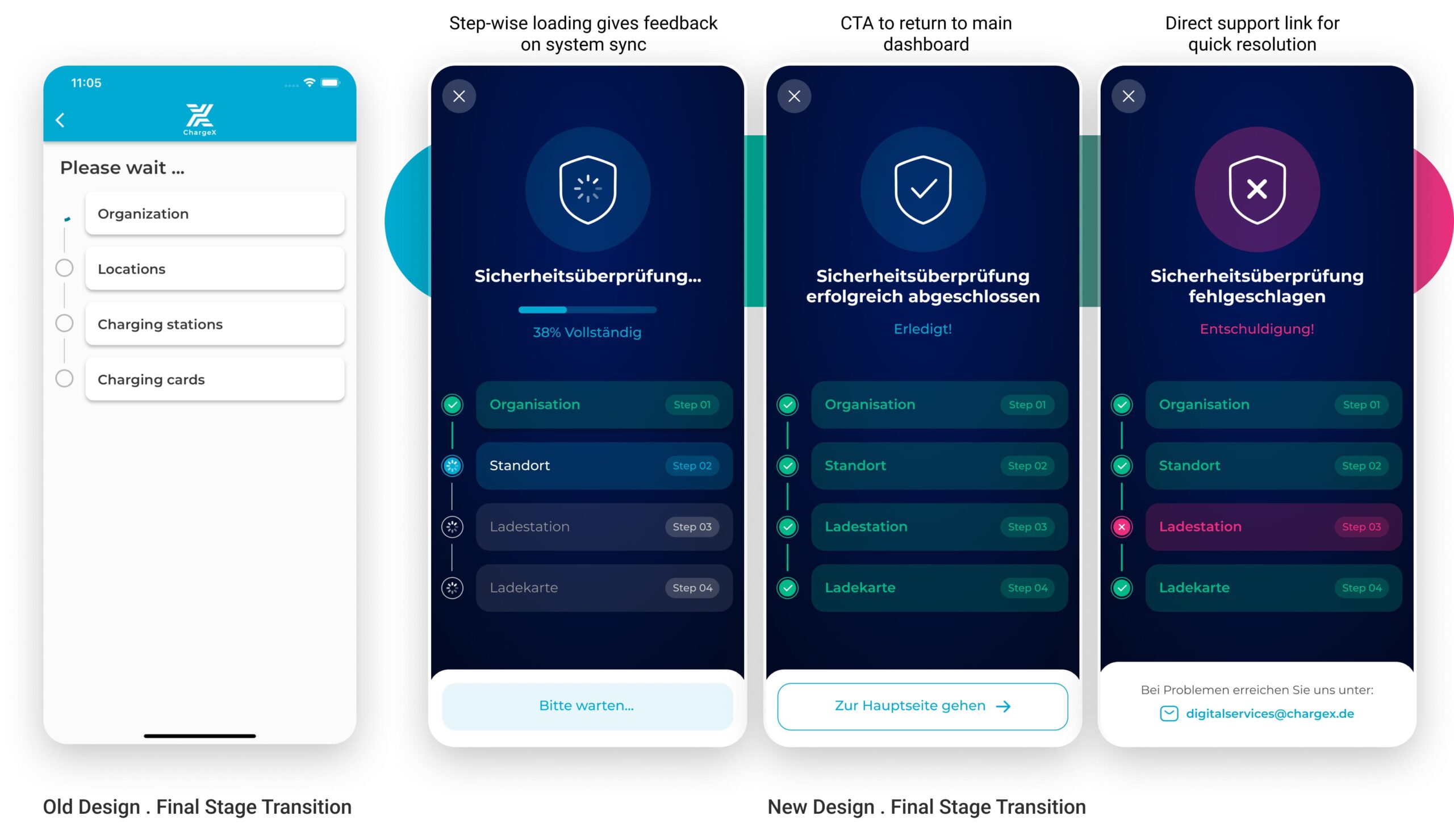
I Redefined a Bare Waiting Screen into a Clear System Check with Progress, Success, and Error States
I redesigned the final stage to feel like a security check-in, something meaningful, visible, and trustworthy. By introducing a step-by-step visual tracker with real-time feedback, admins can now see what’s happening, understand outcomes instantly, and act accordingly in case of errors.
Three distinct states—progressing, success, and error—help users stay oriented and calm. The design uses metaphor (shield icons), clarity (color-coded steps), and actionable fallback (support email) to drive reliability and confidence at the final step of onboarding.
🤔
Hmm…Did the Redesign Deliver? Let’s Look at the Data
After rolling out the redesigned onboarding flow, I began tracking its real-world impact, from smoother admin setups to noticeably quieter support channels.
Impact in 4 Weeks:
Faster Completion, Fewer Drop-Offs, and Less Support Overhead
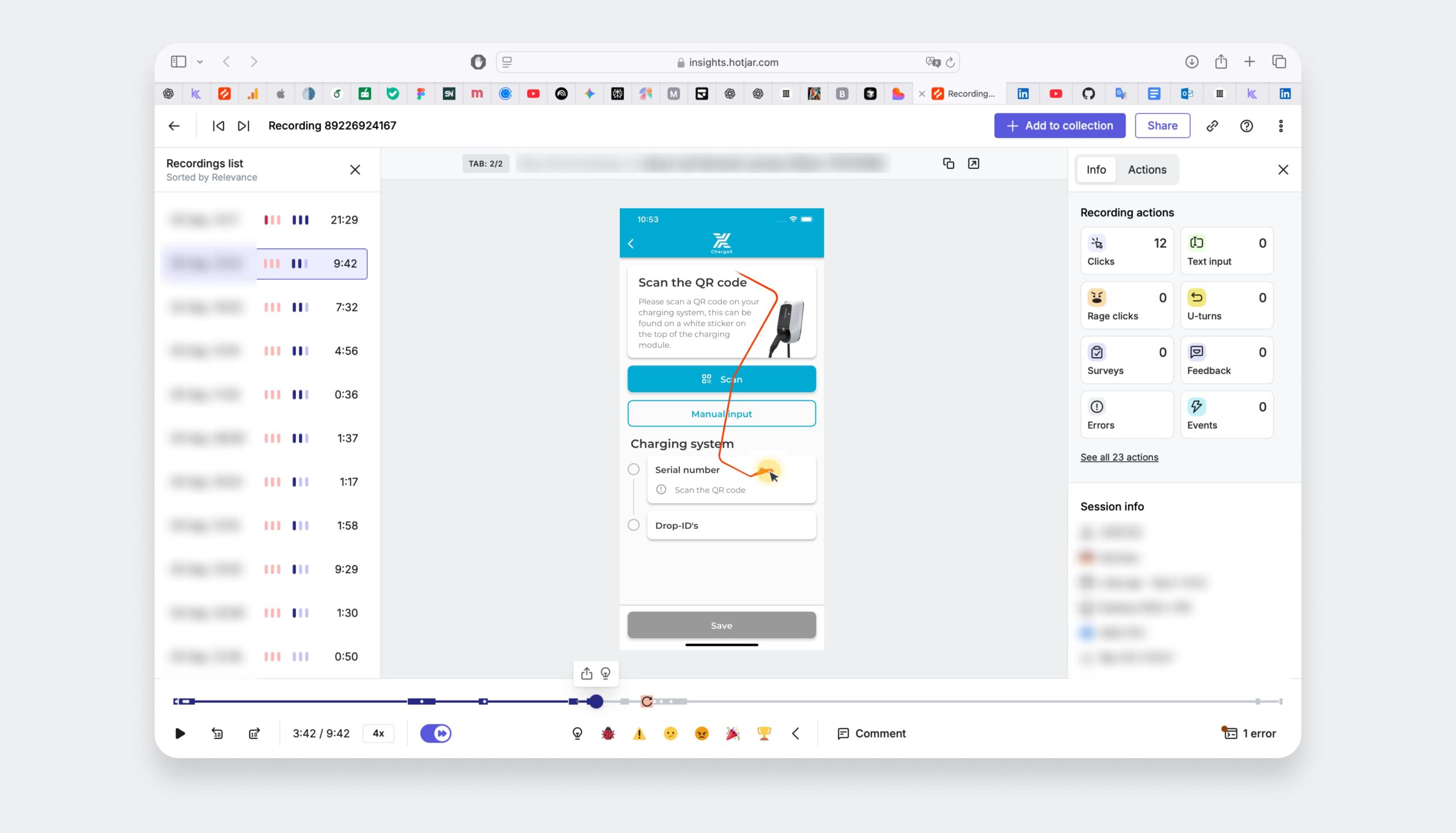
After releasing the redesigned onboarding flow, I started measuring its performance in the real world. I combined hard numbers (Mixpanel funnels, Hotjar recordings, Zendesk tags) with team feedback to capture both quantitative and qualitative signals during the first 4 weeks post-launch. This helped me see not just if admins were moving faster, but also if the experience finally felt smoother and less frustrating.
Support Tickets About Onboarding
↓ 37% in the first month
Based on Zendesk tagging. Most of the recurring admin pain points—like Drop-ID confusion and card input—disappeared.
Time to Complete Software Onboarding
↓ from ~7 min to 3.5 min (happy-path average)
Measured in Mixpanel from onboarding entry to final verification step, excluding physical hardware installation. Represents the average completion time on the happy path.
Error Recovery Success Rate
↓ from ~40% to ~85% independent recovery
Tracked through failure-path events and session reviews. After introducing inline troubleshooting and guided recovery steps, most users were able to resolve issues without contacting support.
Internal CS Feedback
“This is the first time we’re not manually walking someone through onboarding this week.”
Collected in CS weekly retros and our shared post-launch Slack thread. The team could now focus on more strategic support.
👀
And What I Took With Me
This project reminded me that:
Onboarding is the moment users decide whether they trust the system, everything downstream depends on getting it right
What I took from this project was a conviction that I carry into every product I work on: onboarding isn't a setup flow — it's a trust moment. Users aren't just learning how to use the product; they're deciding whether the product is worth their time and confidence. If that moment works, retention and adoption become much easier to build on. If it doesn't, no amount of downstream feature work recovers it.
The shift that mattered most here — designing for failure states before success states — changed how I think about every flow I touch. The edge case isn't an edge case to the user experiencing it. It's the whole experience.
What I'D do differently
I'd define the failure-mode inventory as a shared team artifact earlier, not just as a design input, but as a checklist that engineering and QA could also use during development. That would have caught a few edge cases before they reached staging.
Looking to purchase
Designer Assistance 01, 02, 03?
Please send me an email with your request, and I’ll provide you with instructions on how to buy the designer assistance files.