How I Cut ChargeX Onboarding Time in Half and Reduced Drop-Offs by Streamlining the Flow
ChargeX is a large-scale EV charging infrastructure platform powering smart charging systems across physical sites.
This is the story of how I end-to-end transformed a confusing, support-heavy onboarding experience into a streamlined, intuitive flow for B2B site admins, reducing mental load, aligning with real-world tasks, and making setup feel like something you could actually finish.
B2B SaaS | E-Mobility, Electric Vehicle Charging . Admin Portals
Company
ChargeX GmbH | München, Germany
The Problem
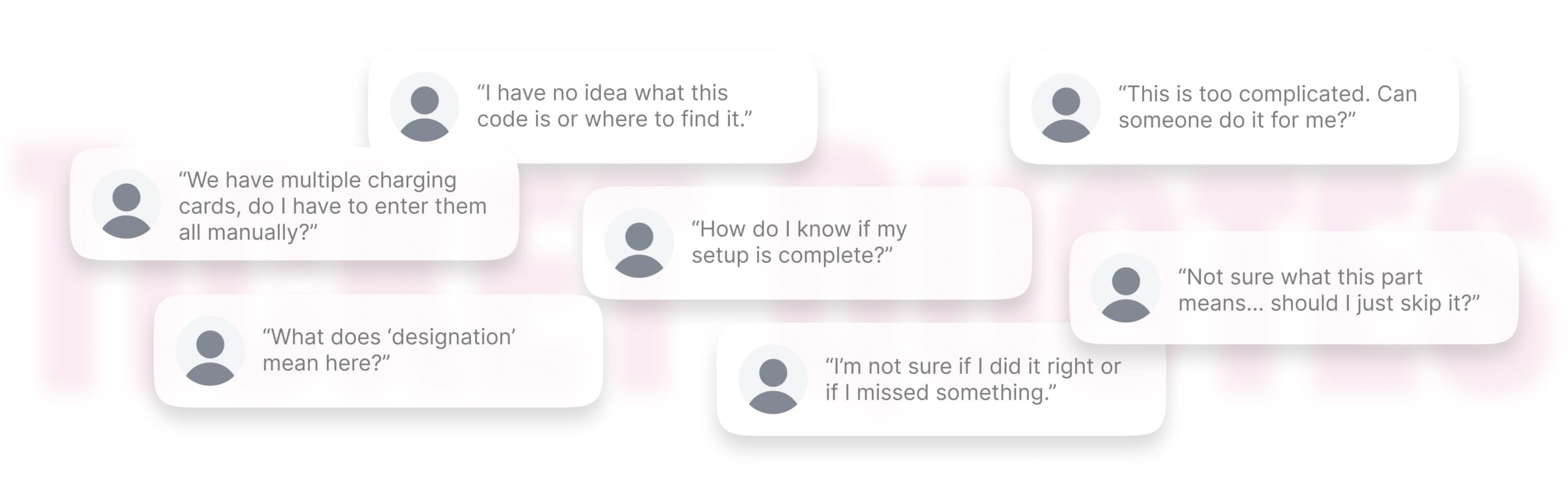
I Uncovered Onboarding Failures After Spotting 200+ Support Tickets Each Month
Before B2B admins could manage charging systems, they first had to verify themselves as site administrators. But many couldn’t complete the setup without calling support. Every week, our CS team was drowning in tickets — over 200 per month — from admins who were confused about terminology, unsure what to do next, or uncertain if they’d even completed onboarding.
That was my first signal: onboarding wasn’t just inconvenient, it was actively blocking adoption and burning support time. Instead of instilling confidence from the first screen, the system was draining trust and leaving admins dependent on human help.
Example of support tickets
🧐
Before redesigning, I needed to understand exactly why admins were struggling and where the breakdowns happened !
Investigating the Onboarding Breakdown
I didn’t want to jump to solutions. Instead, I looked at the problem from different angles to piece together the messy reality of how admins were actually experiencing onboarding.
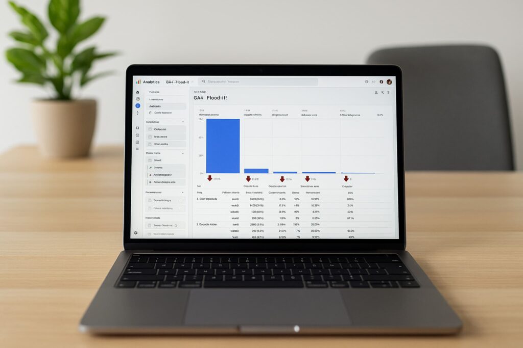
I analyzed funnels to find the leak; a 37% drop at Step 3 (Charging Setup) made that stage my priority
Working with our data analyst I mapped the onboarding funnel from entry to completion. The clearest signal was Step 3: Charging Setup, 37% of admins exited here. This is the first high-stakes configuration point, and the data confirmed it as the primary bottleneck where confidence and momentum broke.
I Reviewed Last Month’s Session Replays in Hotjar to See Behavior at Those Drop Points
Pauses and backtracking showed we needed clearer guidance and feedback.
In 15 session replays I saw long hovers, repeated scrolling, backtracking, and tab-switching around terms like Designation and Drop-ID. This pinpointed the moments of friction (ambiguous CTAs, risky affordances, unclear choices like Scan vs. Manual), but without user intent it was still guesswork.
This Was Hurting the Business, Too !!!
Through Cross-Team Collaboration, I Discovered How Onboarding Was Draining Revenue, Conversion, and Trust
In parallel conversations with Support, Sales, and Ops, the impact came into focus.
💬 Support was spending about 35 hours a week on onboarding questions that should have been handled in-product.
⏳ Stalled setups kept chargers idle, pushing out revenue activation for us and our clients.
📉 Sales showed that prospects who stalled during onboarding were 27% less likely to convert.
🤝 The first impression of our “self-service” product felt hard and that chipped away at trust.
Pilot in 4 weeks
These Meetings Also Exposed a Hard Deadline and Reset My Brief
In our alignment workshop with PM, Engineering, and Sales, I learned Sales had already committed to a pilot going live in four weeks. That turned a “let’s improve onboarding” idea into an urgent mandate: cut drop-offs before go-live. From that moment, I re-scoped for speed and impact.
🤓
With a four-week pilot on the calendar, I wanted to turn the chaos into a one-page plan so we could align on what we could actually ship in time.
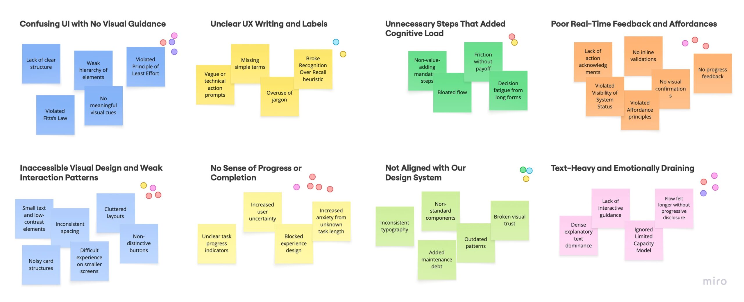
So, I Decided to Turn 300+ Raw Data Points Into Clear Themes the Team Could Act On
After pulling in analytics, support tickets, and Hotjar sessions, I was left with 300+ fragmented data points. To move forward, I decided to structure the chaos using two AI tools — each playing a different role in the synthesis.
I Used ChatGPT to Rapidly Cluster 300+ Data Points
I fed raw text from tickets andsessions into ChatGPT for fast grouping and first-level categorization . This let me cut through noise in minutes instead of days.
Then, I Used Miro AI to Create Visual Affinity Maps
With ChatGPT clusters as input, I switched to Miro AI to map everything visually. This revealed overlaps between surface-level complaints and deeper UX breakdowns.
Finally, I Facilitated a Workshop With PMs and Engineers to Align on Priorities and Trade-Offs
I brought PM and Engineering into a quick working session with the affinity map on one side and impact/effort on the other. We debated, dot-voted, and pressure-tested each theme.
In the workshop, reality landed
I also learned we had one half-time engineer and no backend changes before go-live, so I scoped for front-end fixes only
The pilot was in four weeks, we had one frontend engineer half-time, and we agreed on no backend changes before go-live. Anything needing new endpoints or schema tweaks was off the table.
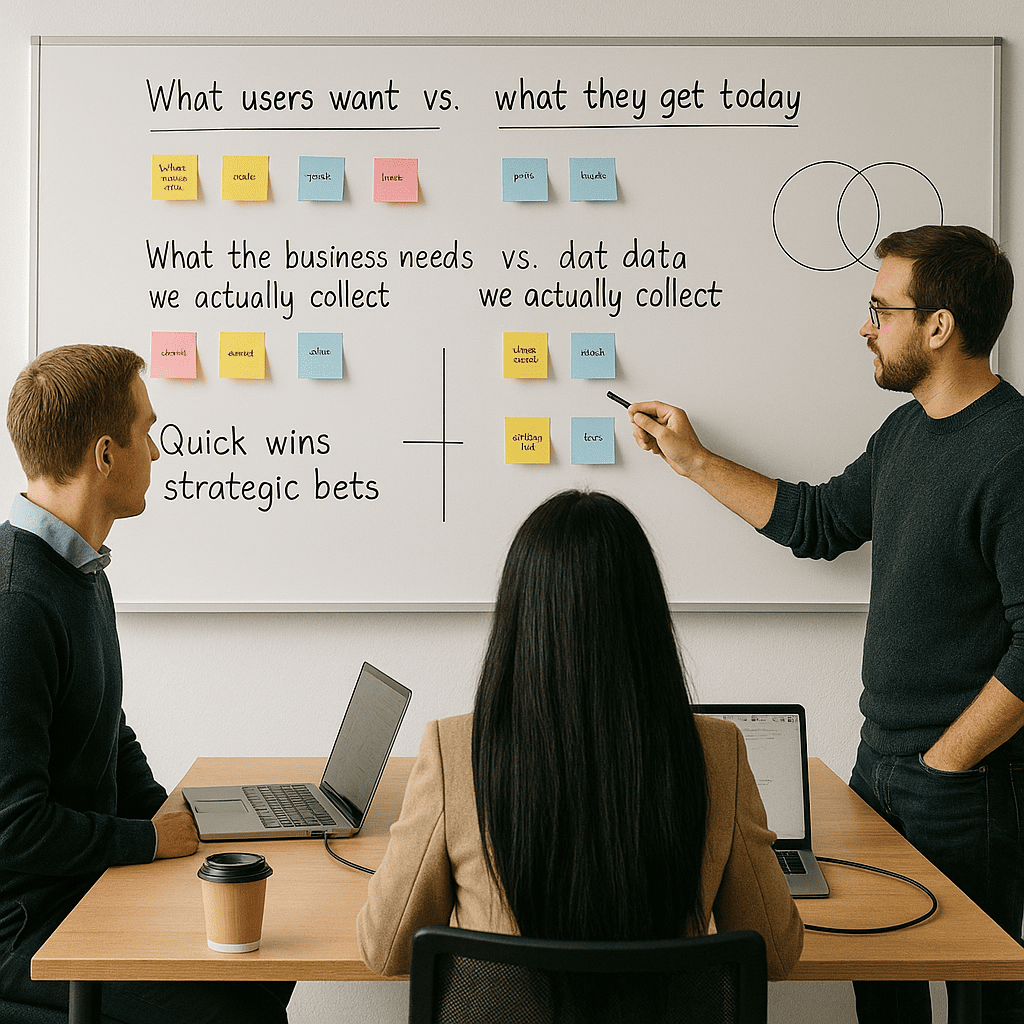
So, I turned the pain points into three principles and a clear Now/Next plan
The Three Principles That Guided Every Design Decision
🧭 Give admins orientation from start to finish
→ I decided to structure the flow with clear steps and progress visibility so admins always know where they are, what’s next, and when they’re done.
💬 Make every action self-explanatory
→ I set out to replace jargon with plain language, strengthen visual hierarchy, and add interaction cues so admins don’t have to second-guess their actions.
⚡ Eliminate friction at every step
→ I chose to streamline redundant flows, reduce text load, and embed real-time feedback so the experience feels fast, light, and trustworthy.
👉 What we’d ship now (4 weeks, front-end only)
Use our existing components to add a stepper and next-step cues, tighten copy and labels, and add lightweight inline validation, confirmations, and safe defaults.
👉 What comes next (post-pilot, needs backend)
Deeper server-side validation, cleaning up duplicated data, and automations for smarter pathing.
😵💫
Before I show you what I did next, let's breaking down the current onboarding!
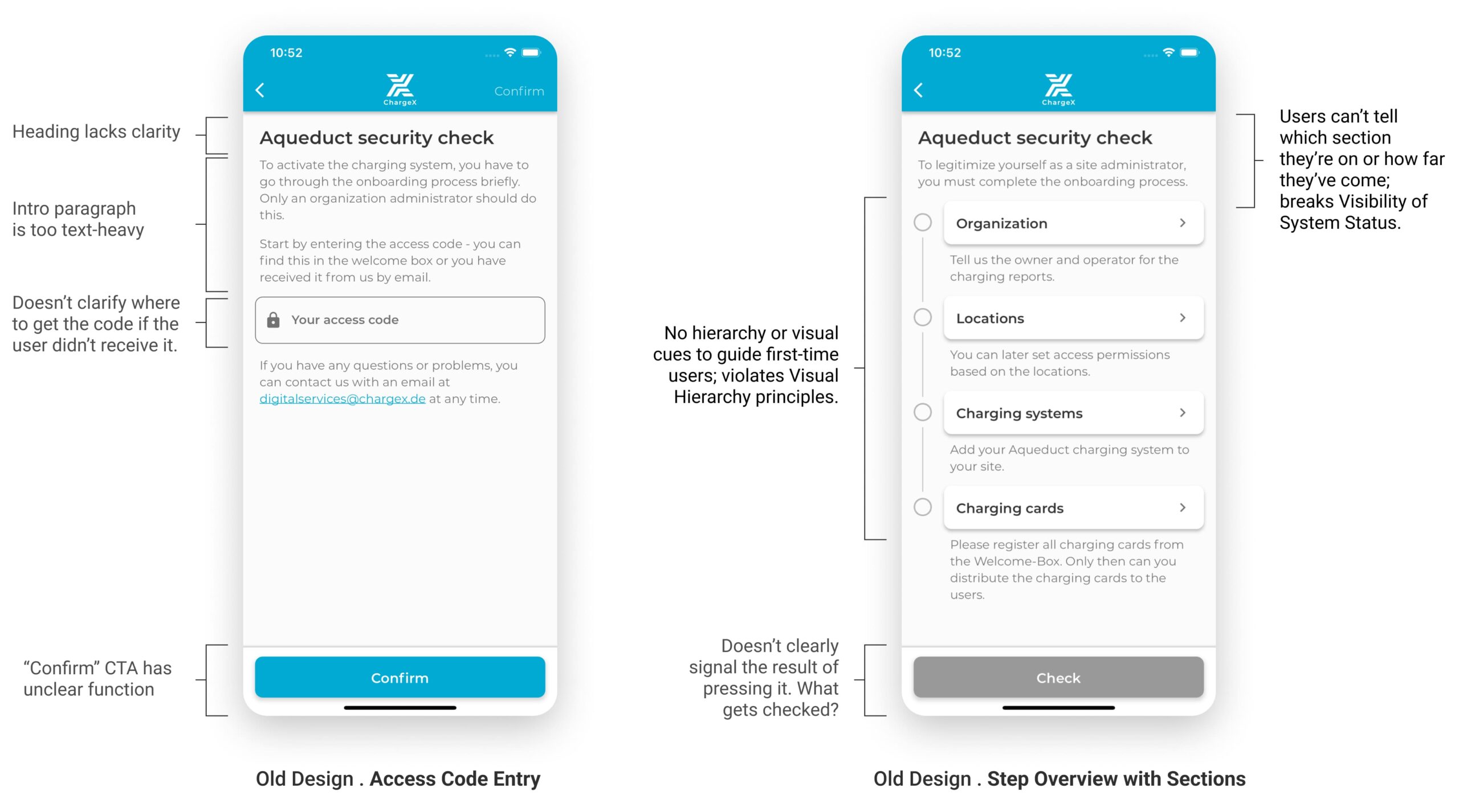
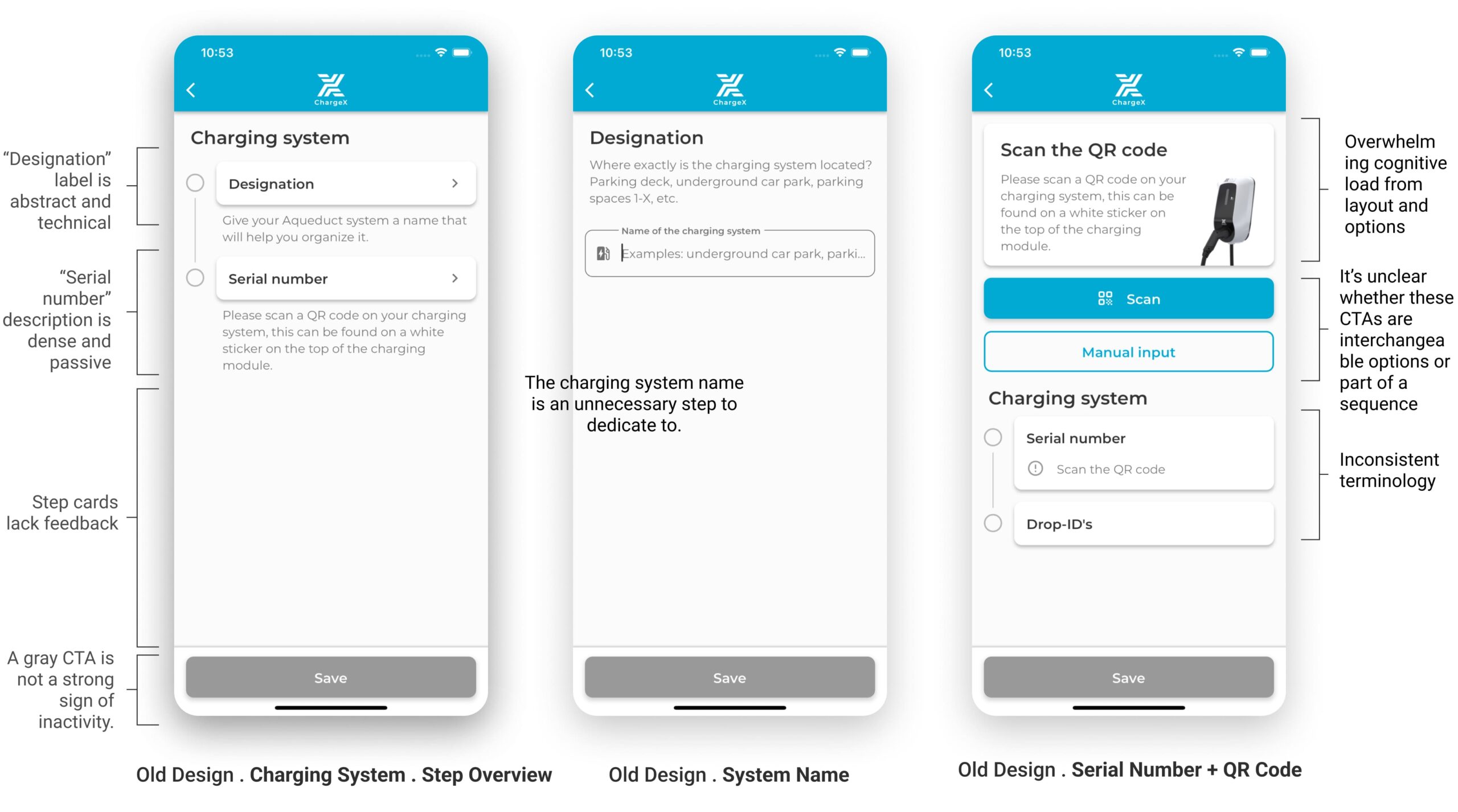
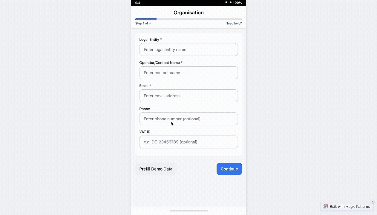
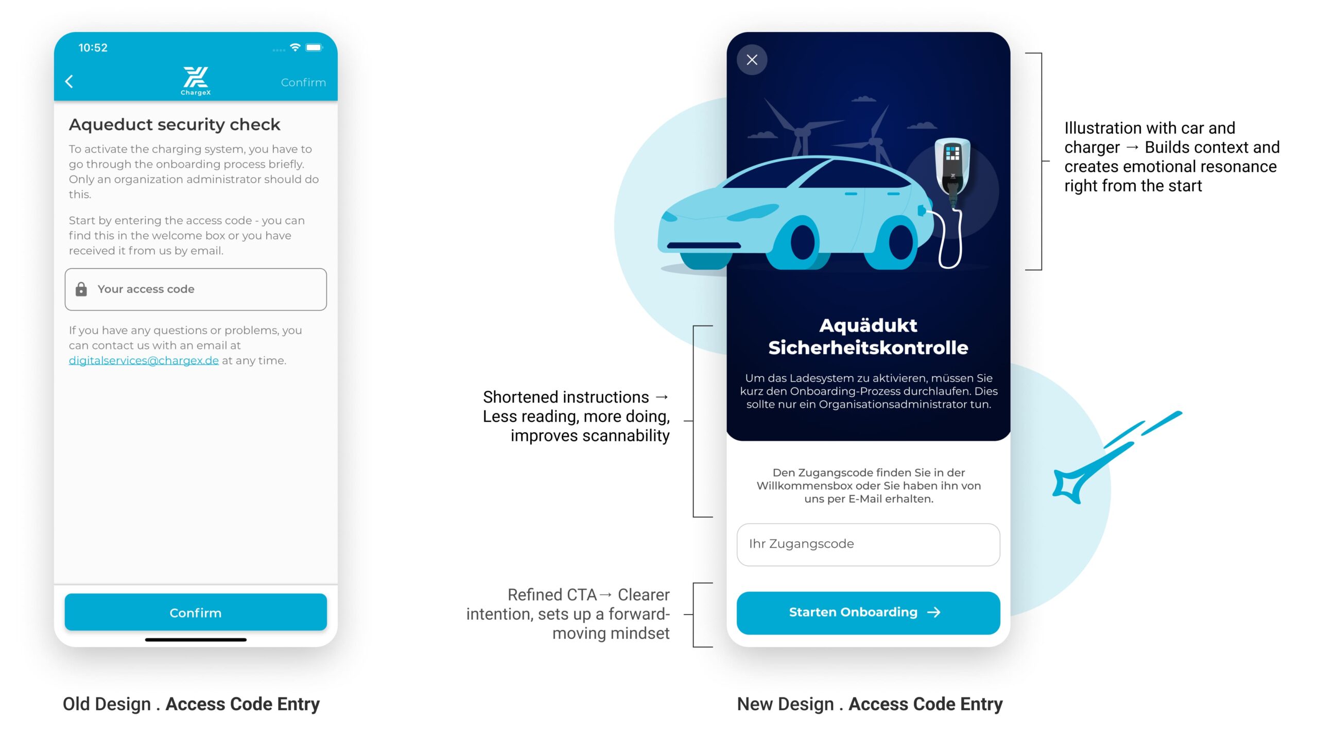
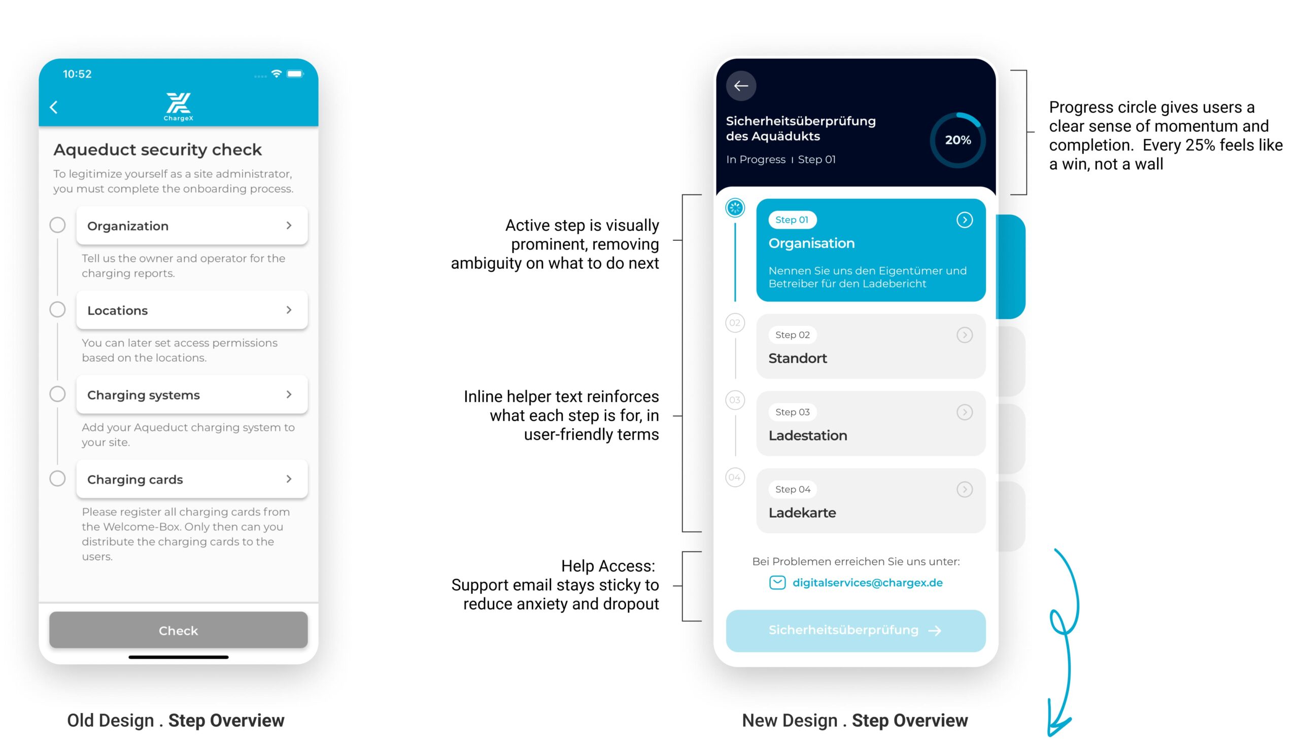
Step 1 — Access Code and Overview Buried the First Action in Text and Vague CTAs
Instead of a clear entry point, admins faced dense instructions, ambiguous “Confirm” labels, and a step overview with no hierarchy. The very first interaction stalled progress rather than starting it.
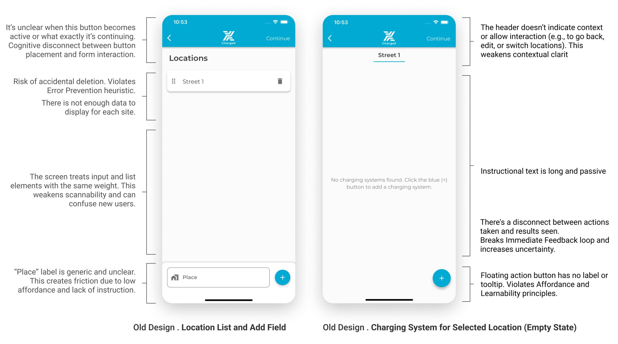
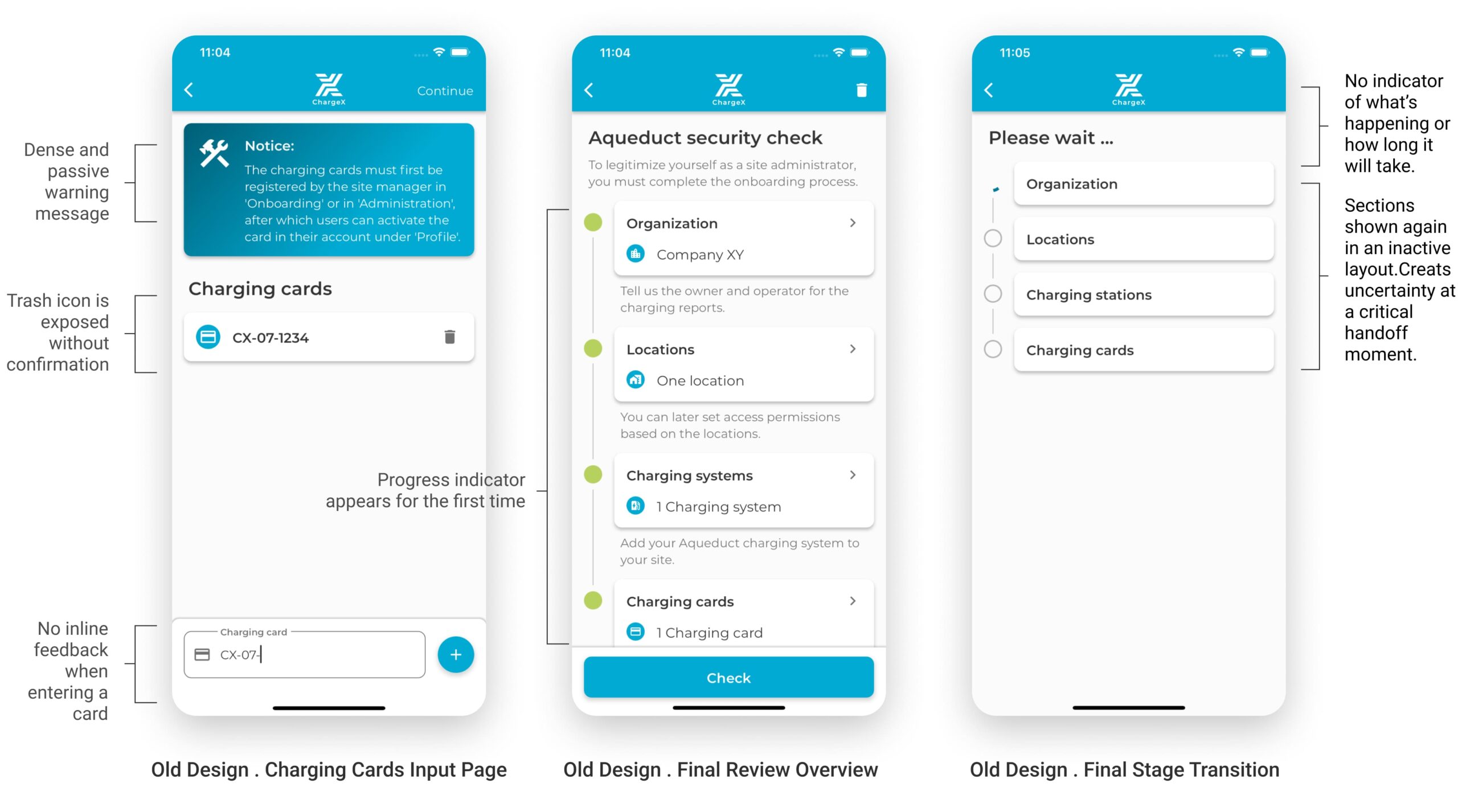
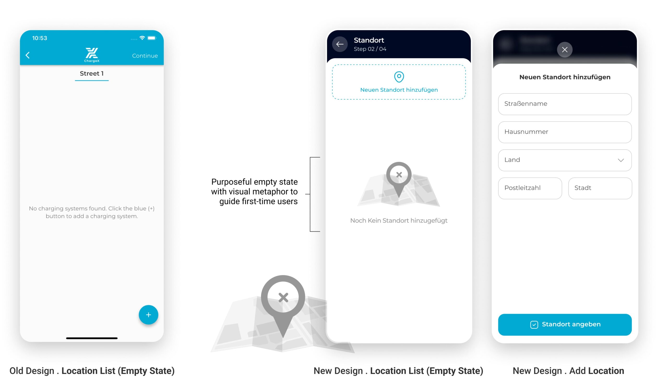
Step 2 — Location Setup Offered No Context and Risked Accidental Deletion
A generic “Place” label, passive empty states, and exposed destructive actions forced admins to guess their way forward. What should have been a simple step became risky and confusing.
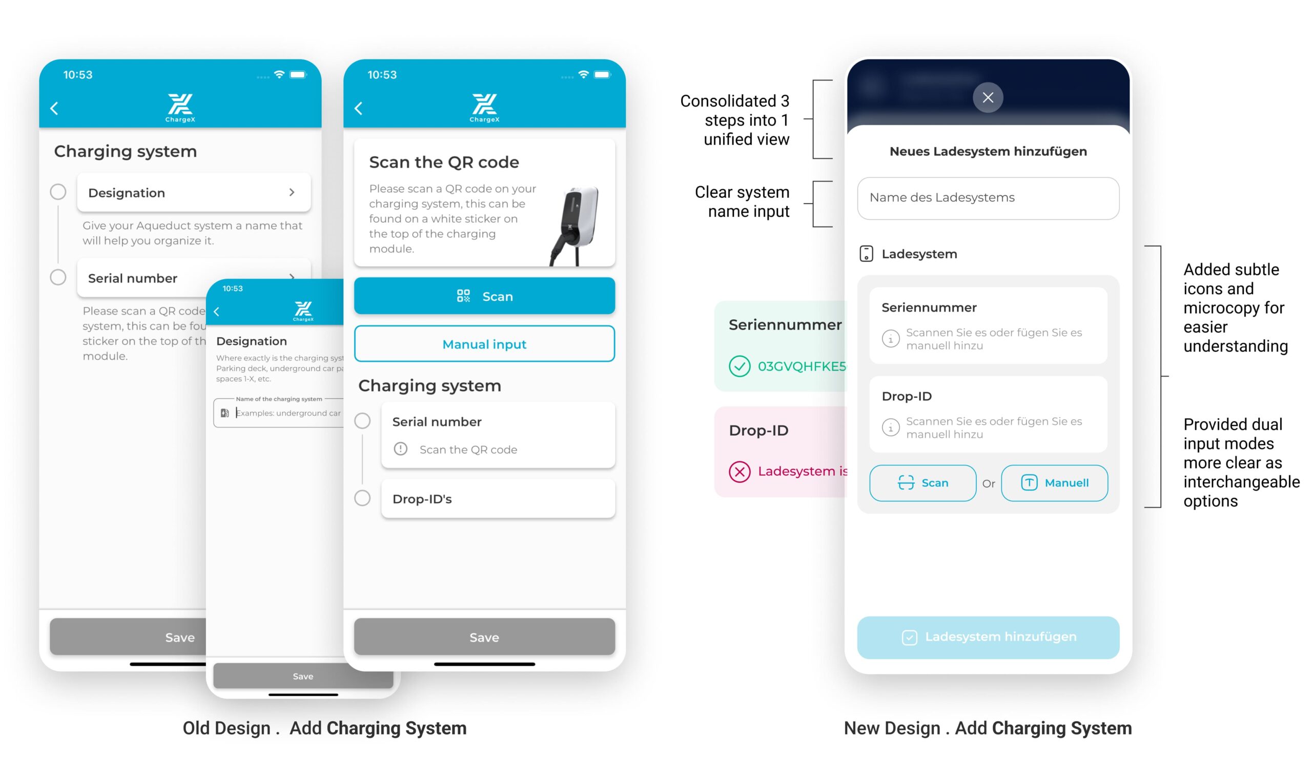
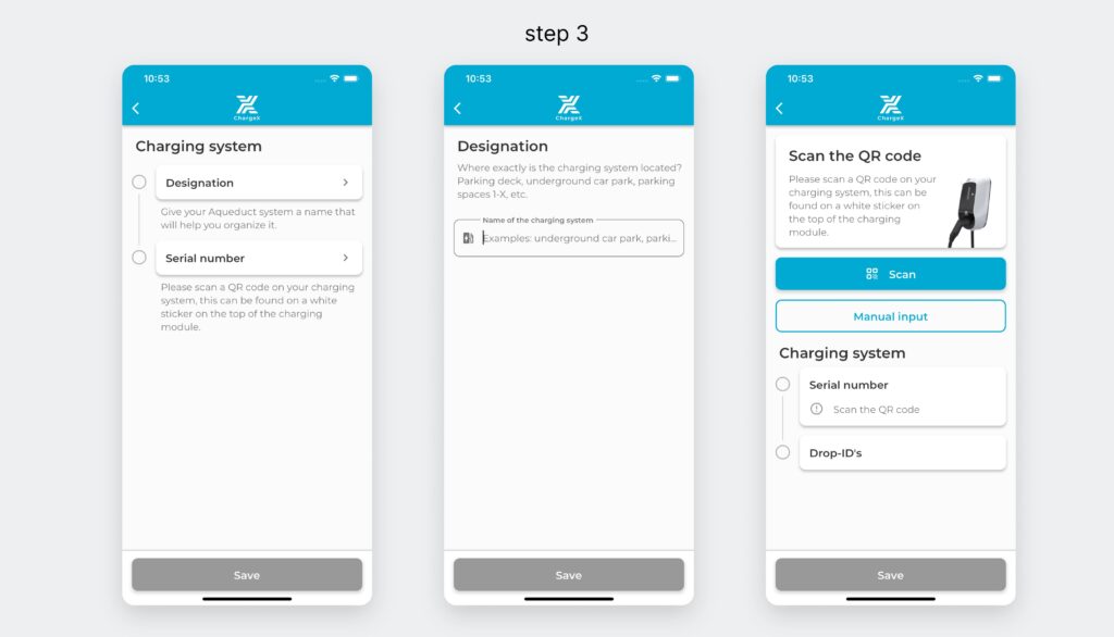
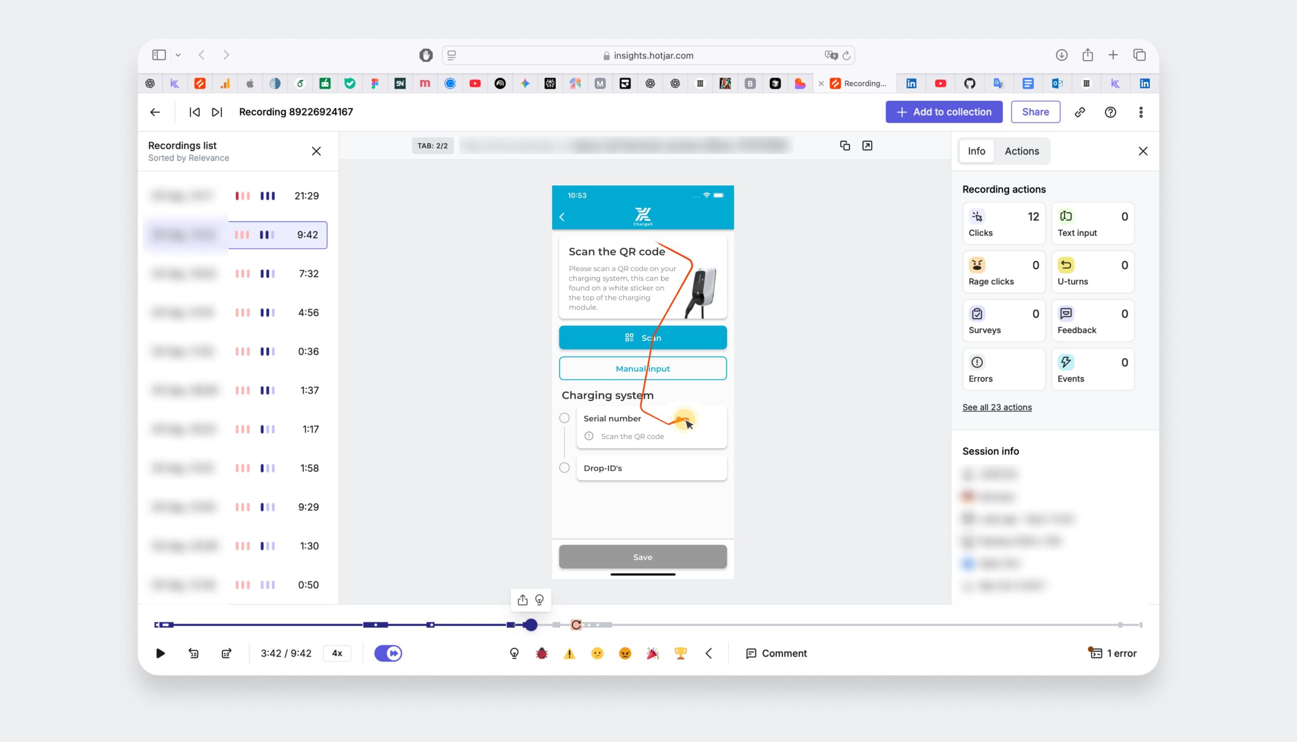
Step 3 — Redundant Fields and Jargon Drove the Highest Drop-Off
One of the most important stages was overloaded with redundant fields (“Designation”), unclear terms (“Drop-IDs”), and no guidance on whether to scan or type. Instead of enabling progress, this critical step became one of the main reasons users abandoned onboarding.
Step 4 — Card Entry and Final Review Gave No Validation or Closure
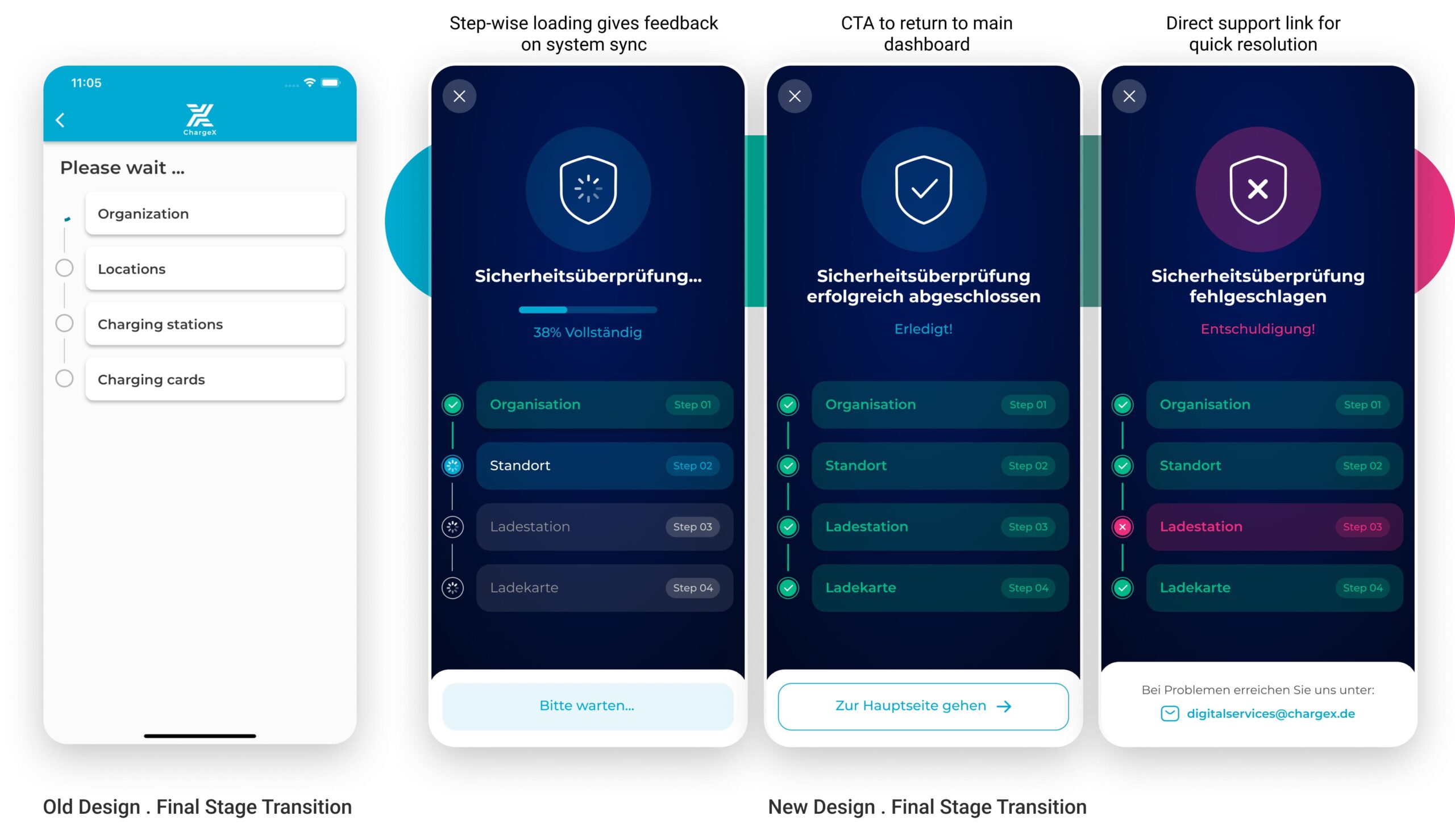
Inline checks were missing, warning banners were dense, and the first progress bar appeared only at the very end. The final “Please wait…” screen gave no confirmation, leaving admins unsure if onboarding had succeeded.
😫 Three weeks remain till the deadline.
At this stage, I needed to see if my solution working end-to-end before dev committed. But a full hi-fi Figma round plus testing would have slipped past the pilot.
😎
But, VIBE CODING save me here! Let's see how?
So, I turned my solution into a clickable prototype using Magic Patterns AI so I could test and fix issues in days, not weeks
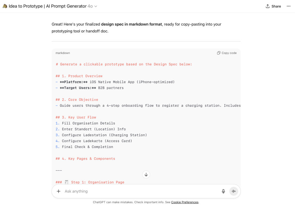
I used my custom GPT to write a detailed, reusable prompt + markdown spec for instant prototyping
I wrote a markdown design spec using a custom GPT I built for myself. I described the prototype end-to-end—flow logic, step gating, inputs, validations, edge cases, and success/error states. My GPT turned that spec into ready-to-use prompts tailored for prototyping AIs.
Then, I fed those prompts into Magic Patterns and “vibe-coded” a clickable, stateful prototype in seconds. Scan/manual branches, inline checks, progress, and saved state were all live, so I could put it in front of real admins immediately.
Finally, I ran 8 interviews on the coded flow to confirm admins could finish onboarding, before opening Figma or starting dev
I needed proof the flow worked end-to-end before opening Figma or asking engineering to commit. Through Customer Success, I recruited 5 admins who had recently failed onboarding, the best stress test. I shared a live link to the coded prototype and ran short, task-based sessions to see whether they could complete onboarding without help.
😱👉😇
Findings weren’t saturated; I planned three more, but got no replies with three weeks left.
To keep momentum, I added 3 first-time internal passes (2 hardware engineers, 1 marketing) who knew the domain but had never seen the prototype. Not perfect participants, but useful signals under deadline.
How lean testing saved me from designing the wrong solution
🗂️ Select from existing assets instead of re-adding.
→ Experienced admins (with multiple sites) expected to pick from existing charging cards/stations instead of adding new ones every time. New admins, who had nothing yet, didn’t bring this up and proceeded to add from scratch. Clear split by experience level.
🔁 Jump between steps to review or edit without losing place.
→ Several participants tried to go back to previous steps to double-check or edit and couldn’t. They asked for an easy way to jump between steps and keep context.
👀 Step transitions weren’t obvious; current position unclear.
→ Four participants said moving from one step to the next was hard to recognize; they had to re-read labels to figure out where they were. I clarified this was a functionality-only prototype, but it told me the final design needs stronger step indicators and clearer transitions.
👉 What this gave me
Confidence that admins can reach the end state, plus three concrete design requirements:
💡Provide an “existing vs. new” path where appropriate.
💡Add global step navigation.
💡Make step status and transitions unmistakable .
🫣 After a week of testing, I had two weeks to go
So I designed and handed off step-by-step while engineering built in parallel.
Lean testing, recruiting, interviews, and synthesis took a week. With two weeks left to hit the pilot, I had to design the final UI (aligned to our design system and all findings) and still leave time to build. I wasn’t sure a single week was enough for front-end dev if I handed off at the end, so I staged the handoff step by step: I finalized each onboarding step, shipped its specs and states the same day, and the engineer started building in parallel while I finished the next slice.
🥰
Now, let's see the final design !
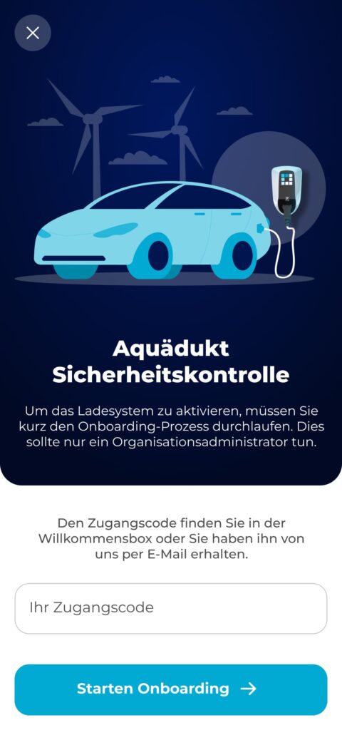
I Introduced Visual Storytelling to Build Trust from the Start
In the redesigned version, I focused on creating an immediate sense of orientation, trust, and relevance. I introduced visual storytelling, refined the hierarchy of content, and replaced the generic "Confirm" button with a clear, action-driven CTA. The tone is now welcoming but authoritative, helping admins understand why they’re here, and what comes next.
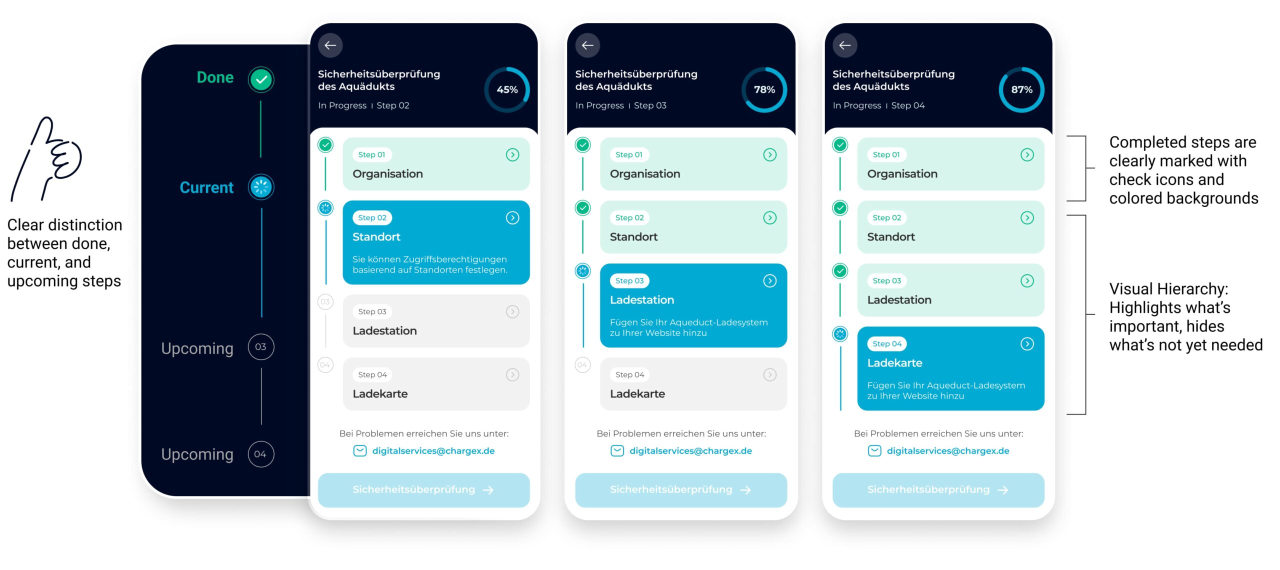
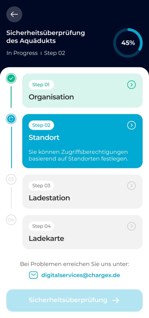
Lean tests showed people missed step changes, so I turned the flat list into a guided journey
In the coded tests, four participants said they couldn’t tell when a step had changed, and several wanted an easy way to jump back and edit. I redesigned the flow as a guided journey: clear step transitions, a visible sense of where you are/what’s next/when you’re done, and global step navigation to review or edit without losing progress.
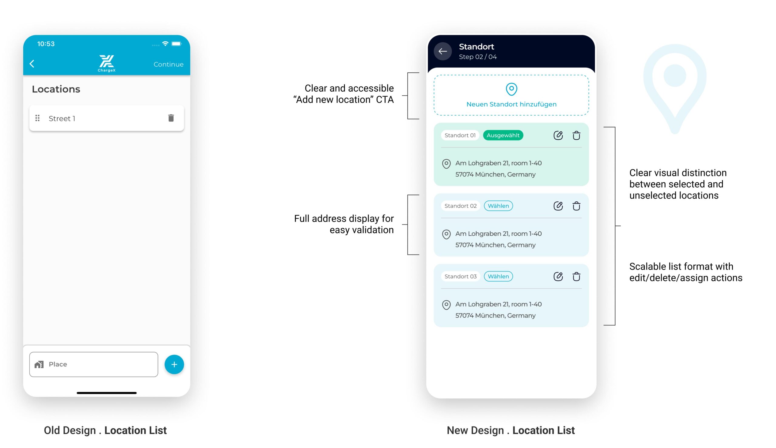
Tests showed experienced admins wanted to pick an existing site, so Location became “pick or add,” with clear guardrails
In the sessions, multi-site admins expected to select an existing location instead of re-entering it from scratch, while new admins were fine adding a first site. I reworked Location into a simple choice: use an existing site (when one exists) or add a new one. I added a clear address confirmation, a safe delete with confirmation, and a plain empty state that explains what the step is for.
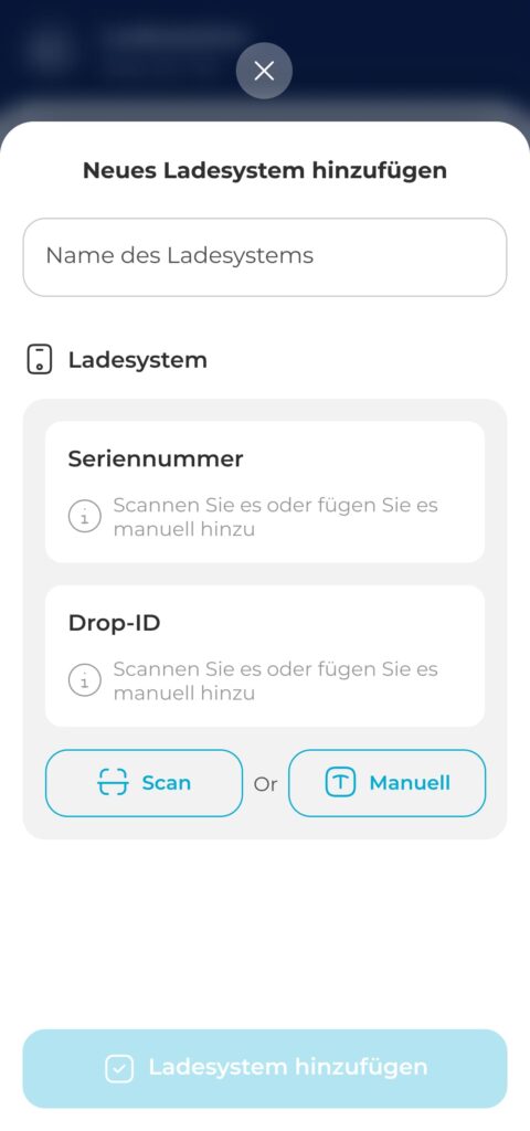
37% dropped at Step 3, so I made it one guided workspace with clear path choices
In the redesigned step, I strategically collapsed multi-screen flow into a single, well-structured screen. By removing unnecessary segmentation and combining related inputs, users now complete this task in one cohesive action. Clear grouping, icon-guided inputs, and dual options (Scan or Manual) reduce friction and make even first-time configuration feel intuitive.
This approach also improves technical accuracy by guiding admins toward correct input formats.
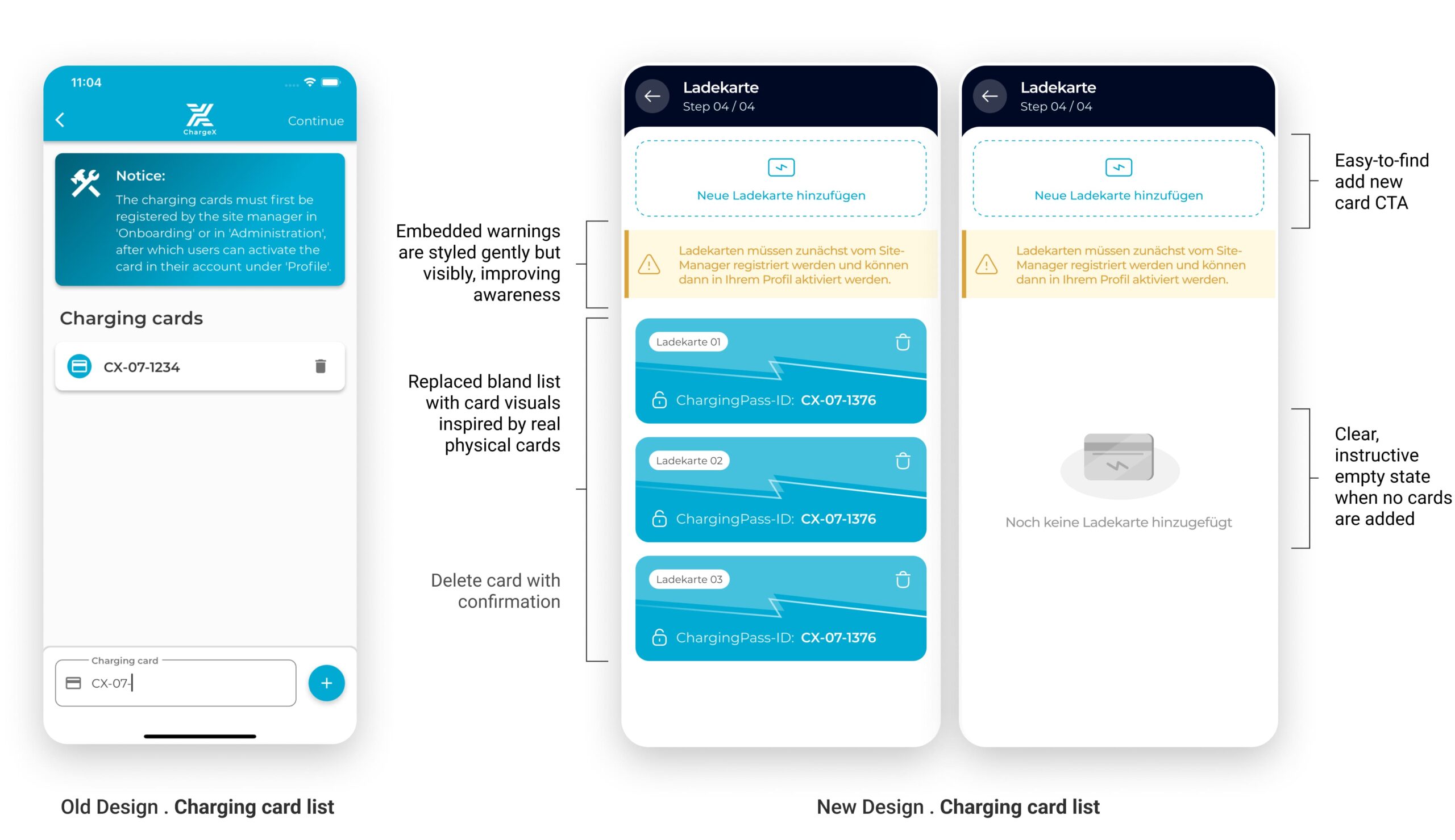
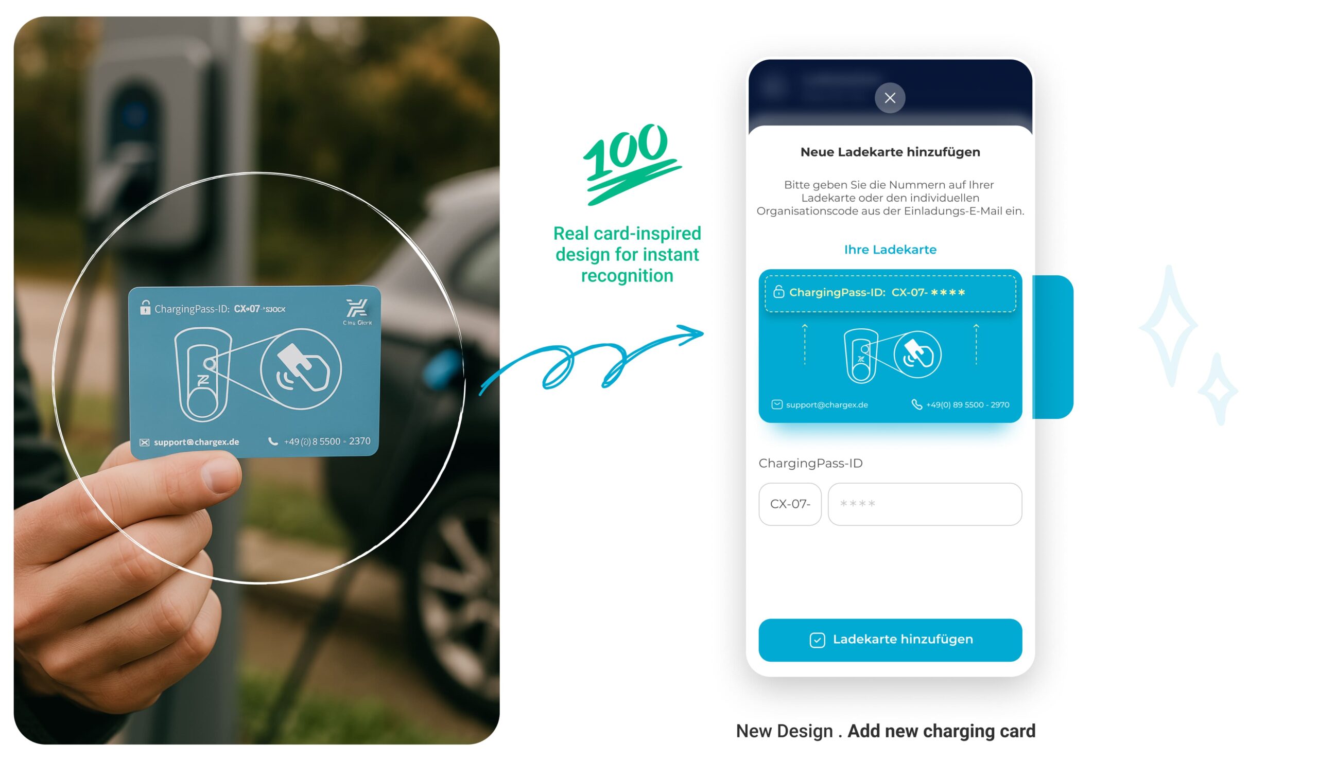
I Turned a Static Charging Card List into a Visual System that Mirrors Real Cards
I reimagined this step by grounding the digital experience in something admins already know and trust: the physical charging card. By mimicking the actual card’s look, color, and structure, I bridged the physical-digital gap, making the system feel more intuitive, reliable, and self-explanatory.
No more guessing which card is which. Now, every card looks like a card.
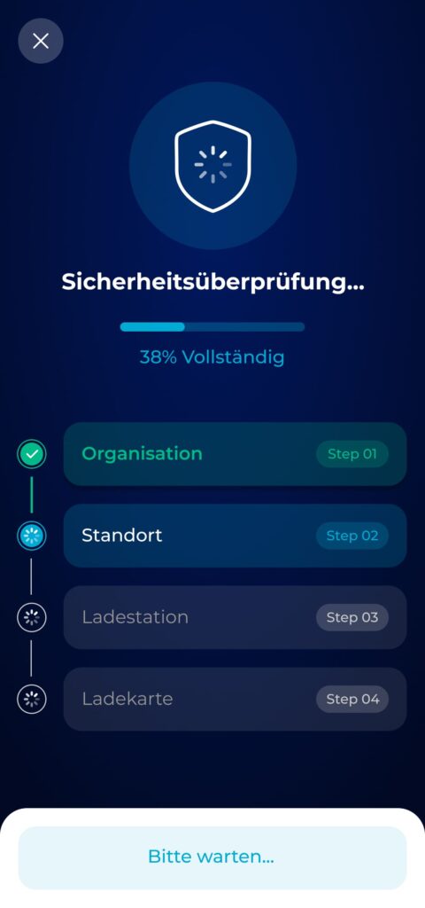
I Redefined a Bare Waiting Screen into a Clear System Check with Progress, Success, and Error States
I redesigned the final stage to feel like a security check-in, something meaningful, visible, and trustworthy. By introducing a step-by-step visual tracker with real-time feedback, admins can now see what’s happening, understand outcomes instantly, and act accordingly in case of errors.
Three distinct states—progressing, success, and error—help users stay oriented and calm. The design uses metaphor (shield icons), clarity (color-coded steps), and actionable fallback (support email) to drive reliability and confidence at the final step of onboarding.
Lastly, I Chose a Lean Validation with My Team to Keep Momentum Under Tight Timelines
Before rolling out the redesign, I decided not to wait for a full-scale usability study. We were working under tight timelines, and what mattered most at this stage was getting quick, directional insights that could flag any blockers before launch.
I prepared a clickable prototype in Figma and shared the link with my internal team for a Lean Validation session.
Designers, engineers, PMs, and CS colleagues all walked through the onboarding flow as if they were first-time admins. Each brought a different lens: engineers spotted technical input pitfalls, CS flagged terminology that could confuse users, and designers pointed out interaction polish.
This quick validation directly shaped the final design.
→ For example, I adjusted button copy to reduce confusion, tweaked error state visuals for faster recognition, and refined the step hierarchy so progress felt smoother. These lean iterations ensured the flow was clear, intuitive, and technically reliable, all without losing momentum toward release.
🤔
Hmm…Did the Redesign Deliver? Let’s Look at the Data
After rolling out the redesigned onboarding flow, I began tracking its real-world impact, from smoother admin setups to noticeably quieter support channels.
Impact in 4 Weeks:
Faster Completion, Fewer Drop-Offs, and Less Support Overhead
After releasing the redesigned onboarding flow, I started measuring its performance in the real world. I combined hard numbers (Mixpanel funnels, Hotjar recordings, Zendesk tags) with team feedback to capture both quantitative and qualitative signals during the first 4 weeks post-launch. This helped me see not just if admins were moving faster, but also if the experience finally felt smoother and less frustrating.
Support Tickets About Onboarding
↓ 37% in the first month
Based on Zendesk tagging. Most of the recurring admin pain points—like Drop-ID confusion and card input—disappeared.
Time to Complete Onboarding
↓ from ~7 min to 3.5 min
Measured in Mixpanel from onboarding entry to final verification screen. The streamlined flows helped admins finish faster.
Retry & Drop-Off Rates
↓ 42% fewer restarts or abandoned flows
Tracked via Mixpanel funnels and Hotjar session insights. Fewer users exited and re-entered the flow.
Internal CS Feedback
“This is the first time we’re not manually walking someone through onboarding this week.”
Collected in CS weekly retros and our shared post-launch Slack thread. The team could now focus on more strategic support.
What the Impact Meant
For admins, the redesign removed ambiguity and guesswork, turning vague “Please wait…” screens into a guided, reassuring journey. With clear cues and visible progress, they felt more in control, more confident, and more supported at every step.
For ChargeX, it reduced the load on support, sped up site activations, and delivered a smoother onboarding flow that matched the brand’s promise of simplicity and innovation in EV infrastructure. The business could now scale without being slowed down by recurring onboarding issues.
👀
And What I Took With Me
This project reminded me that:
🤩 The final 5% of clarity has a 50% impact.
It’s easy to overlook transition states, error cases, or confirmation screens, but these are the moments that make or break confidence.
📲 Visual grounding works.
Referencing real-world objects (like the charging card design) helped bridge the gap between physical experience and digital actions.
🟢 Good onboarding is good strategy.
It’s not just about “signing up”, it’s about creating trust, momentum, and self-sufficiency from the very first screen.
Looking to purchase
Designer Assistance 01, 02, 03?
Please send me an email with your request, and I’ll provide you with instructions on how to buy the designer assistance files.


