How I Cut the Start Charging Journey Time at ChargeX by Making It a One-Tap Flow
ChargeX is a fast-growing EV charging startup in Germany. I led the end-to-end redesign of ChargeX’s mobile charging experience, focusing on the core flow for starting a charging session. My role covered research, problem framing, prioritization, workflow design, validation, UI execution, and post-launch measurement, working closely with Product, Engineering, and Customer Success.
Impact:
Charging initiation time
Reduced by 40%
Support Load
Reduced by 41%
App adoption
↑ More sessions started in-app
Charging flow
4 steps → 1 tap
My Role
End-to-end Product Design → User & Business Discovery → Problem Framing → Concept & Feature Definition → Lean Validation → High-fidelity UX/UI → Design System Integration → Developer Handoff → Post-launch Measurement & Iteration
Team
🎯 Solo Product Designer
🤝 Daily collaboration with PM + Tech Lead
🔁 Close loops with Engineering, Customer Success, Sales, and Marketing
🧠 Inputs from interviews, support tickets, and stakeholder workshops
⚙️ Agile workflow with async reviews and iterative design–build cycles
Industry
B2C | E-Mobility, Electric Vehicle Charging
Company
ChargeX GmbH | München, Germany
The Problem
I found that a difficult start-charging experience was limiting both user confidence and app adoption
Starting a charging session should have been one of the simplest actions in the app, but many users still preferred initiating sessions directly through the physical charging module.
For users, the app felt slower and less predictable than the hardware. For the business, that meant lower adoption of the wider mobile experience and less value from the connected B2B platform, where admins managed sessions, energy usage, billing, reporting, and user communication.
At that point, we knew the start-charging experience was creating friction, but we didn’t yet know which parts of the journey were causing it or why users kept returning to the physical module.
Primary user
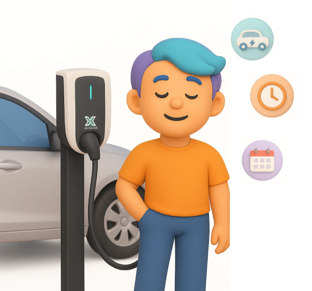
Daily EV driver charging several times a week.
What matters to Lukas
- Charging should start almost instantly, without repeating the same setup every session.
- The app should remove uncertainty, so they always know what happens next.
- Routine charging should feel automatic, while advanced controls stay available only when needed.
- Charging history, billing, and energy usage should be available without interrupting the charging flow.
🤓 Assumptions are powerful starting points, but real change demands validation.
I start with investigating where the charging flow was breaking down through a combination of field observation, support evidence, and survey data
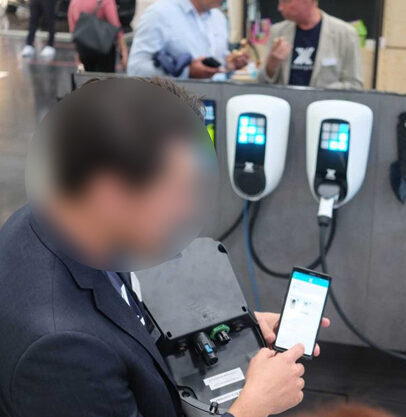
I started at IAA Mobility, where I could watch people trying to start real charging sessions. Going in, I expected the biggest frustration to be entering the charging module ID. But after observing people, I realized the friction started much earlier.
Users weren't just slowed down by the four-step flow. They were constantly stopping to figure out what they actually had to do next. Some hesitated at prioritization, others weren't sure whether charging had already started, and many switched to the physical charger because it simply felt faster and more predictable.
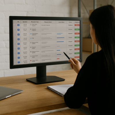
That made me curious, so I went through support tickets with Customer Success and interviewed the support team.
The same pattern showed up again and again. Most questions weren't about charging itself. They were about understanding the flow—what Drops meant, whether prioritization was required every time, where to find the module ID, and whether charging had already started. Customer Success was spending the same time every week explaining those questions to different users.
To make sure those patterns weren't limited to the people I observed, I also ran a survey with 62 internal and external users.
The responses confirmed the same pattern. People wanted the app to remember their preferences, reduce unnecessary decisions, and make the next action feel much more obvious.
When I connected the research evidence, four product decisions were creating most of the friction
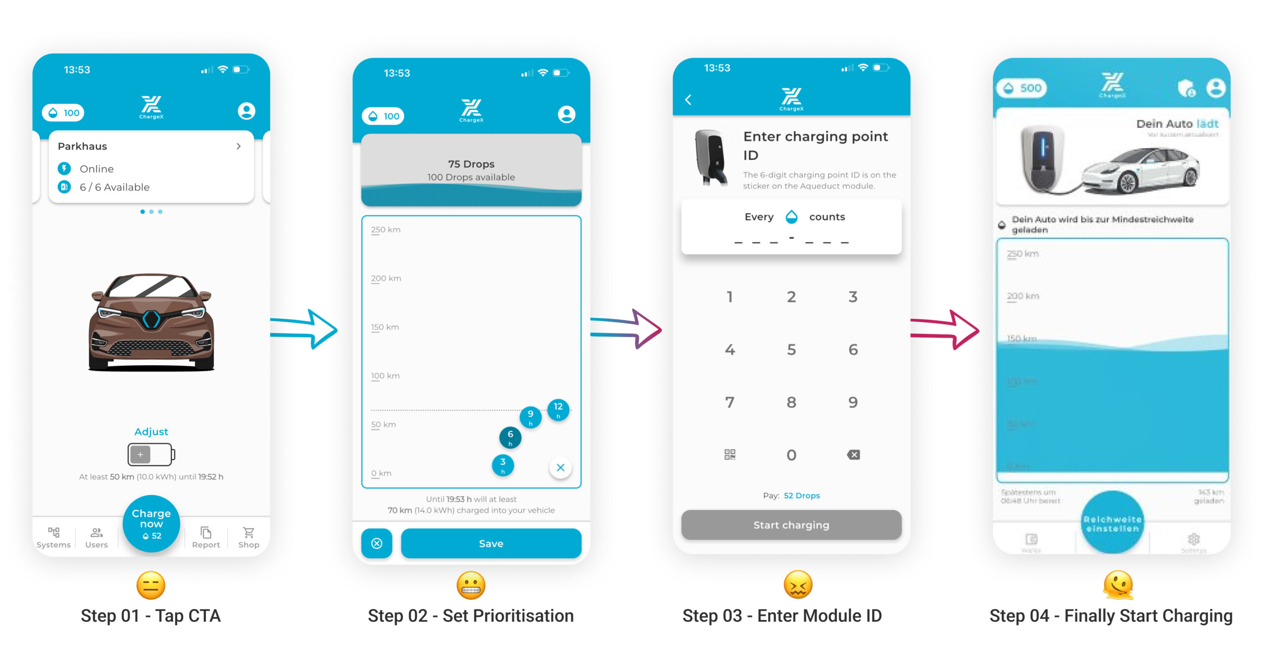
😬 The main CTA created the wrong expectation
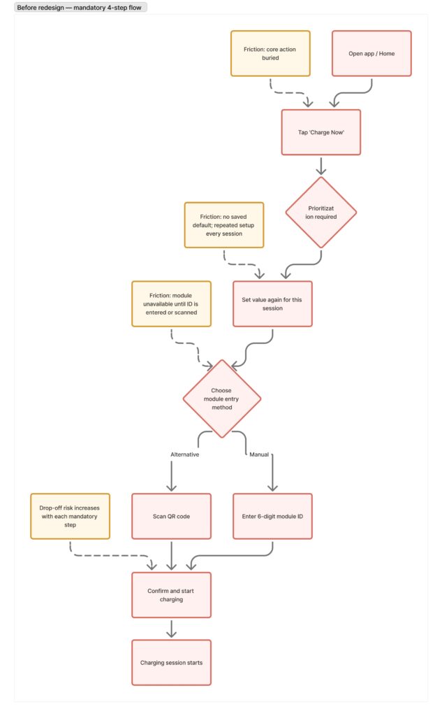
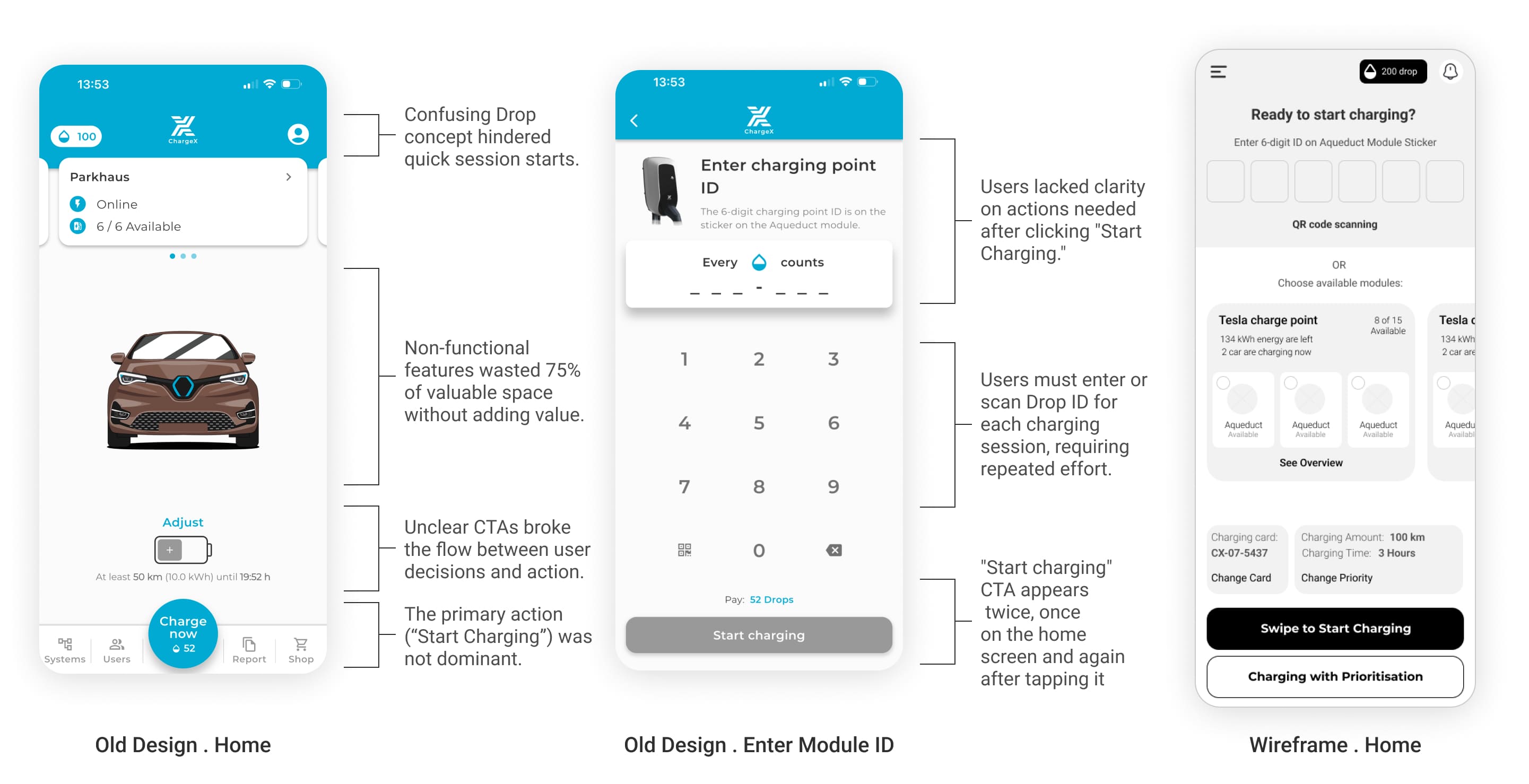
Users tapped Charge Now expecting charging to begin. Instead, they entered another sequence of configuration screens and eventually reached a second Start Charging button.
The journey ahead wasn’t predictable from the home screen.
😰 Prioritization was treated as a requirement instead of a preference
Most users rarely changed their charging priorities, but the app still asked them to configure them before every session.
😤 Module selection depended on information users had to find themselves
Users had to type or scan a module ID each time, even when the connected stations and available modules could already be shown inside the app.
☹️ The app repeated familiar decisions instead of learning from them
Even returning users had to repeat almost the same setup every time, regardless of their saved location, charging habits, or previous preferences.
I translated the research into a shared product workflow everyone could align around
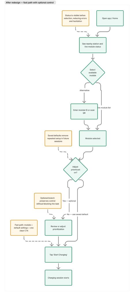
Research had uncovered several friction points, but they all belonged to the same journey. So I mapped the complete charging flow around one direction: make the common path immediate, while keeping optional control available when users actually needed it.
This helped us validate the product logic first—what the journey should look like, where decisions belonged, and which steps could be removed or automated—before discussing layouts, components, or visual design.
That workflow became the blueprint for the redesign and gave Product, Engineering, and myself a shared direction before moving into detailed design.
⭐️ Our North Star for the redesign was increasing adoption of the ChargeX mobile app.
I aligned competing stakeholder priorities around a shared release strategy
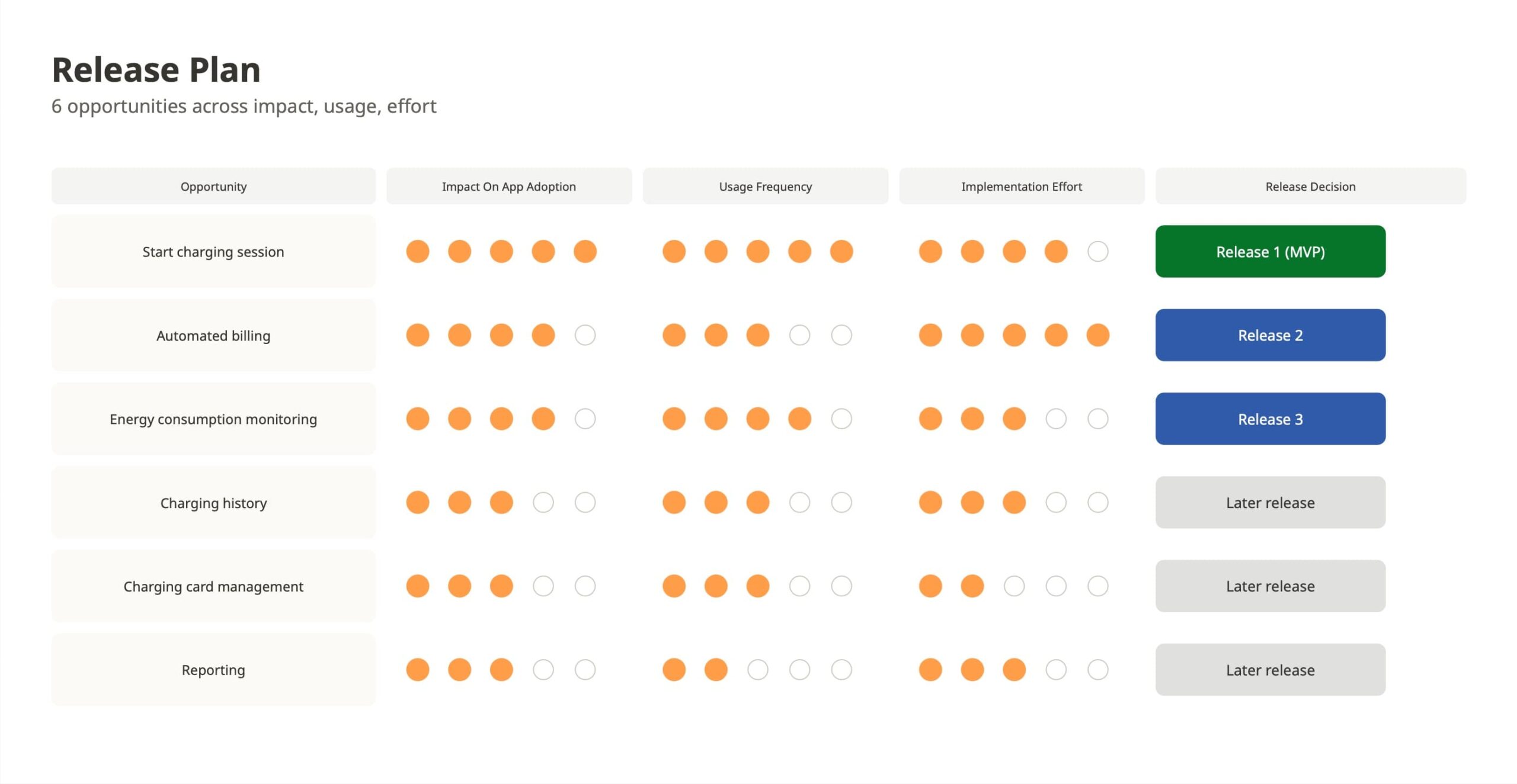
Research uncovered several opportunities across the app, including automated billing, charging history, reporting, charging card management, and energy consumption monitoring.
At that point, there were different opinions about where to start. Some Sales stakeholders preferred prioritizing billing, while I believed the start-charging journey would have a stronger impact on both users and app adoption.
To move the discussion away from individual opinions, I created a comparison framework based on three criteria: impact on app adoption, usage frequency, and implementation effort. I brought that into the team discussion so we could evaluate each opportunity against the same evidence.
The start-charging journey was not the smallest piece of work, but it was the most frequently used and had the strongest connection to the main reason people opened the app. Based on that, I recommended making it the first release and moving the remaining opportunities into the longer-term roadmap.
Before designing the interface, I defined the behaviors I wanted to change
I wanted to measure the redesign by changes in user behavior, not just by whether the interface looked simpler.
🟢 Reduce the time to initiate a charging session
by comparing both scenarios: users charging with their saved default settings and users who chose to configure prioritization before starting.
🟢 Reduce drop-off during the charging journey
by measuring how many users successfully completed the flow instead of abandoning it before charging began.
🟢 Increase the share of charging sessions initiated through the app
rather than directly from the physical charging module, as a signal that the app had become the preferred way to start charging.
🟢 Reduce support tickets related to charging initiation
especially questions about prioritization, module selection, and understanding whether a charging session had started successfully.
These four metrics became the baseline for evaluating whether the redesign had actually improved both the user experience and app adoption.
At this point, I felt I had enough evidence to move into design. The problem wasn't whether users were struggling anymore—it was how to remove that friction without taking away flexibility for people who needed more control. So I started translating those findings into the product decisions that shaped the new charging experience.
I translated the research into four product decisions
The research didn't point me toward one screen. It pointed me toward four interaction decisions that together could remove most of the friction from starting a charging session.
Decision 01
I made the charging journey predictable before users committed to it
Research showed users expected charging to start after tapping the primary CTA, but instead they entered another sequence of configuration screens. The home screen also spent valuable space on decorative elements while hiding information people actually needed and forcing users to discover the workflow only after they had already committed.
Design decision
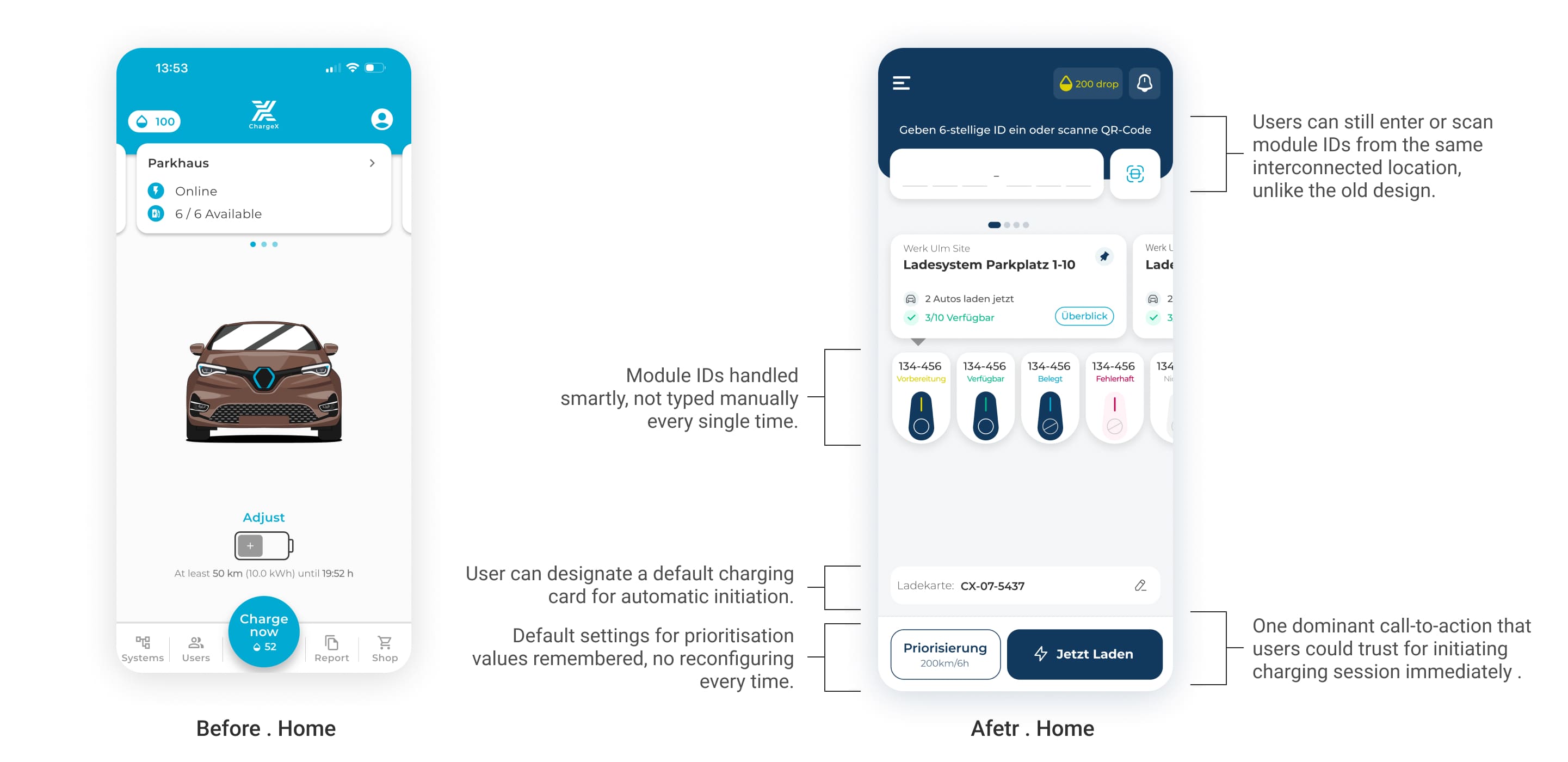
Instead of treating the home as a landing page, I redesigned it as the control center for starting a session.
Before tapping anything, users can now immediately see:
:
- nearby charging stations
- live module availability
- saved charging card
- saved prioritization
- one clear Start Charging CTA
The result was a much more predictable experience. Rather than discovering the workflow one screen at a time, users could understand the entire charging process before deciding to begin.
Decision 02
I replaced manual module lookup with direct selection
One finding surprised me.
Users were often standing directly in front of the charger, yet the app still asked them to remember, scan, or manually type a six-digit module ID.
The product already knew which charging station are available. Asking users to recall information the system could surface felt unnecessary.
Design decision
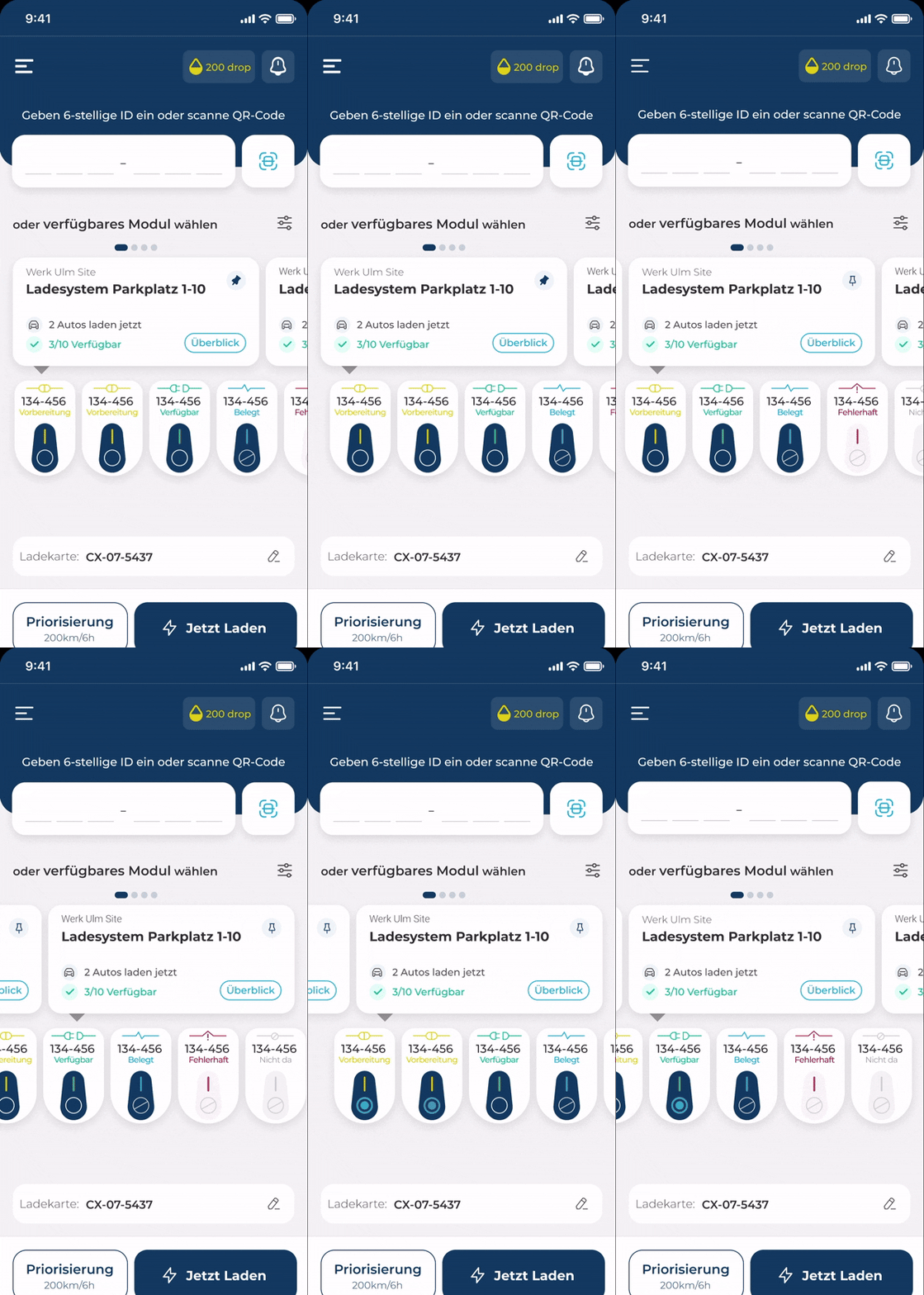
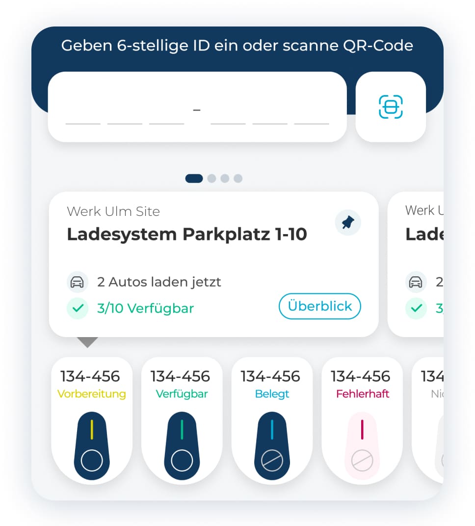
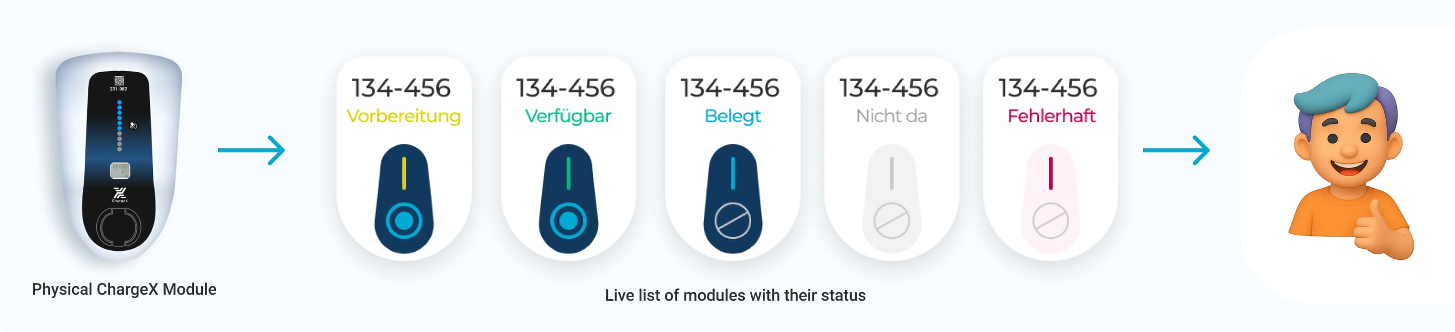
I introduced a live list of available charging modules directly beneath each station.
Instead of typing IDs, users simply tapped the correct module.
To strengthen recognition, I designed the cards to resemble the physical charging hardware users were already looking at.
Decision 03
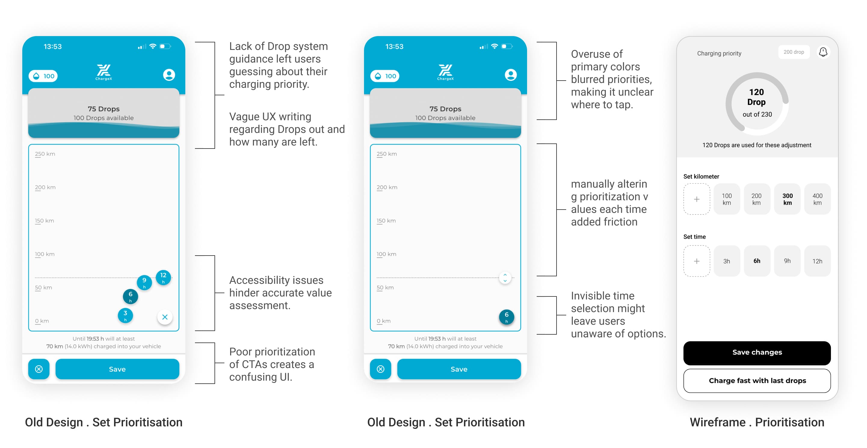
I redesigned prioritization around remembered preferences instead of repeated decisions.
The research showed people rarely changed prioritization between charging sessions.
Yet every session forced them through exactly the same configuration again.
The friction wasn't prioritization itself.
It was asking users to repeat a decision they'd already made.
Design decision
🤓 I moved prioritization out of the critical path
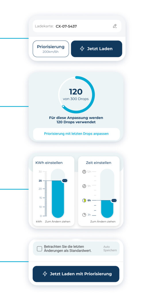
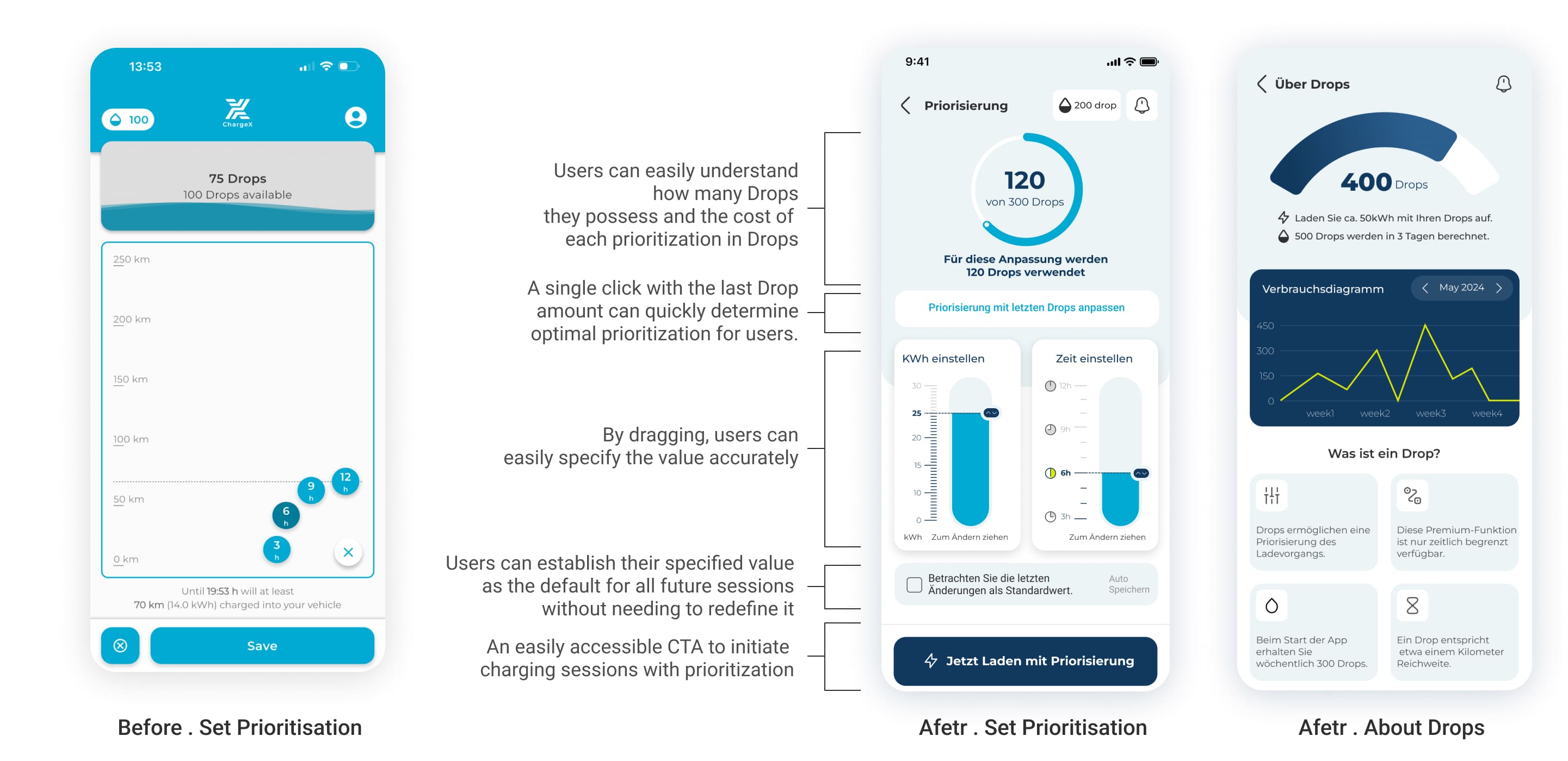
I made prioritization optional. Users who were happy with their existing preferences could start charging immediately, while anyone wanting to adjust their charging strategy could still access prioritization directly from the home screen.
🤌🏻 I added a smart configuration based on the user’s available Drops
Users had to manually adjust energy and charging time, then figure out whether that combination was still possible within their available Drops. I added a smart configuration that used the user’s current Drop balance to suggest a suitable combination of energy and charging time. Instead of trial and error, users could apply a valid prioritization in one tap and still fine-tune it afterwards.
🤩 I redesigned fine-tuning to make charging preferences easier to understand
The original prioritization screen relied on small controls, vague terminology, and difficult-to-read inputs. I redesigned the prioritization interface around larger visual controls, drag interactions, and clearer feedback about Drops, charging duration, and energy targets. This made advanced configuration easier without increasing complexity.
😎 I Added Smart Defaults So Users Don’t Waste Time Re-Entering Values
In the old design, even after adjusting their charging preferences, users had to repeat the same configuration in future sessions. I added the ability to save updated settings as the new default, so future charging sessions could begin immediately while still allowing users to change their preferences whenever needed.
This is how it looks at the end.
Decision 04
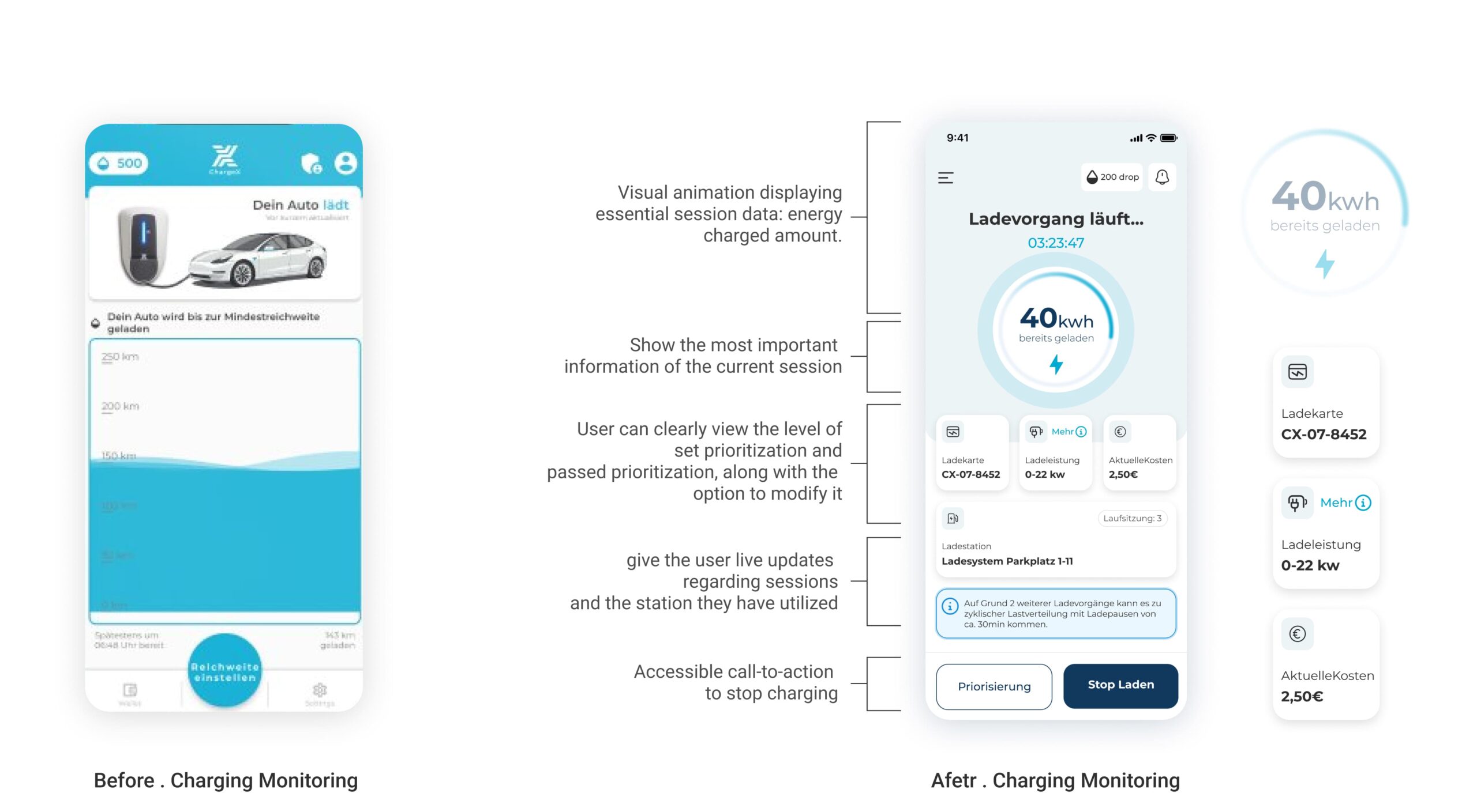
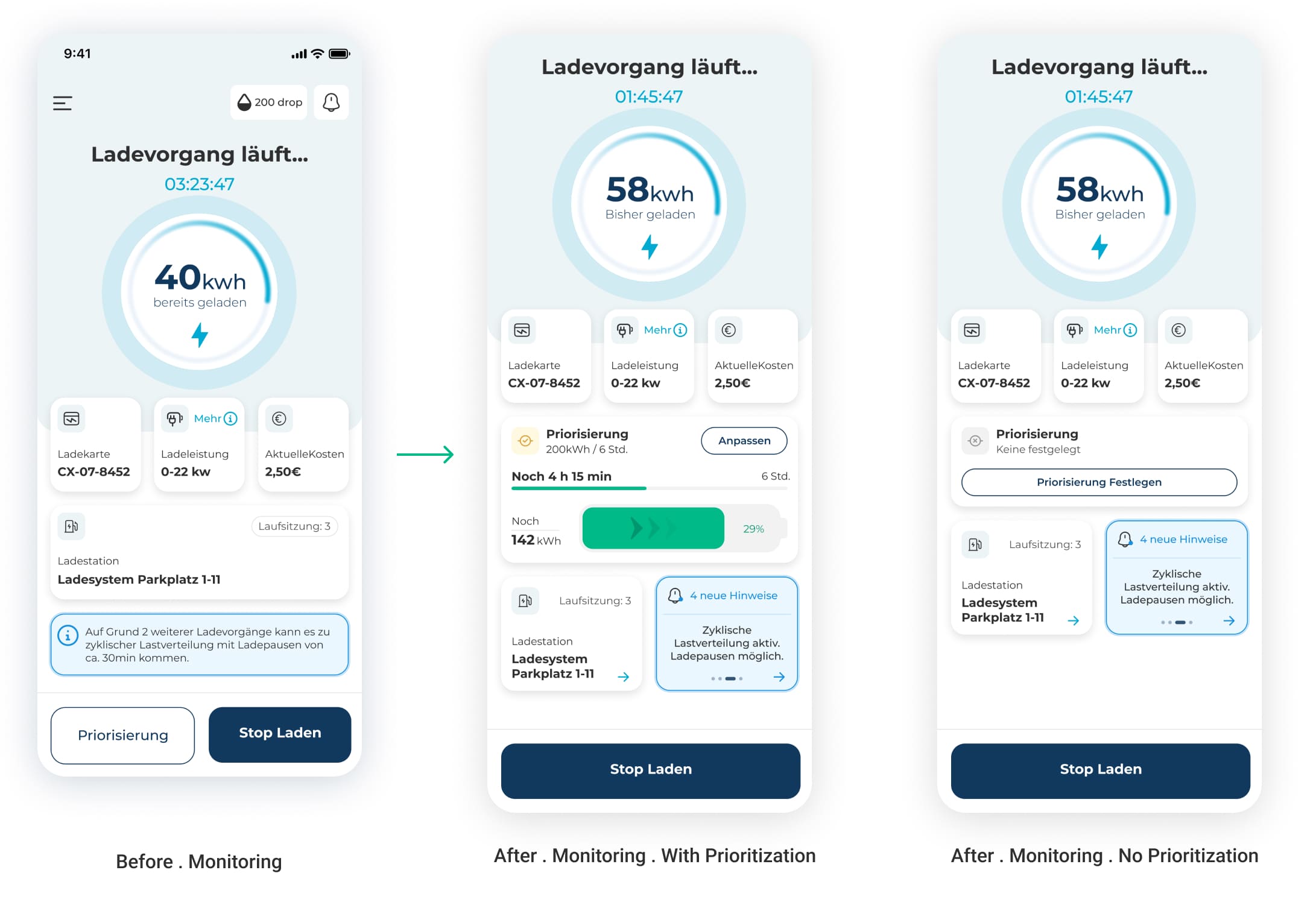
I redesigned monitoring so users could actually understand what was happening during a session
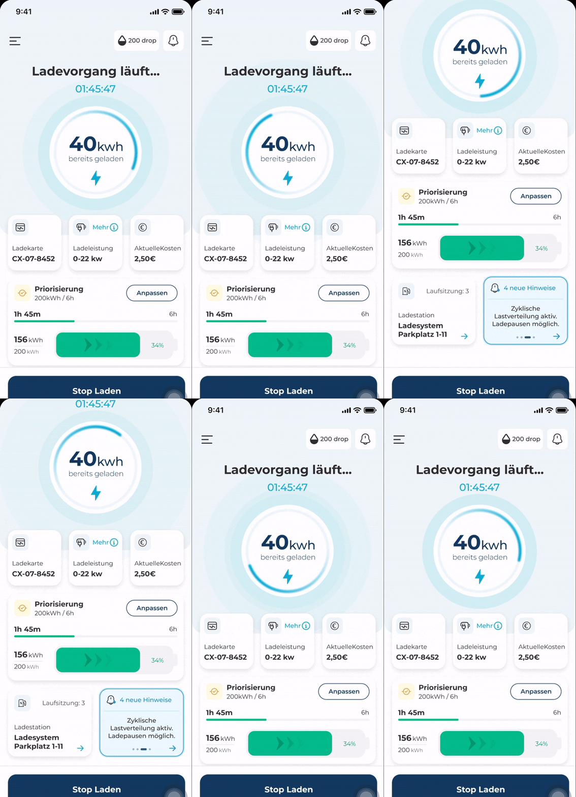
The old monitoring screen showed that charging was active, but it didn’t give users enough information to properly follow the session. They couldn’t clearly see how much energy had already been delivered, how long the session had been running, what it was costing, or how their prioritization was progressing.
Design decision
I redesigned the screen to bring those details into one clear view, with live energy, duration, cost, charging station, prioritization status, and a visible stop action. The goal was to help users understand the session at a glance and act immediately if something needed to change.
👀
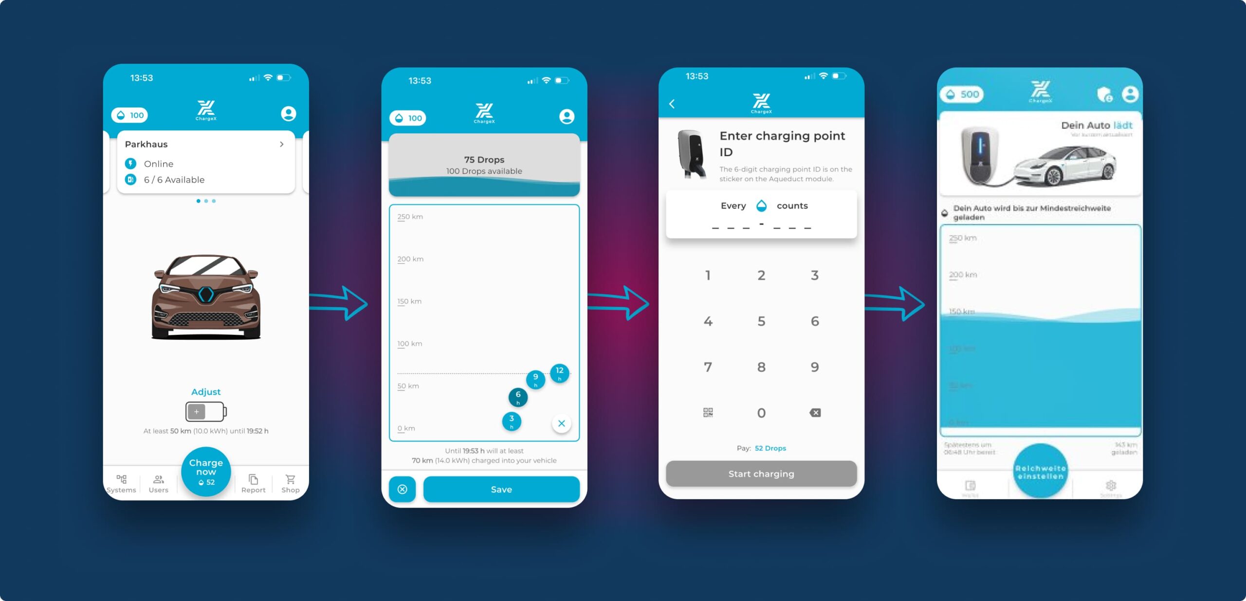
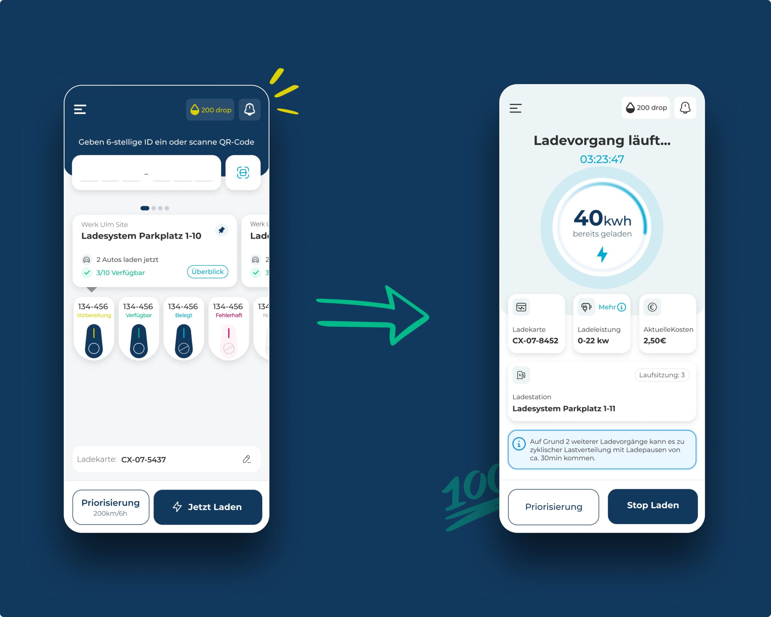
Now let’s put it all together and see the final charging journey, simplified from many steps into one seamless flow.
From Four Frustrating Steps to One Seamless Tap
Old Charging Journey
New Charging Journey
First, I released new flow behind a feature flag before rolling it out to everyone
Since I already had enough research to feel confident about the new direction, I worked with Product and Engineering to release the redesigned charging journey behind a feature flag. We enabled it first for our internal colleagues and a small group of existing customers before rolling it out to everyone.
During the first month, I stayed close to how people were actually using it. I interviewed internal colleagues, gathered customer feedback through Customer Success, and tracked the success metrics I'd defined earlier.
Those observations helped me improve the journey before the full rollout.
First, users loved that prioritization became optional, but during longer charging sessions many wanted to see how close they were to the charging goal they had originally configured.
So I redesigned the monitoring screen to visualize progress toward that target.
Now users see not just total kWh and hours set, but also how much they've already charged and how much time is left, for example, "120 kWh out of 300" and "4 hours out of 6." It gives users a real sense of progress, without making them do mental math.
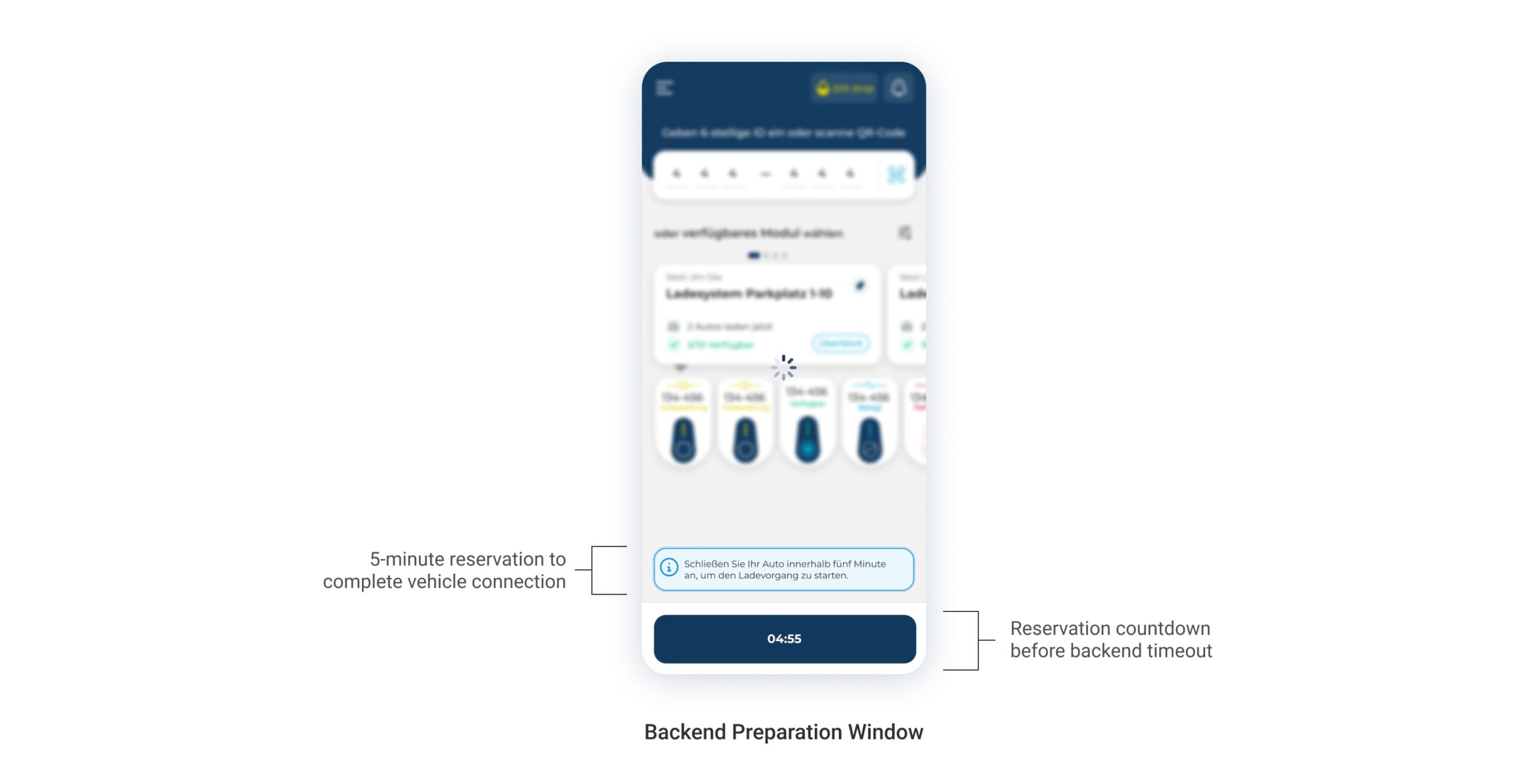
Second, I found an important handoff issue between selecting a module and physically connecting the car. After users tapped Start Charging, the backend could only prepare the session once the car was connected to that module. If that didn’t happen within five minutes, the backend stopped the initiation process and released the module.
To make this edge case clear, I added a temporary lock screen with a countdown and a direct instruction to connect the car. This gave users clear feedback about what the system was waiting for, while keeping the module reserved long enough for them to complete the physical step.
🥰
After those iterations, and once both the behavioral metrics and qualitative feedback remained positive, we rolled the new charging journey out to all customers.
I measured the same behaviors after launch, not general satisfaction
Charging initiation time
↓ Dropped by 40%
I measured the time from the moment users entered the charging flow until the backend confirmed that the charging session had started. I compared the same event sequence before and after rollout, including sessions using saved defaults and sessions where users adjusted prioritization.
Behavior Changed
Users moved from selecting a module to starting a session with fewer repeated actions and less time spent configuring the same settings.
I compared backend session-source data to understand whether users were choosing the redesigned app journey instead of initiating charging directly through the physical module.
The share of app-initiated sessions increased after rollout, giving us a clear directional signal that the app had become a more practical way to start charging.
Behavior Changed
Users increasingly chose the mobile app as their starting point for charging.
Evidence
- Backend session-source data
- App versus physical-module initiation rates
- Customer and internal-user feedback
Charging-initiation support tickets
↓ Dropped by 41%
Together with Customer Success, I compared tickets from before and after rollout using the same charging-related categories: starting a session, finding or entering a module ID, understanding prioritization and Drops, and unclear or failed session starts.
Behavior Changed
Users completed the initiation journey with less support and fewer questions about what to do next.
Evidence
- Support-ticket categories
- Customer Success feedback
- Pilot and post-launch customer conversations
The redesign also supported wider app adoption
A shared internal understanding of who we are designing for
More users entered the app to start charging instead of using only the physical module.
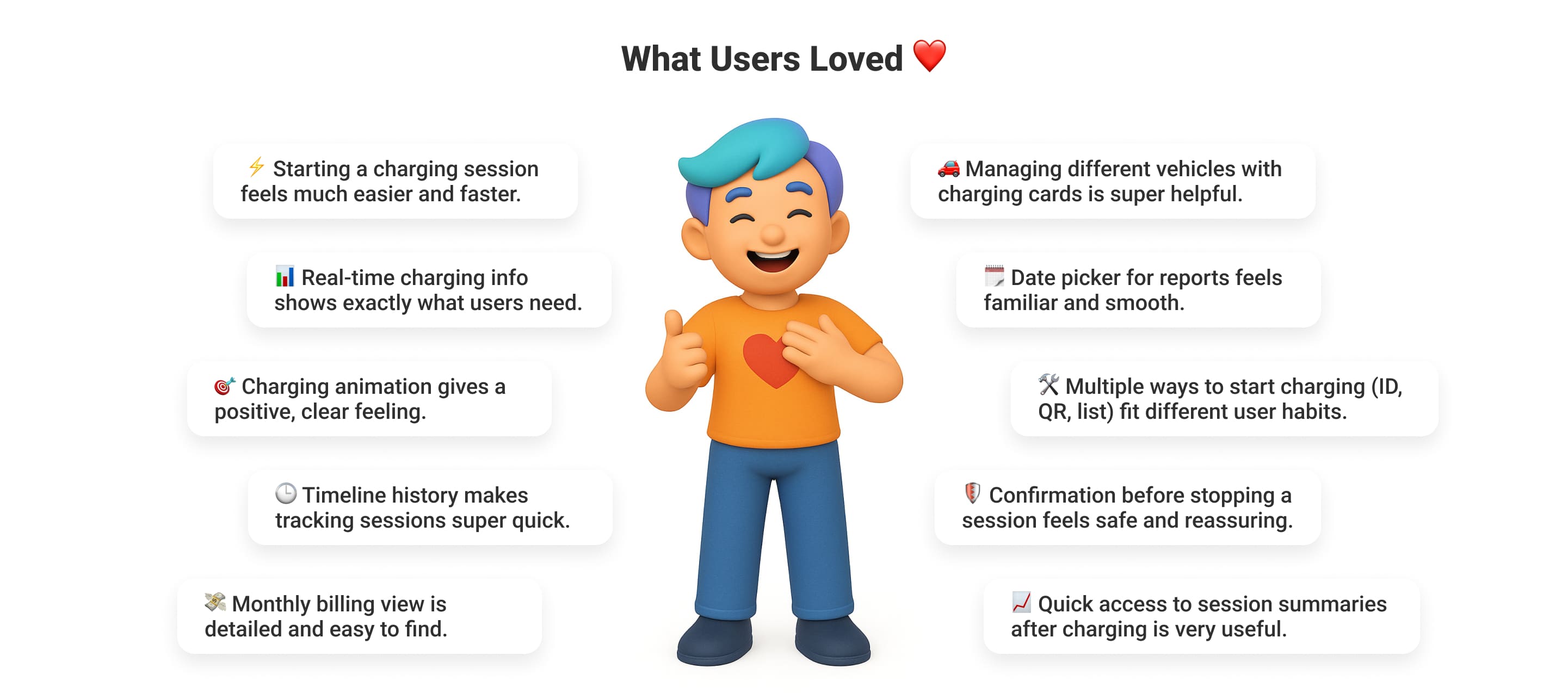
Once inside the app, they could also track energy use, review charging history, access billing and reporting, and understand their consumption patterns.
That gave users more visibility into their own charging activity and reduced the number of follow-up questions or manual requests sent to admins.
For admins, it meant less effort spent explaining sessions, sharing reports, or resolving basic usage questions.
🧐
Additional contributions beyond the start-charging workflow
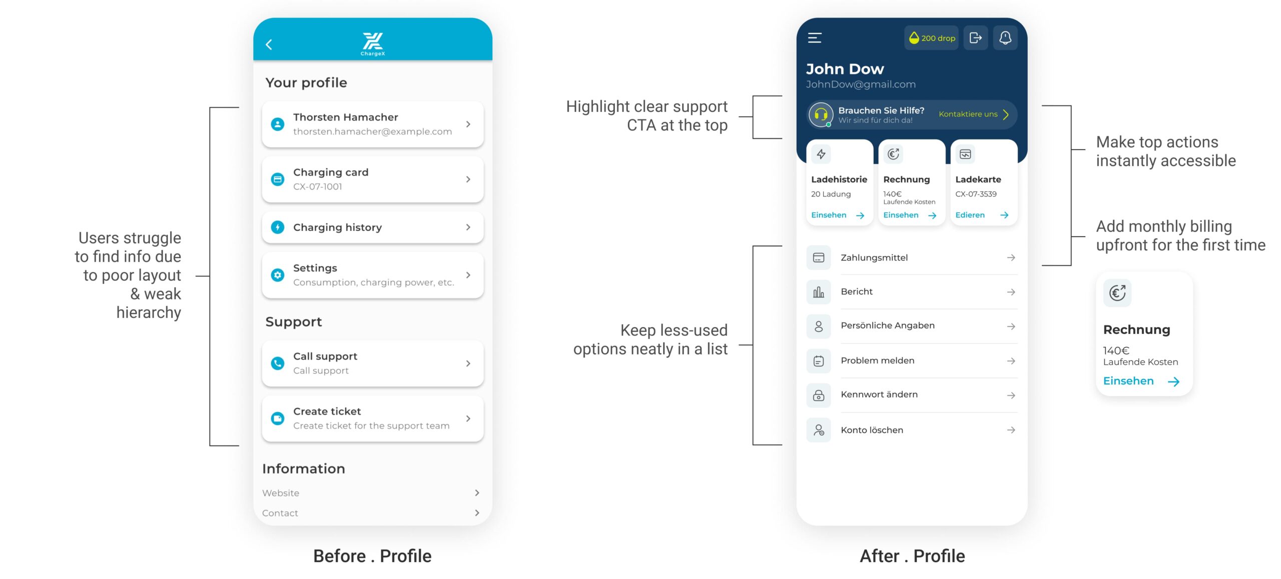
I Reorganized Profile Into a Clear Hub by Elevating Frequent Actions and Moving Rarely Used Items Down
Previously, the profile was a flat list where important tasks like checking charging history or billing were buried alongside rarely used options. I redesigned it into a structured hub : the top section now highlights the most-used features (history, billing, charging cards) in accessible cards , while less frequent items are grouped neatly below. I also surfaced a prominent contact CTA, making support instantly reachable.
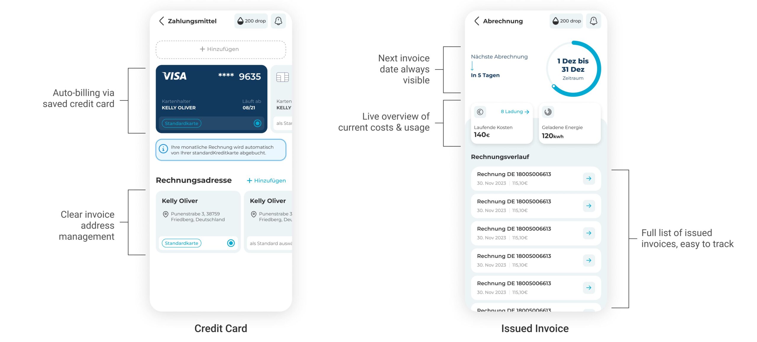
I Introduced Automated Billing in Profile to Replace Manual Invoices and Unlock Scalability
Until now, users had to handle monthly invoices manually, which was slow, error-prone, and unsustainable as ChargeX grew. I introduced automated billing directly inside the Profile hub: users add their credit card once, and from then on, invoices are automatically deducted every month. Alongside this, I surfaced a clear next billing date, running costs, and invoice history in one place. This not only removes friction for users but also lays the foundation for a scalable, future-proof payment system that ChargeX can grow on.
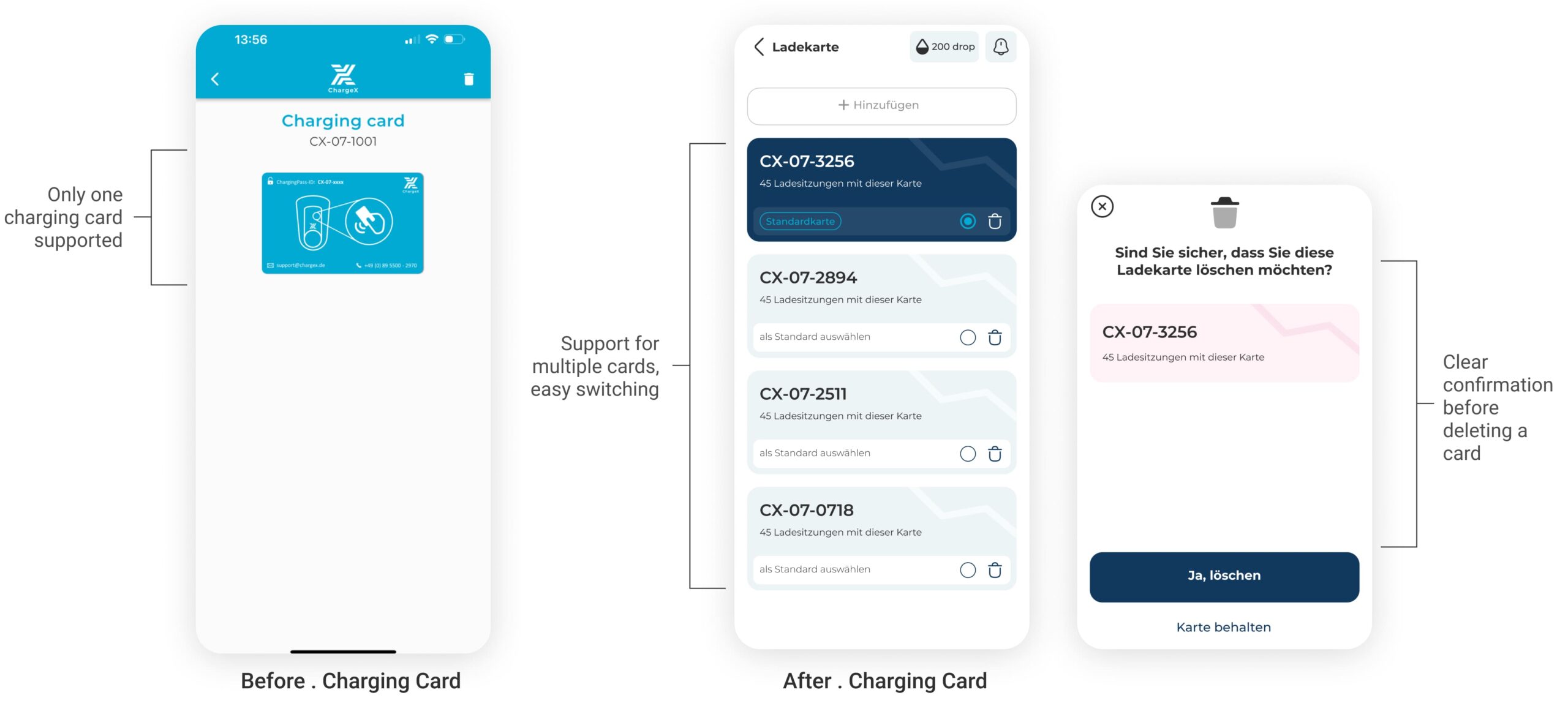
I Also Enabled Multi-Card Support After Research Showed Users Needed to Manage Several Charging Cards Across Vehicles
Research revealed that many EV users weren’t limited to just one charging card. Families shared vehicles, partners wanted separate cards, and some users needed different cards for personal vs. work expenses. The old app only allowed a single card, which caused friction and confusion. So I redesigned the charging card section to support multiple cards.
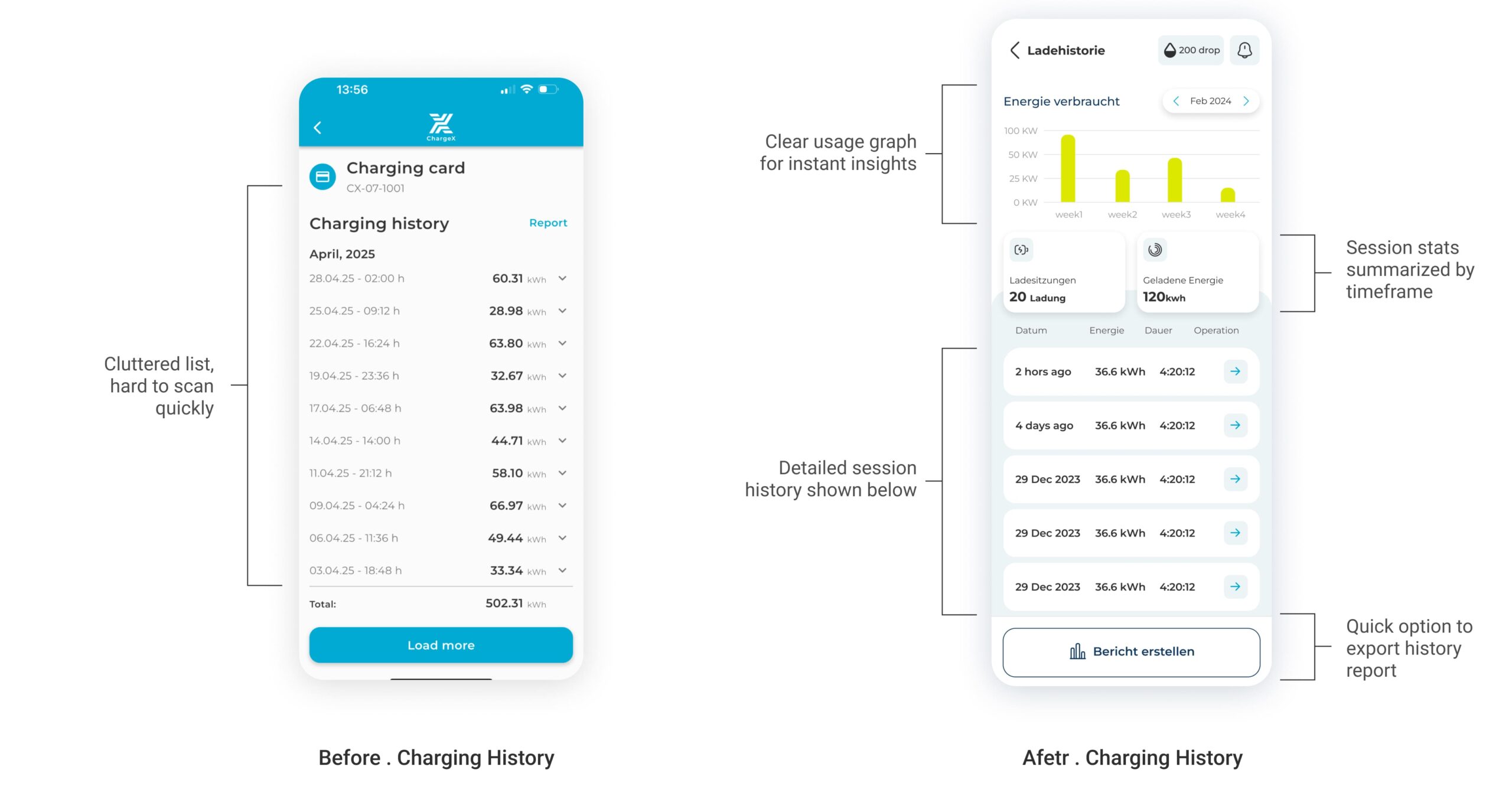
And, I Transformed Charging History From a Static List Into Visual Insights So Users Can Track and Understand Their Energy Use at a Glance
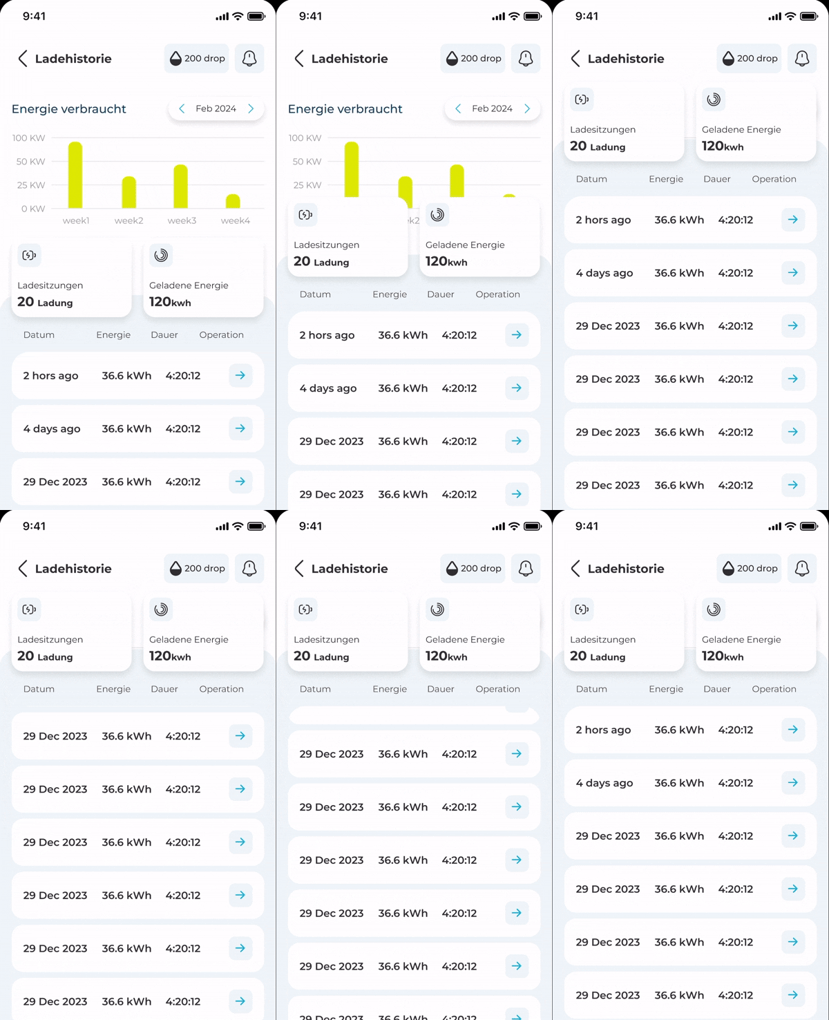
The old charging history buried key details in a long, text-heavy list, forcing users to scroll endlessly without context.
To fix this, I redesigned the section into an interactive dashboard: a visual diagram shows weekly energy use, high-level stats summarize sessions and kWh, and a detailed timeline of sessions stays accessible below. Users can also generate a downloadable report for any timeframe instantly. This shift turned charging history into a decision-making tool instead of just a static log.
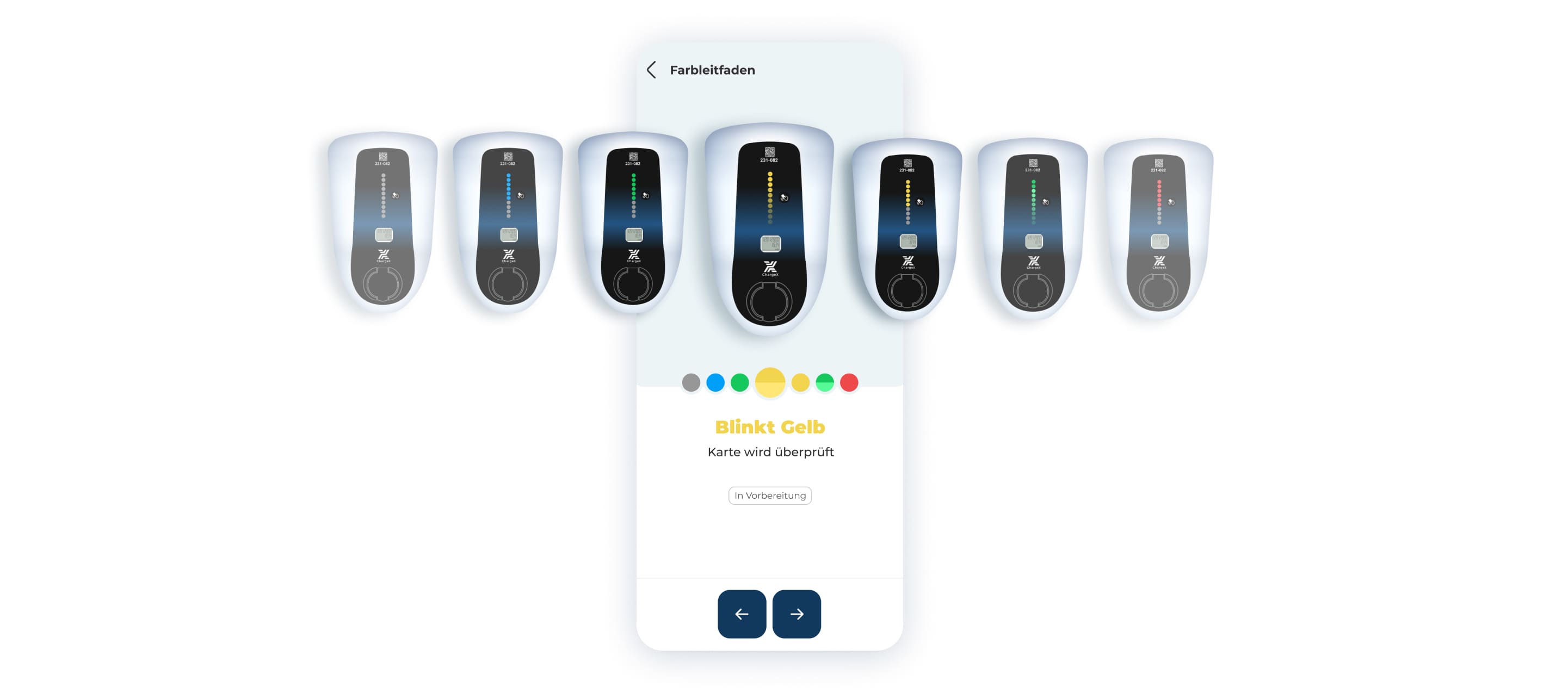
I Designed a Color Guide Inspired by Real ChargeX Modules to Build Instant Recognition
To reinforce trust, I added a station detail guide showing real photos of ChargeX hardware and their LED lights. By mirroring the actual hardware colors in the app, users instantly connect what they see on screen with the modules in real life.
👀
What I took from this!
The most valuable outcome was making the product’s hidden structure visible
I learned how much impact a seemingly small improvement can have when it affects a journey people repeat all the time. Since then, when I prioritize work, I look closely at frequency, like how often users experience it. Improving a high-frequency journey can create much more value than polishing something people only use occasionally.
What I'D do differently
I’d map the backend dependencies and physical handoff states earlier, before moving into detailed UI. The feature-flag rollout helped surface cases like the five-minute connection window, so next time I’d bring Engineering into that flow-mapping stage sooner and define those system states upfront.
👀
Take a look at behind the scenes!
I Saw the Risk of Inconsistency Growing, So I Built a Design System from Scratch to Future-Proof ChargeX
Designing the new flows solved today’s pain points, but I also knew that without a strong foundation, the app would quickly become inconsistent and hard to maintain. That’s why I started building a scalable design system from scratch, to ensure every future feature could scale smoothly, handoffs would be seamless, and developers had a single source of truth.
👀
For example ...
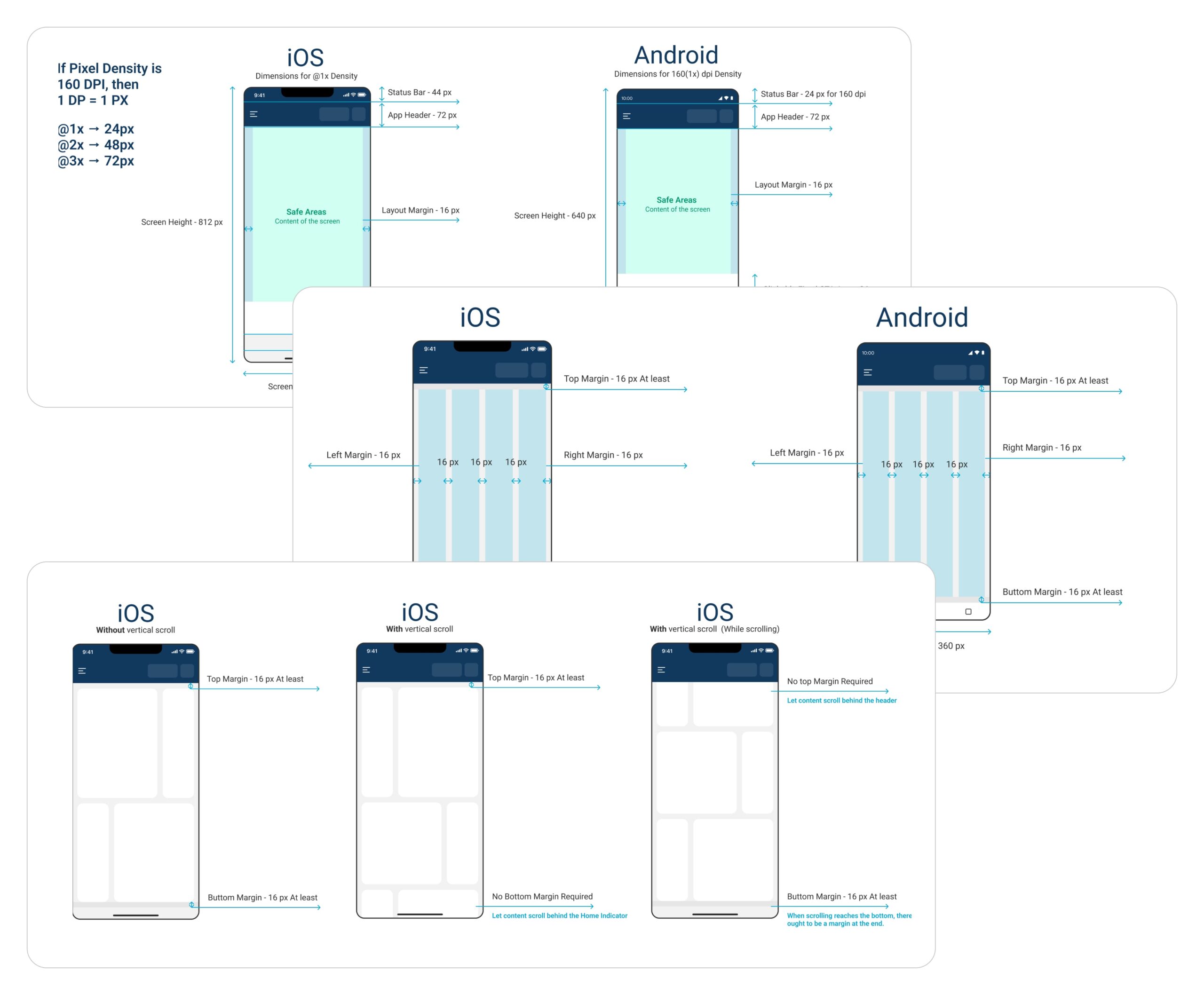
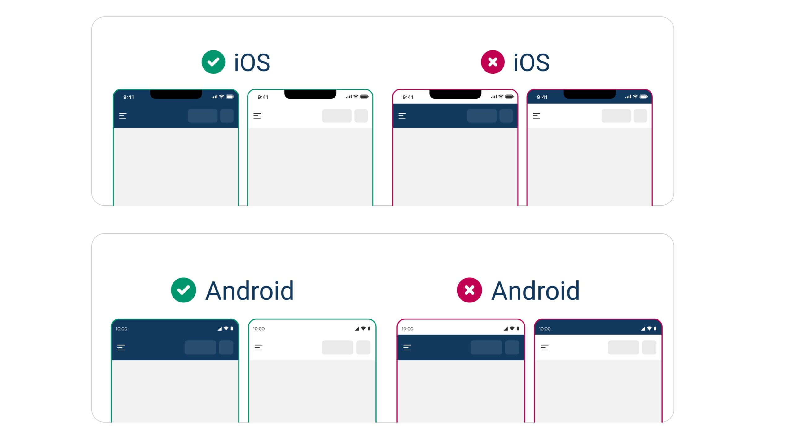
I Documented Rules for Scalability and Handoff Across iOS and Android
I defined rules for spacing, margins, grids, safe areas, and scroll behaviors to make sure screens looked polished on both platforms while still feeling native.
I Standardized Status Bars, Colors, and Platform Behaviors
I created clear rules for status bar backgrounds, scroll behavior, and app theme colors to ensure consistency across devices and contexts.
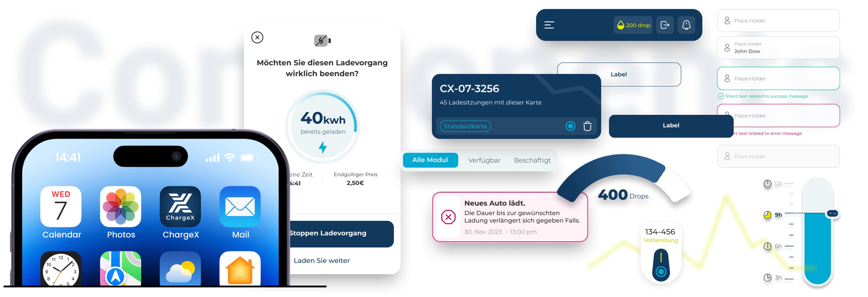
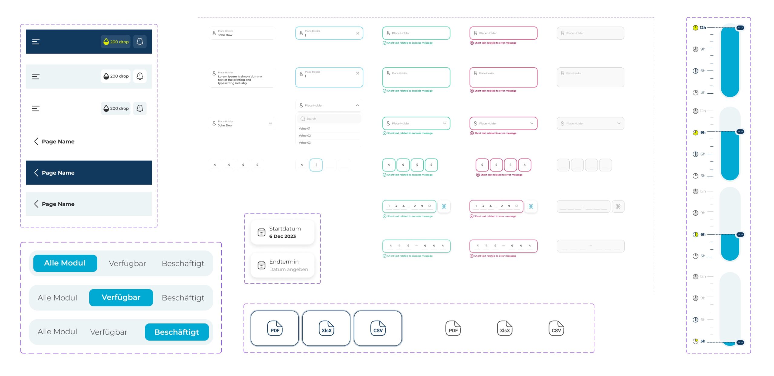
I Built Reusable Components for Faster Iteration
From inputs and dropdowns to buttons and cards, I designed a flexible component library that let the team assemble flows without reinventing the wheel each time.
👀
And Lastly ...
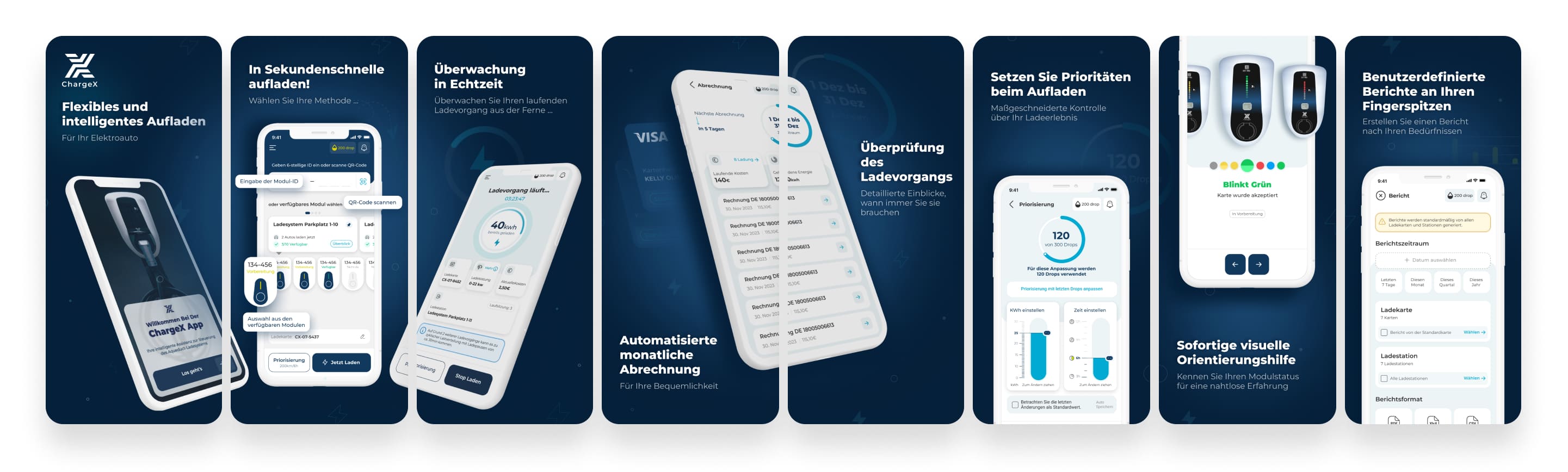
I Designed Introductory App Screenshots for App Store and Google Play to Take ChargeX From Prototype to MVP Launch
After a few rounds of design tweaks based on usability testing, it was time to take ChargeX from polished prototype to reality.
To prepare for the MVP launch on the App Store and Google Play, I also designed a set of introductory app screenshots, highlighting the key experiences we wanted new users to notice right away.
Looking to purchase
Designer Assistance 01, 02, 03?
Please send me an email with your request, and I’ll provide you with instructions on how to buy the designer assistance files.