How I Transformed a one-size-fits-all ChargeX dashboard into three role-based experiences that scaled the business
ChargeX is a German startup building modular, scalable EV charging solutions for fleets, residential buildings, and businesses. But as the customer base grew, the existing Admin Dashboard couldn’t keep up, it was rigid, outdated, and unable to serve the very different needs of admins. That’s where I came in. I led the end-to-end redesign and feature expansion of the dashboard: uncovering new customer groups, identifying key admin personas, and creating a scalable system built around real-world workflows.
Impact:
Customer segments unlocked
3×
Station Find Time
2m → < 40s
Module Identification Success
50% → 90%
New Business Revenue
↑ 35%
Note: To respect NDA commitments, certain details in this case study have been blurred .
🎯 Solo Product Designer
🤝 Close collaboration with PM + Development Lead
🔄 Continuous input from Customer Success, Sales, and Stakeholders
📊 Insights from interviews, support tickets, and usage data
⚙️ Agile delivery with iterative design–build–validate cycles
Industry
B2B SaaS | E-Mobility, Electric Vehicle Charging
Company
ChargeX GmbH | München, Germany
The Problem
I noticed the product was ignoring who was actually using it
The existing Admin Dashboard, built six years ago, was rigid and outdated. It only fit one type of admin, leaving new customer groups like SMEs, fleets, and hotels without the features or workflows they needed. Critical gaps such as the lack of automated billing, scalable group management, and usable station monitoring made daily operations slow and frustrating. No one had defined our users. Sales, customer success, and engineering each held fragments of insight, but there was no shared model to build decisions on. The product kept growing without a foundation.
🔴 The real problem I identified
The dashboard had a user problem disguised as a feature problem. Adding more features wouldn't help, we needed clarity about who we were designing for first.
I Created Clarity First, Aligning Stakeholders Around Real Business Needs
I facilitated workshops with PMs and stakeholders to turn scattered assumptions into a clear, prioritized map of what the product truly needed to support.
👥 Defined clear admin roles and responsibilities
Established who our admins really were and how their responsibilities shaped daily workflows
🧩 Structured workflows around real operational responsibilities
Shifted focus from generic features to responsibility-driven workflows, ensuring each role could complete critical tasks without friction.
⚡ Built a foundation designed to scale across growing customer segments
Aligned teams around creating a scalable system that could support organizations from single sites to large multi-location operations
👉 This gave us a shared foundation, so when I moved into user research, I wasn’t guessing what mattered, but validating against clear business direction.
🤓
With business goals clarified, my next step was to pinpoint the exact people this dashboard had to work for.
I built a layered research approach, each method answered a different question, and together they closed the gap
The problem was distributed across three sources: historical behaviour data, real users, and internal team knowledge. No single source would give me the full picture. So rather than picking one method, I designed a sequence where each step built on what the previous one couldn't tell me.
At first,
I Analyzed Support Tickets to Spot Patterns in Admin Needs in collaboration with CS Team
Together with the Customer Success team, I went back through one year of support ticketsto capture a holistic view of what admins were struggling with and, more importantly, what they expected the dashboard to help them achieve. Instead of treating tickets as isolated problems, I used them to look for recurring patterns in expectations, workflows, and frustrations
What it changed about my thinking:
The clusters showed that most failures happened during the same few tasks, station lookup, module identification, but the failure modes were completely different depending on who was doing them. That was the first hard evidence that different users needed fundamentally different structures, not just different labels. It gave me the confidence to argue for a full architectural redesign rather than patch fixes.
👉 Design decision it unlocked:
The ticket data proved the problems were structural, not cosmetic. That's what made the case for rethinking the whole IA, rather than optimising individual flows, credible to engineering and product leadership.
Then,
I Conducted 18 In-Depth Interviews to Uncover Admin Needs, Priorities, and Expectations
Support tickets showed recurring problems, but to truly understand the people behind them, their motivations, workflows, and expectations, I conducted 18 semi-structured interviews across different business contexts. I started with 10 sessions, but since new insights kept surfacing, I extended to 18 until the data reached saturation. Each session lasted ~45 minutes and helped us see how different types of admins approached their roles and where their needs diverged.
What it changed about my thinking:
The interviews made something clear that data couldn't: the three user types didn't just have different tasks, they had completely different mental models of what the product was. A hotel manager thought about it as a guest amenity. A fleet manager thought about it as a scheduling system. Designing one navigation for both was like designing one cockpit for a car and a plane. The interviews made that viscerally real.
👉 Design decision it unlocked:
Each persona needed a different entry point, not a filtered view of the same dashboard. This insight drove the decision to restructure navigation around roles, rather than add role-based filters on top of existing flows. It's the difference between surgery and a bandage.
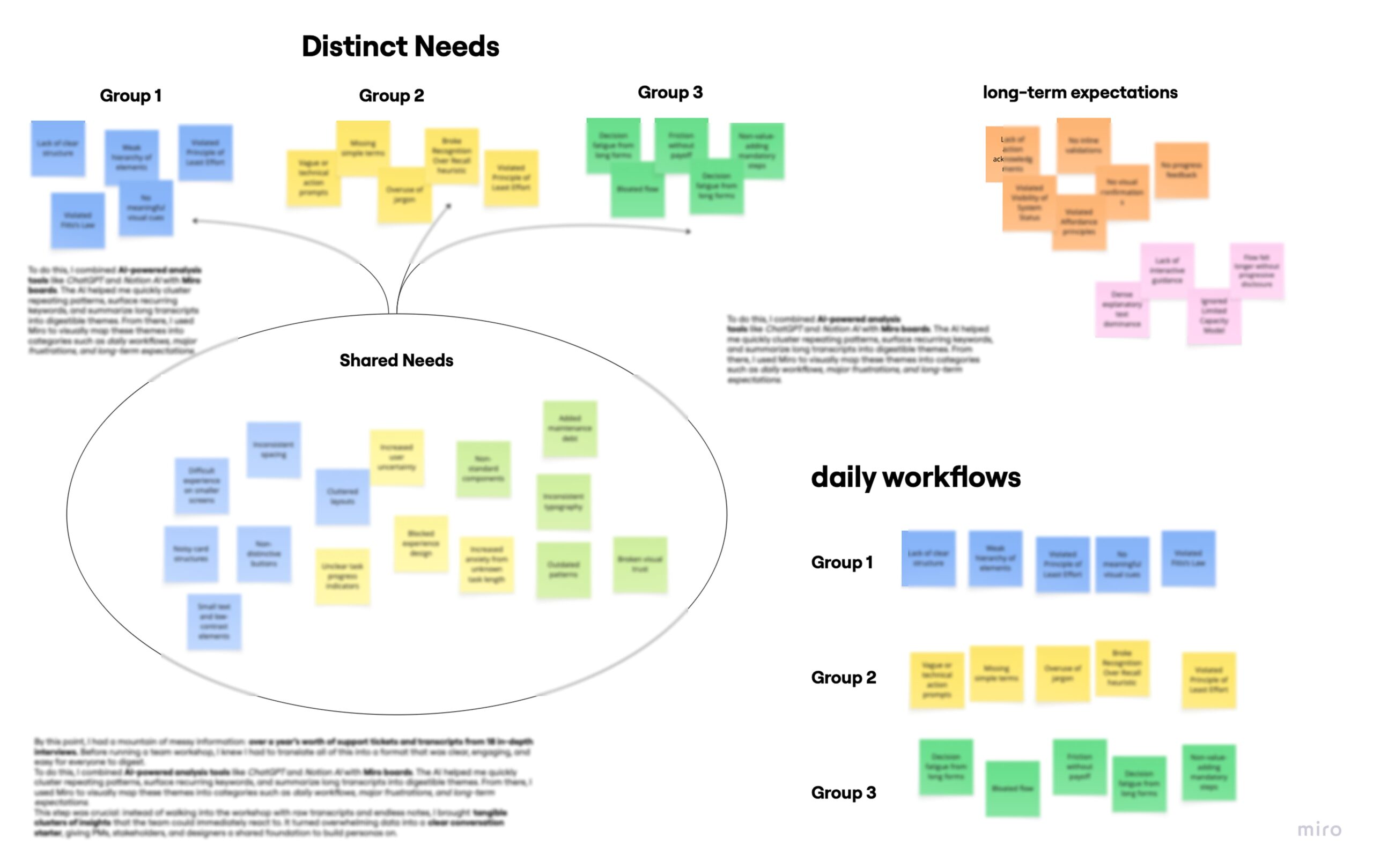
Afterward, I Turned Raw Tickets and 18 Interview Transcripts into Clear Insights Using ChatGPT, Notion AI, and Miro to Prep for the Persona Workshop with the team
By this point, I had a mountain of messy information: over a year’s worth of support tickets and transcripts from 18 in-depth interviews. Before running a team workshop, I knew I had to translate all of this into a format that was clear, engaging, and easy for everyone to digest.
To do this
I combined AI-powered analysis tools like ChatGPT and Notion AI with Miro boards. The AI helped me quickly cluster repeating patterns, surface recurring keywords, and summarize long transcripts into digestible themes. From there, I used Miro to visually map these themes into categories such as daily workflows, major frustrations, and long-term expectations.
👉 Instead of walking into the workshop with raw transcripts and endless notes, I brought tangible clusters of insights that the PMs, stakeholders, and engineers could immediately react to.
🤓
Then I Facilitated Two Workshops with Team to Turn Our Miro Insights into Shared Understanding of Admins Persona and Clear Feature Priorities
For the First Workshop, My Goal Was to Align the Team Around Clear Personas and Their Needs
I designed and facilitated this workshop to bring clarity to the scattered insights. Using Miro, I laid out the differences and overlaps between admins, then steered discussions on which features counted as universal table stakes (like simple reporting) and which were role-specific (such as scheduling for fleets or guest billing for hotels).
During workshop;
I challenged assumptions, asked clarifying questions, and made sure every perspective was surfaced, but kept the group anchored to the data I had synthesized.
By the end, I defined three personas that gave the whole team a shared language for the first time
Now, Meet the People Who Shaped My Design Decisions (with a Focus on SME & Fleet Managers in This Case Study)
Meet Clara,
The admin behind tenants and residential houses.
Clara is 45, based in Hamburg, and manages EV charging for residential building. She's not deeply technical, but she’s the go-to person when tenants have charging issues, and needs tools that just work.
What matters to Clara (Hidden Due to NDA)
- Managing multiple user groups efficiently
- Clear billing for residents or customers
- Customizing data views to her needs
- Easy report exports for meetings
- Knowing exactly who charged where
This Is Who I Optimized For Here
Meet Markus,
The admin behind SME and Fleet charging chaos.
Markus Weber is 50, lives in Munich, and manages charging for his company’s employees and EV fleet. Efficiency is everything. He ensures the infrastructure works like clockwork for his team.
What matters to Markus (Hidden Due to NDA)
- Fast overview of sessions and usage
- Automating monthly billing by user group
- One-click session starts
-Managing many users with minimal clicks
- Avoiding dependency by fixing issues on his own
Meet Tom,
The admin behind hotel manager with guests.
Tom is 40, running a busy Berlin hotel with growing demand for guest EV charging. He’s not into technical hassle, just smooth operations and top-tier guest experiences during check-in and check-out peaks.
What matters to Tom (Hidden Due to NDA)
- Guests always find available stations
- Monitoring live sessions at a glance
- Simple tools for hotel staff use
- Clear billing tied to guest stays
- Reliable, stress-free charging flow
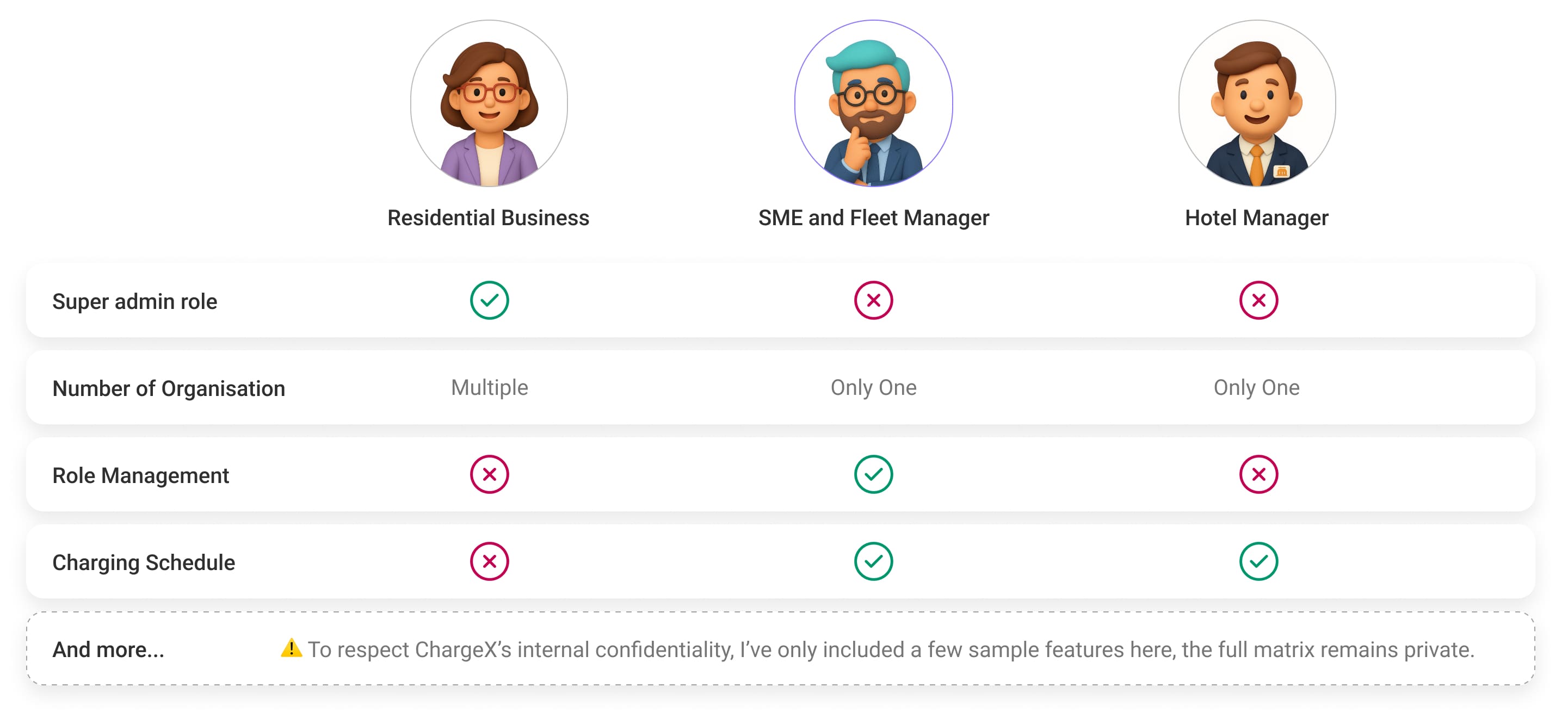
After Defining Personas, I Mapped Their Needs Into a Role-Based Feature Matrix to Align Feature Priorities for the First Release
Before diving into solutions, we needed clarity on what each persona actually needed from their dashboard. So, I created a Role-Based Feature Matrix to map out the core features, access levels, and priorities for each group. This gave me a clear picture of where their workflows overlapped, and where they didn’t.
🧐💡
From the first workshop, I decided to prioritize SMEs and Fleet Managers as our core users to start, so this case study focuses on designing the dashboard around their needs.
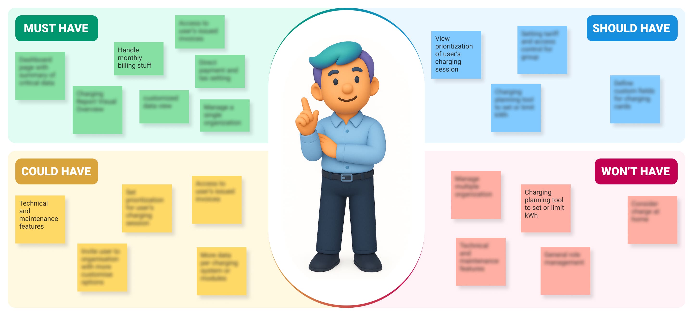
And For the Second Workshop, I Prioritized Features with MoSCoW to Turn a Long Wishlist into a Focused Roadmap
With so many potential features on the table, I knew we needed clarity on what truly mattered for SMEs and Fleet Managers in the first release. I led a MoSCoW prioritization session, categorizing features into Must-Haves, Should-Haves, Could-Haves, and Won’t-Haves. By grounding the discussion in user pain points and business priorities, I made sure essentials like billing were treated as Must-Haves while less critical extras were deferred.
Trade-off
I chose to delay features and invest in the foundation, because I could see where the product would break without it
With the research complete, I was at a real decision point. There was pressure to ship features quickly. But I could see that building more features on top of an undefined user model would make the product harder to us, and harder to scale, with every release. This was the moment where I had to choose between what was fast and what was structurally sound.
Option A — The default path
Ship features now, define users later
- Faster short-term velocity
- Less upfront alignment required
- Familiar, it was already how the team worked
- Each new feature adds more noise to an already flat structure
- Design decisions keep being made on intuition with no shared frame
- Cost of fixing the structural problem grows with every release
Option B — What I pushed for
Define the user model first, then redesign the architecture
-Delays some feature releases in the short term
- Requires cross-team alignment before design starts
- Higher upfront investment in research and IA
- Every future feature has a defined user context to build for
- Navigation and workflows scale cleanly as the product grows
- Creates a shared language across product, sales, and CS
How I evaluate and made the call
I mapped the cost of each option not just over the next sprint, but over the next year. Option A looked cheaper because the cost was deferred and invisible, you don't feel design debt until it's compounded. But I could see the trajectory clearly: without a user model, every decision would keep being made on assumption, every new feature would land in the wrong context for someone, and the product would gradually become harder for anyone to navigate, and harder for the team to reason about. The structural fix would only get more expensive to do later.
I presented this to leadership not as a design preference, but as a systems risk. The question I framed wasn't "should we do the research?" but "what does this product cost to fix in 12 months if we don't?" Once they saw the long-term cost of Option A, the short-term delay of Option B became obviously worth it. That's what made the case land.
🤩
Now, with the must-haves for SMEs and Fleet Managers clearly prioritized, I am ready to kick off the big refactor of our six-year-old dashboard.
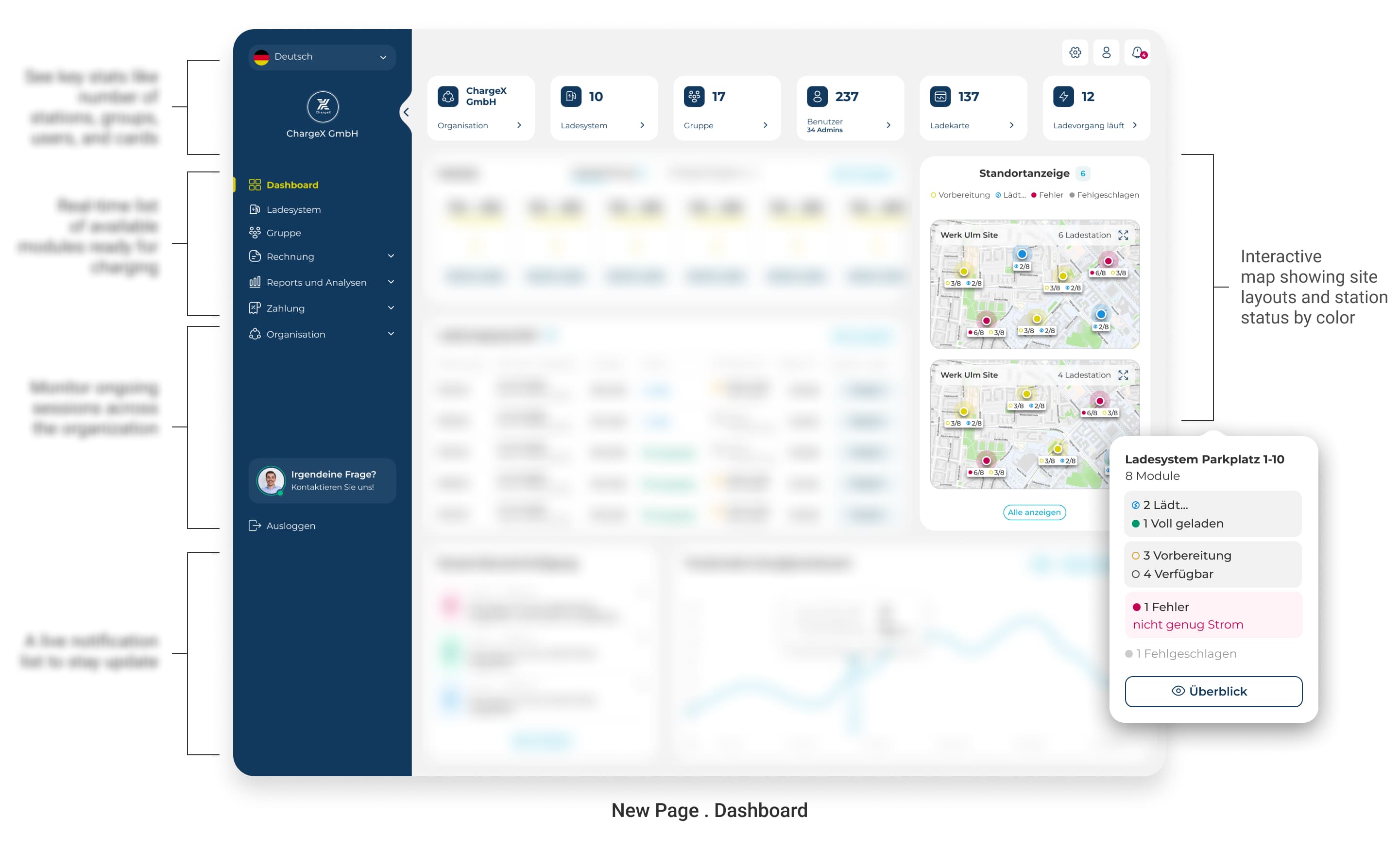
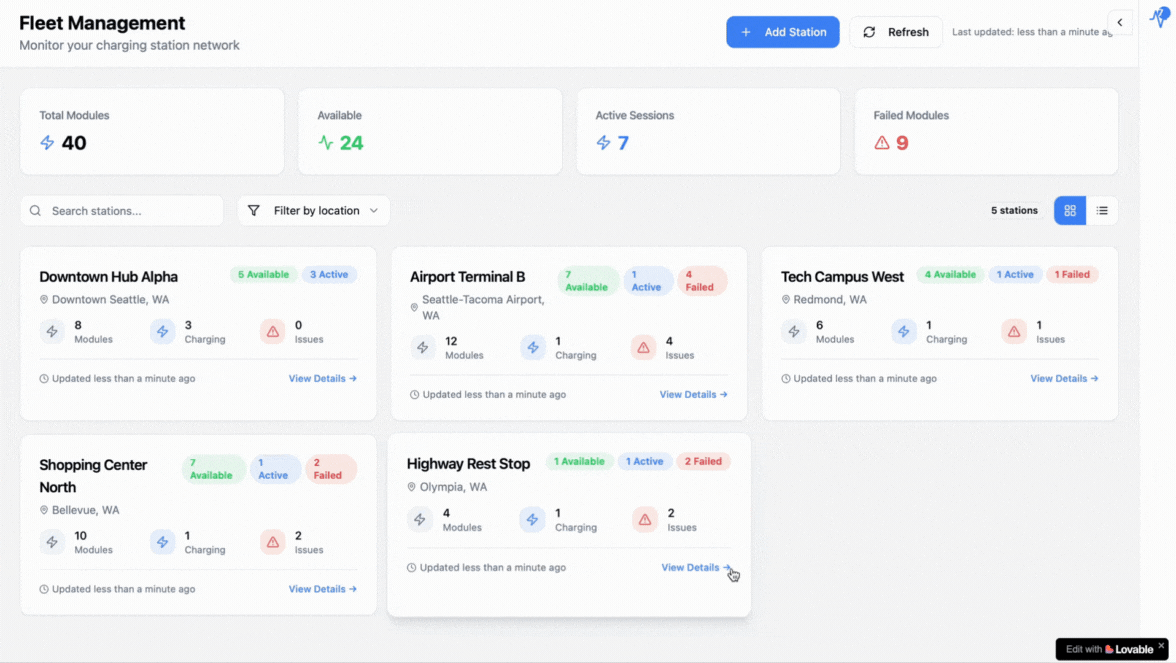
As the First Crucial Move, I Introduced a Real Dashboard to Give SMEs Instant Clarity on Their EV Operations For Fast Decision Making
🔴 From the start, I realized this persona didn’t just need more tools, they needed a clear perspective. Support tickets and interviews revealed their frustration with jumping between pages just to understand what was happening.
🟢 So, I designed the first real dashboard that the old system never had: a single control center that brings together charging station status though live map view, ongoing charging sessions, and key alerts at a glance. Now, instead of wasting time piecing things together, SMEs and Fleet Managers can instantly see what matters and act with confidence.
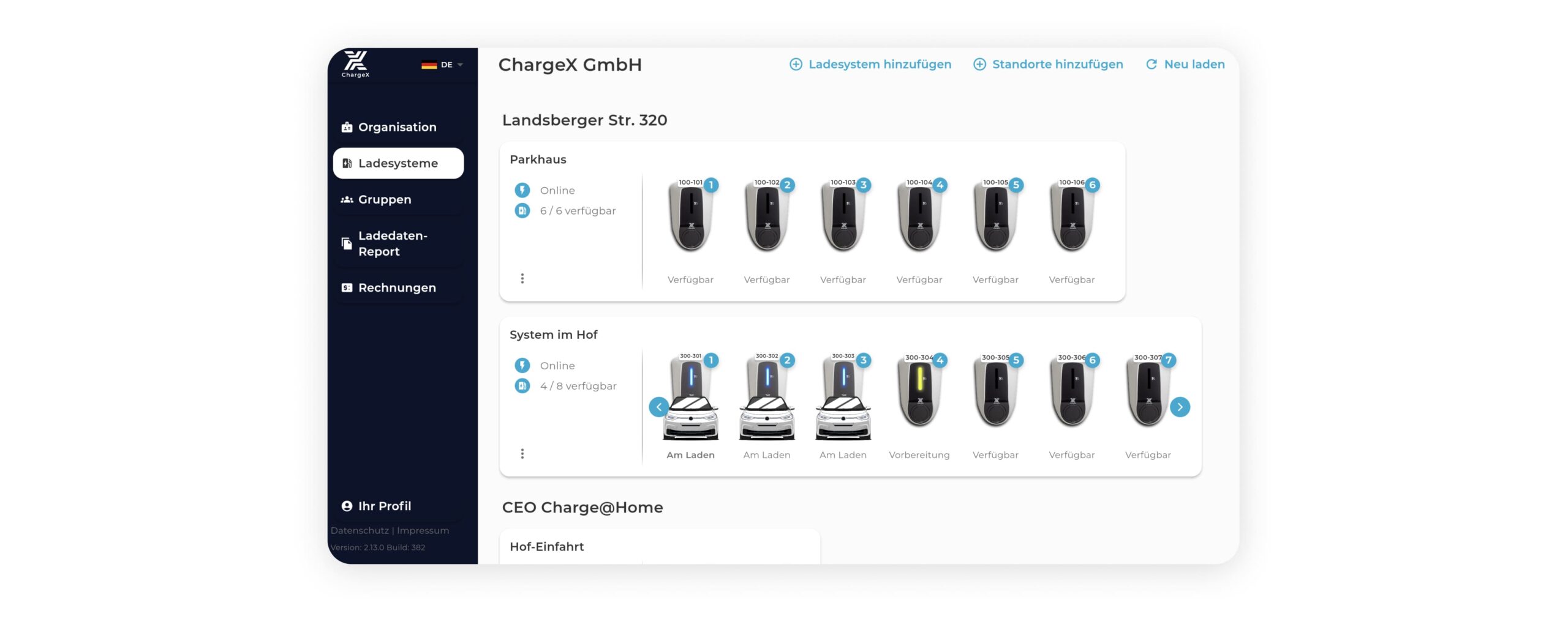
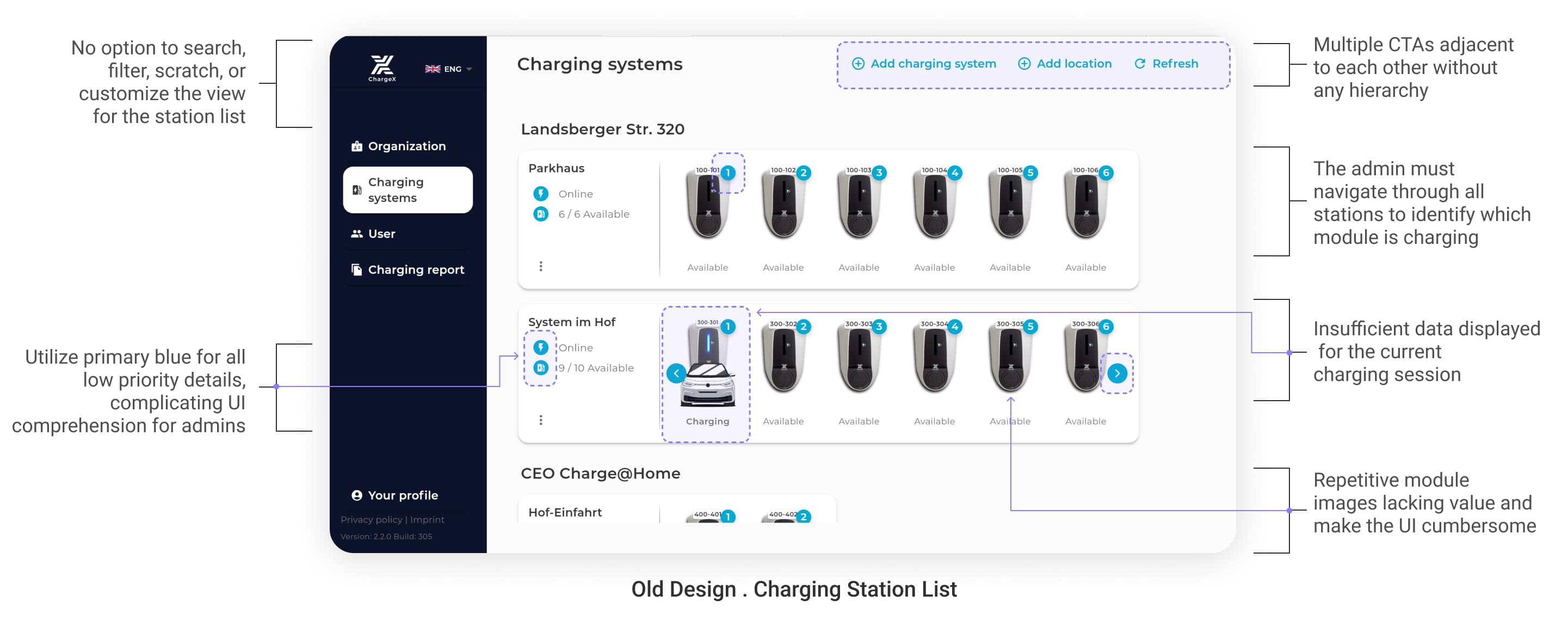
Then, I Tackled the Scaling Problems SMEs Faced With the Station List
🔴 One of the loudest complaints I uncovered was that the old station list simply didn’t scale. With no search, no filters, and no clear session details, admins wasted time scrolling through endless lines just to figure out who was charging and what was happening.
For This Section, I decided to Use Lovable for AI Rapid Prototyping to Run a Lean Test, That Turn My Assumptions Into Tested Insights
Instead of jumping straight into Figma and high-fidelity design, I wanted to validate my assumptions about how admins manage charging station lists. I had some ideas to make the lists scalable, easier to manage, and packed with the right data, but I needed quick feedback before investing weeks into design and dev.
With a structured design spec I wrote in markdown (produced via my personalized GPT workflow), I fed it into Lovable. Within seconds, I had a working clickable prototype, fast, visual, and real enough to test with admins right away.
I put the prototype in front of 11 admins for a lean usability test. The speed of setup meant I could validate assumptions quickly and gather insights without wasting time polishing UI too early.
As a Result of Lean Testing, I Learned :
Admins strongly valued having a separate view for ongoing sessions only.
They preferred seeing module lists (with statuses) upfront for all stations, rather than clicking station by station.
They wanted charging card numbers tied to each session visible instantly.
Some labels and terms caused confusion and needed refinement.
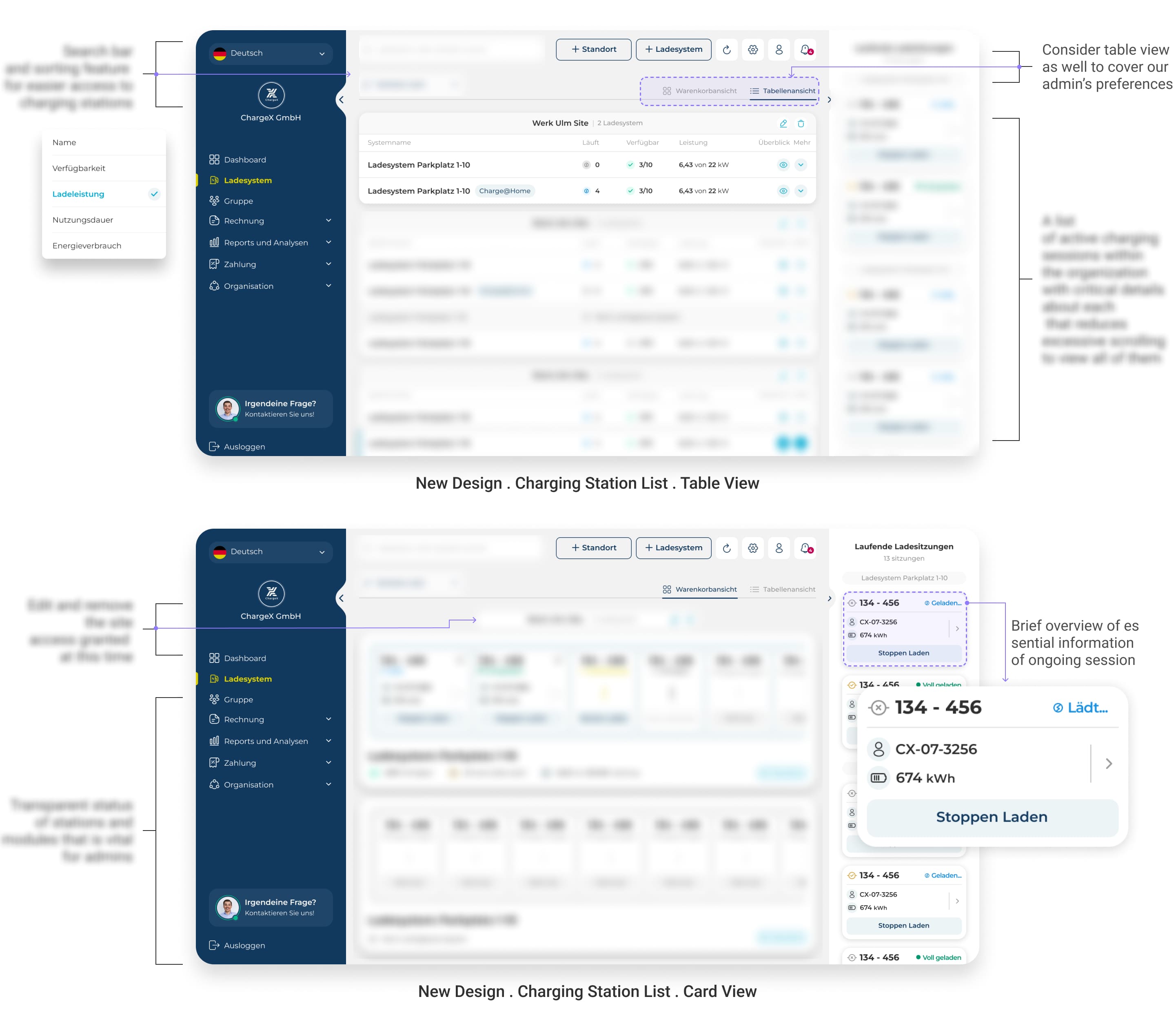
✔️ So Finally, I introduced two view modes (table and card), built in search and sorting for long lists, and surfaced the essentials of every active session directly in the list.
With color-coded station states, admins can now instantly spot what’s available, active, or down, no more guessing, no more digging.
Afterward, I Took On the Messy Group & User Management Page to Fix Scalability Issues, and Introduced Monthly Billing as a Core Admin Tool
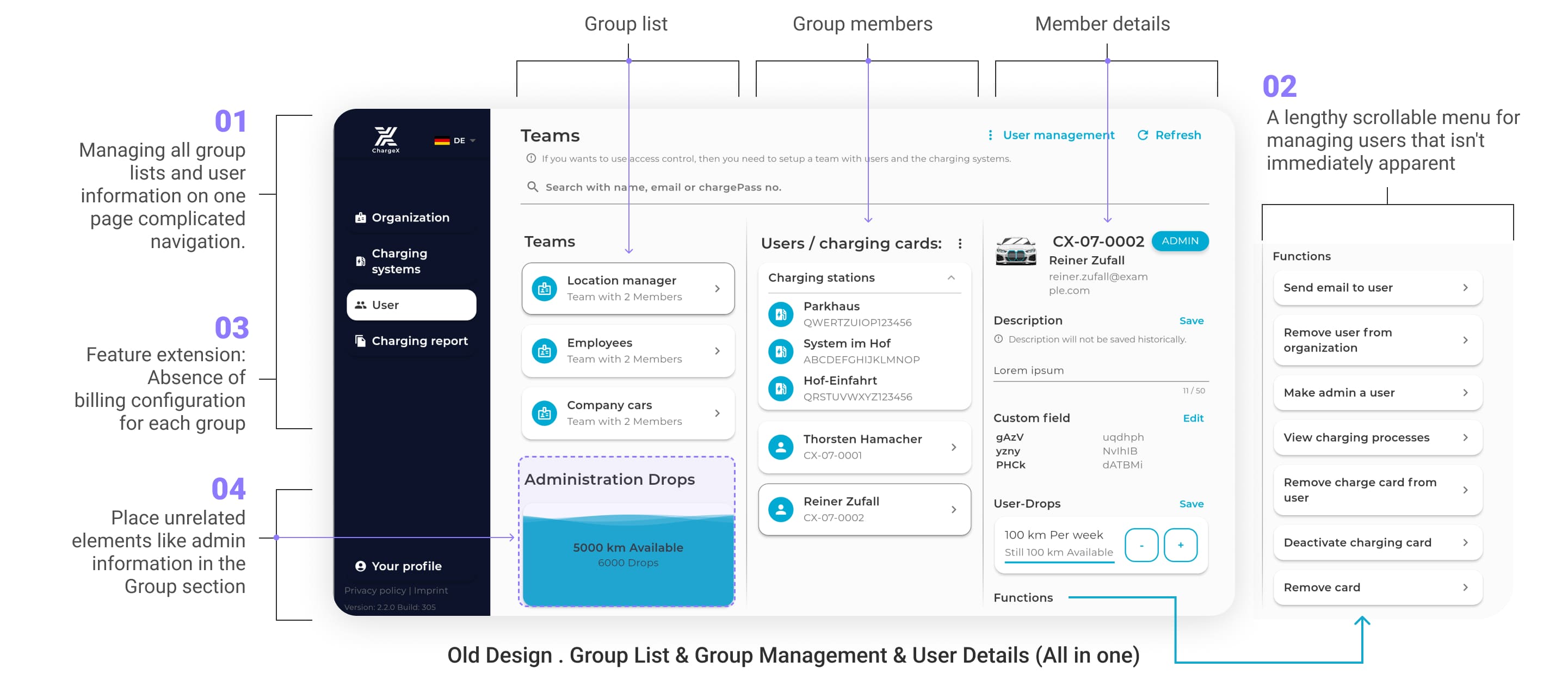
🔴 The old system mashed everything, groups, users, cards, into one endless page with no hierarchy. Admins told us it was confusing, time-consuming, and missing the billing tools they needed to actually run their business.
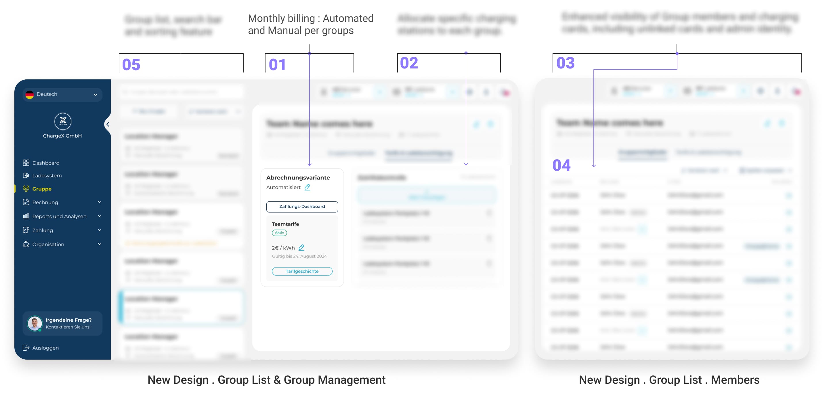
✔️ I Rebuilt Group Management Into a Clear, Searchable Hub Where Admins Can Assign Stations, Set Billing, and Manage Members Without the Old Confusion
I created a dedicated Group List page with structure, search, and sorting. Each group can now be managed with clarity: assign stations, set automated or manual monthly billing, and view members and cards in a clean, scannable way.
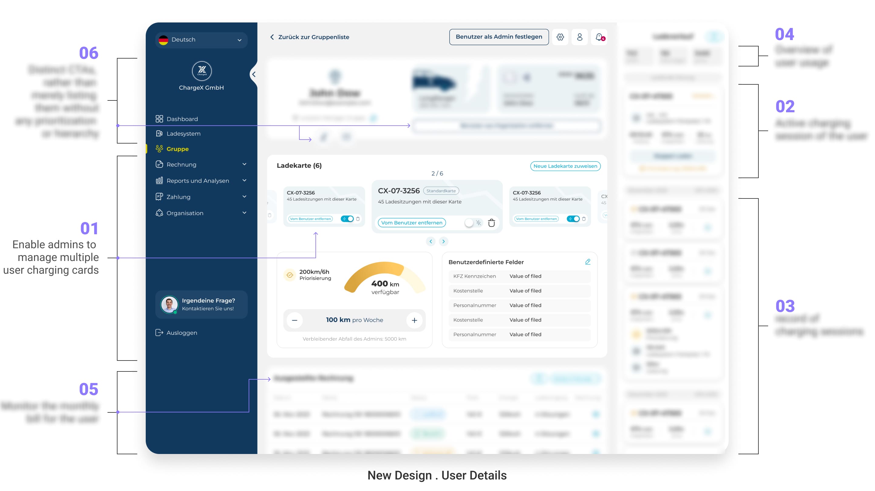
✔️I Also Transformed User Management Into a Focused Detail Page That Surfaces Cards, Sessions, Reports, and Billing, So Admins Take Action Instantly Instead of Digging Through Menus
Instead of a wall of unstructured links, I introduced a User Detail page. Admins can now manage multiple cards per user, monitor or stop sessions, generate reports, track monthly bills, and access quick stats at a glance. Every key action is surfaced through clear CTAs, not buried menus.
🥲
Ok, we fixed group management and introduced monthly billing as a new core feature, but was our mission done yet? Not quite.
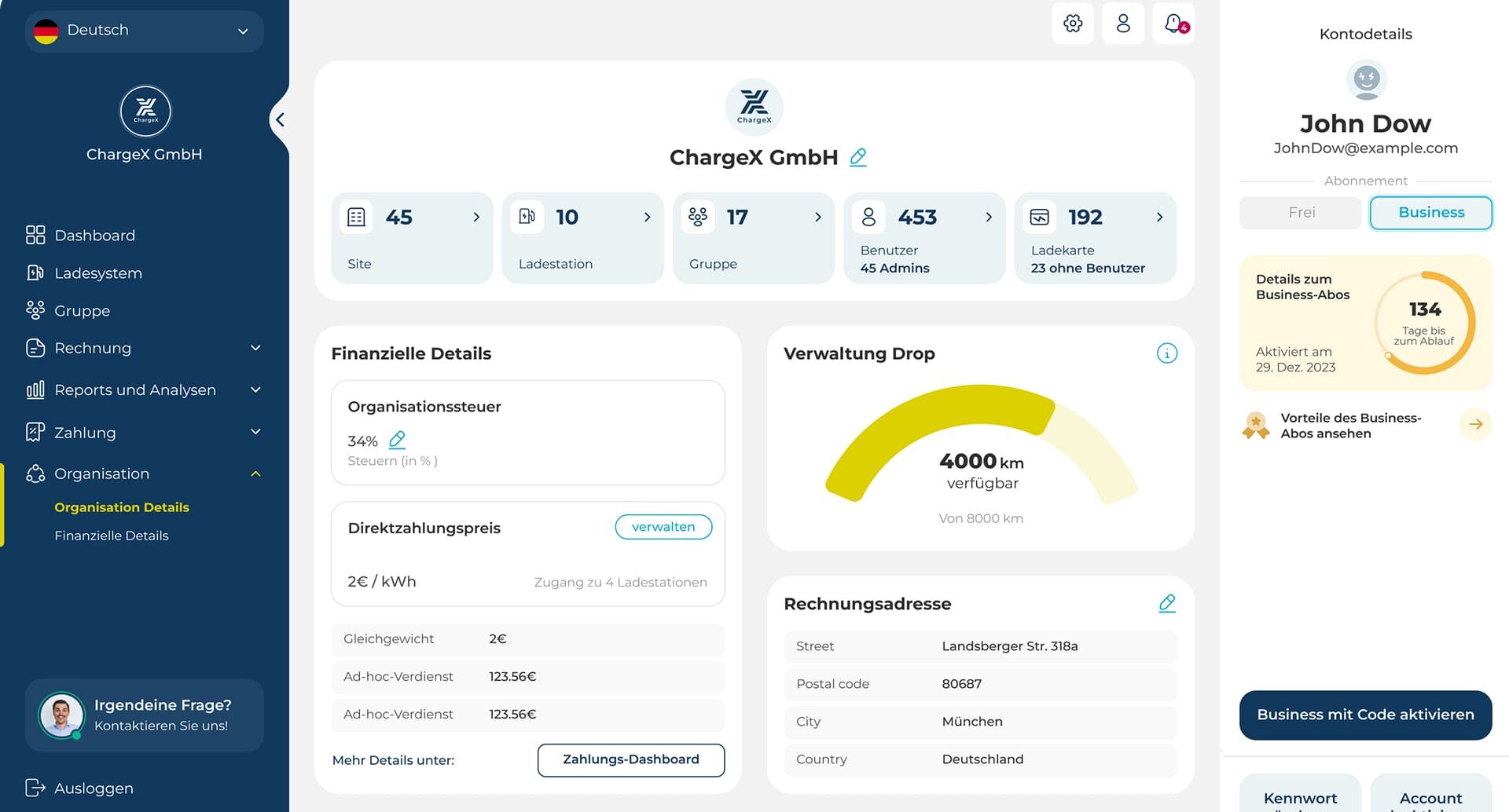
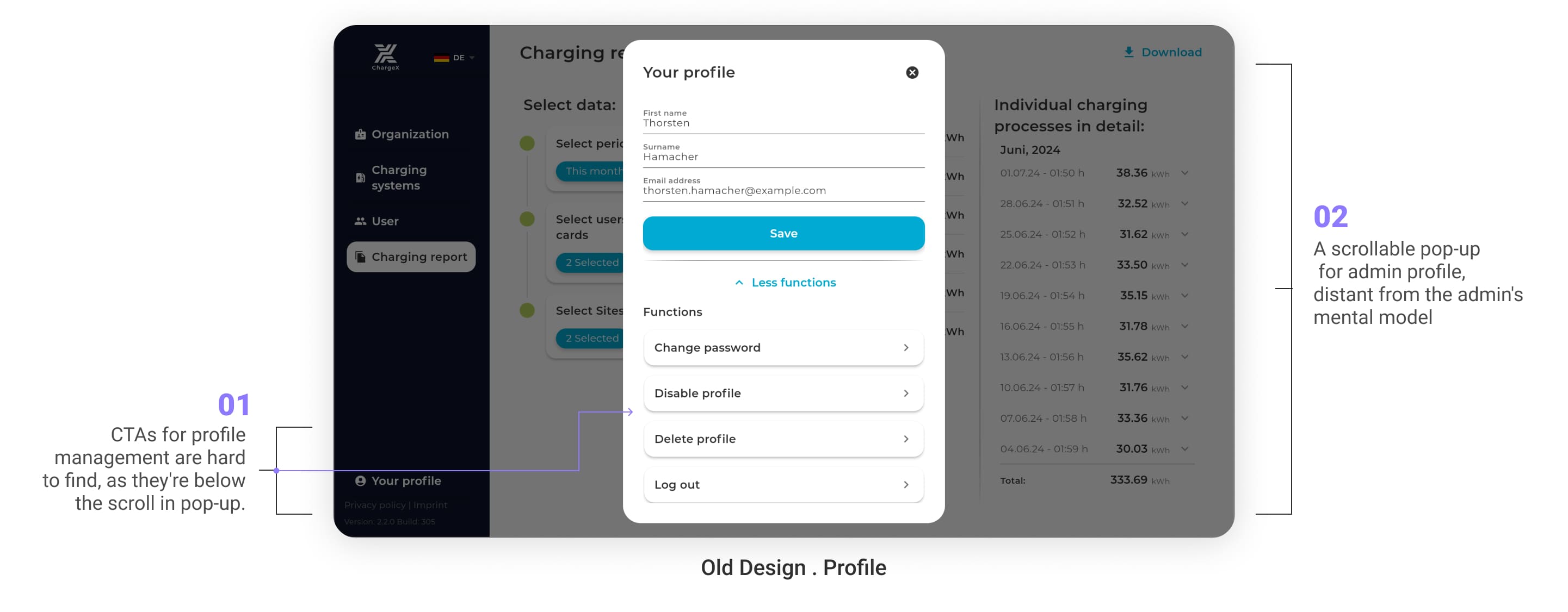
I Also Had to Fix Profile Management That Felt Hidden and Confusing, to Make Upgrading to a Business Account Clear and Encouraging
🔴 The old profile was buried in a scrollable pop-up that didn’t fit admins’ mental model of a dashboard. Even basic actions like updating profile settings were hidden below the fold. I stepped in to redesign it because admins needed a profile space that was not only visible and trustworthy but also the natural entry point for upgrading to a business account.
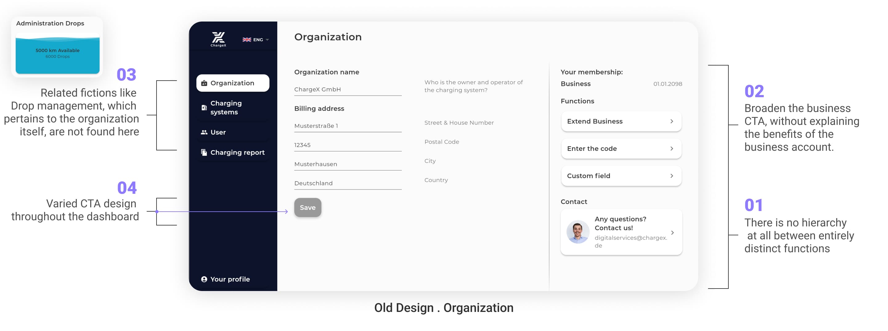
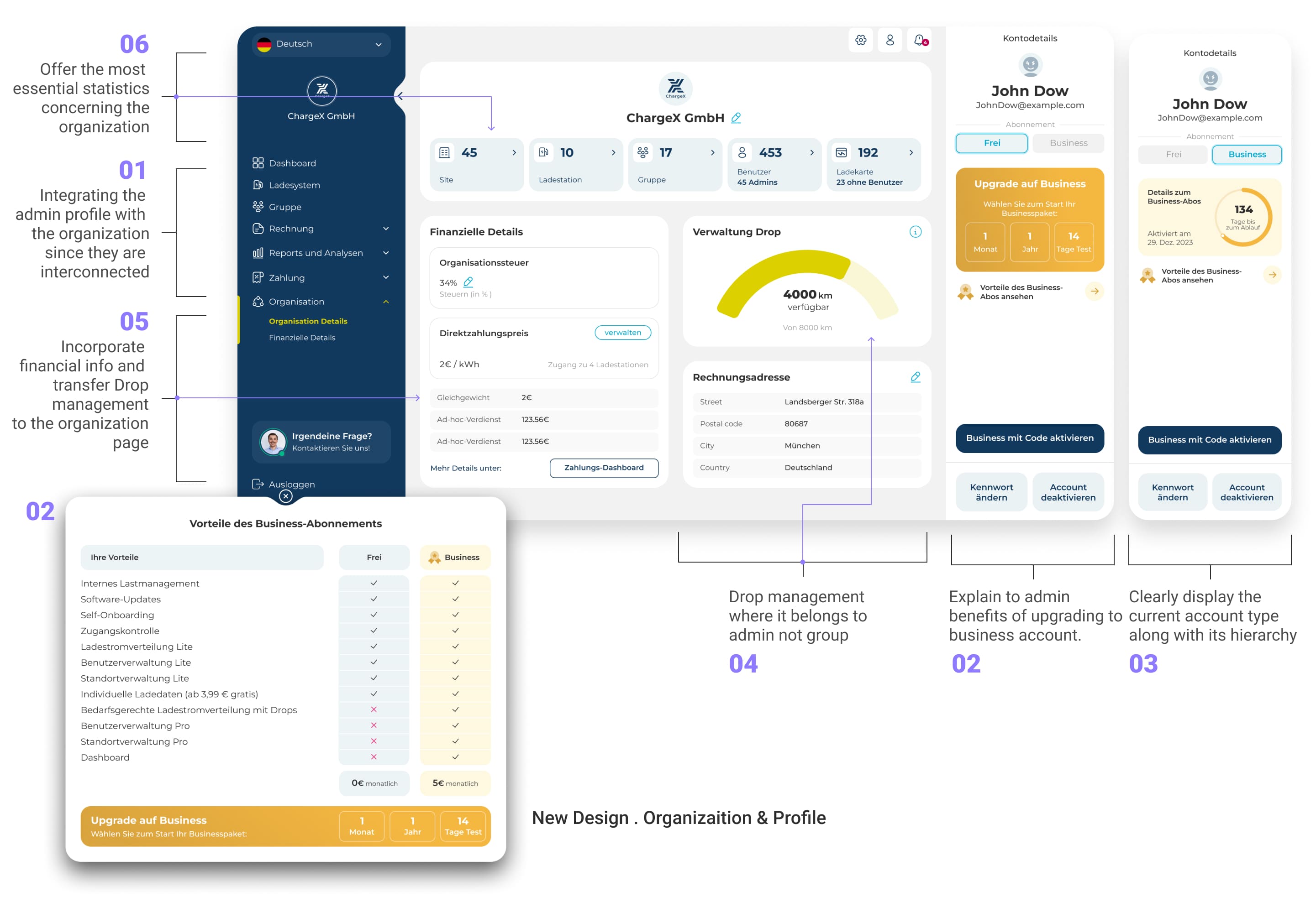
Then, I Untangled the Organization Page That Mixed Unrelated Tools, to Create a Logical and Trustworthy Structure
🔴 In the old setup, the organization page threw everything together with no logic: important CTAs blended with minor actions, upgrade buttons gave no reason to upgrade, and related tools like Drop Management were misplaced in other sections. I decided to restructure it because admins needed clarity and a logical hierarchy to manage their business with confidence.
✔️ Finally, I Brought Profile and Organization Together, so Admins Can See Their Plan, Upgrade Easily, and Manage Drops Where They Belong
My solution was to merge profile and organization into one clear, intuitive hub. I designed it to surface what truly matters: clear account type and upgrade benefits, correctly placed Drop Management, financial insights powered by monthly billing, and key stats at the top for fast decision-making. By connecting the dots, I turned two confusing spaces into a single business-focused area that helps admins act with clarity instead of frustration.
🥲
Another major need that surfaced during research was SMEs’ reliance on reports to truly understand their organization, so it is time to fix the broken reporting experience.
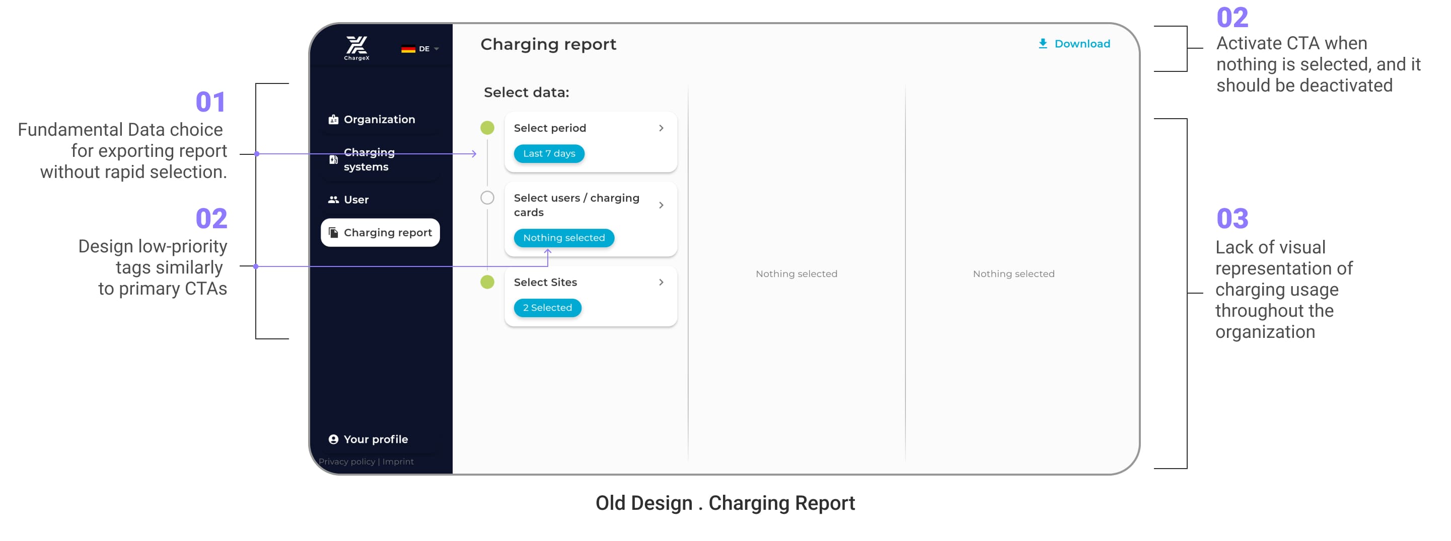
So, I Focused on Fixing Reports Because SMEs Couldn’t Quickly Filter, Preview, or Trust Their Exports
The old reporting section was messy and unhelpful: admins had no quick filters, no previews, and confusing UI where CTAs and tags looked the same. With nothing but raw numbers and no visuals, exports felt like a gamble. Instead of unlocking insights, the tool left SMEs frustrated and ignoring valuable data they needed for decisions.
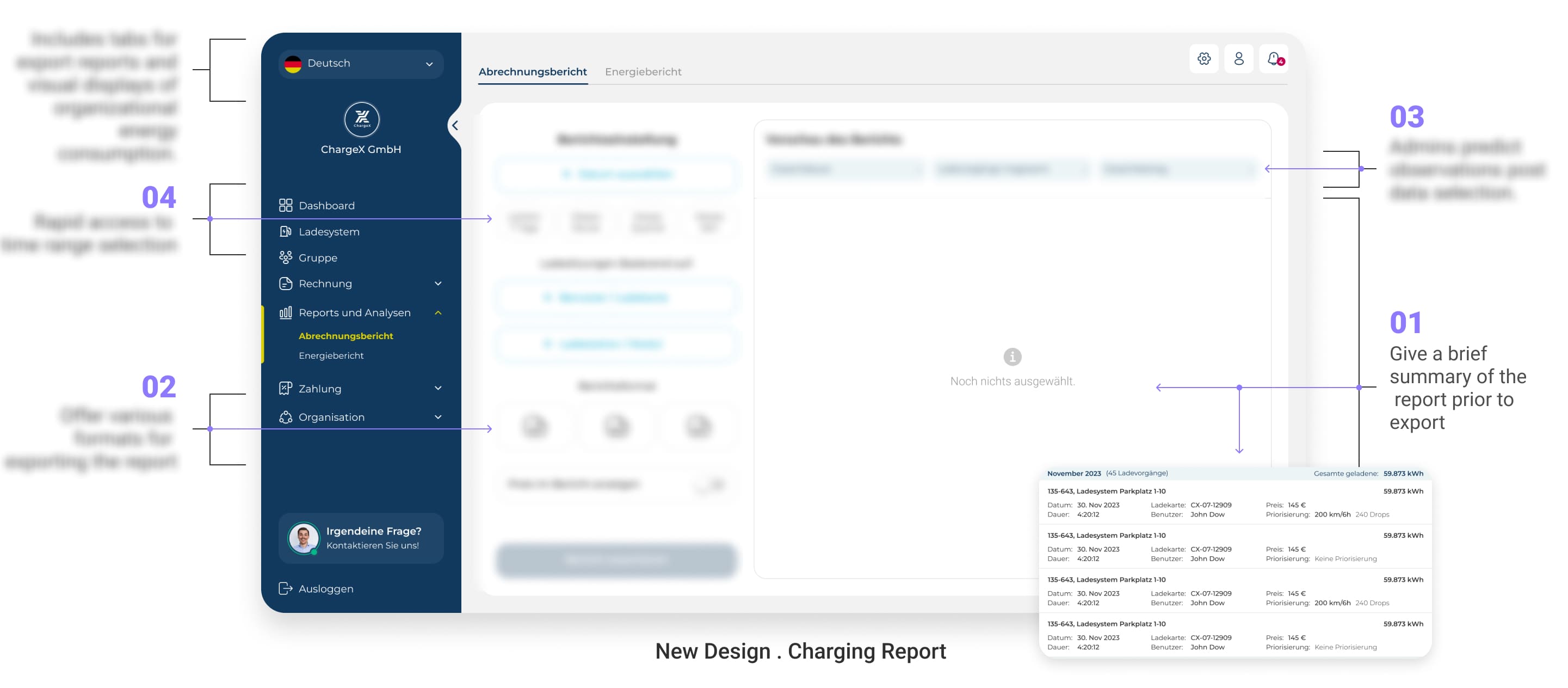
✔️ To fix this, I split the reporting section into two focused tabs to Give SMEs Both Control and Clarity
In the First Tab, I Gave SMEs Live Previews and Quick Filters So They Knew Exactly What They Were Exporting
Previously, admins exported data blind, with no preview, no filters, and no clear control. I redesigned the flow to show a live preview before exporting, added quick time selectors for speed, and let them pick the format that matched their workflow. This turned exporting from trial-and-error into a fast, reliable process that SMEs could depend on daily.
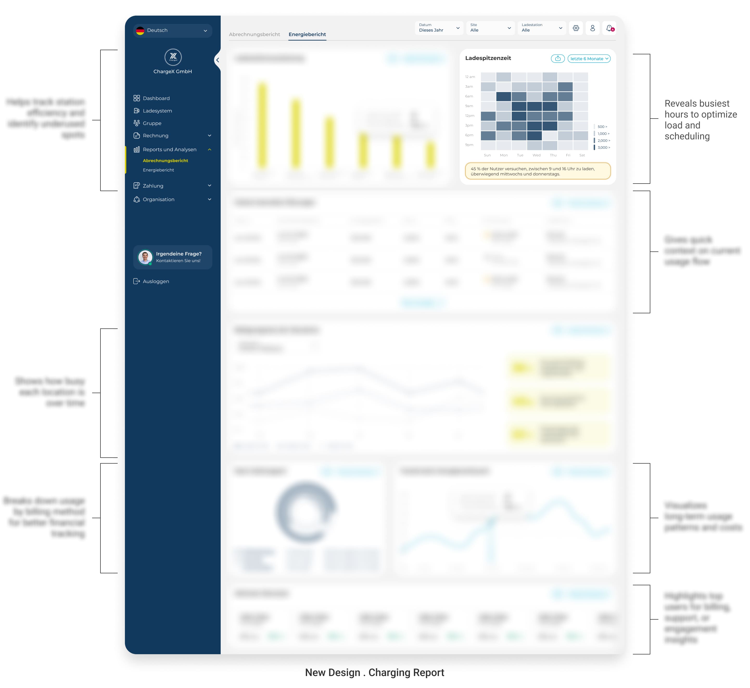
In the Second Tab, I Turned Raw Numbers Into Clear Visual Insights
Raw spreadsheets slowed SMEs down and buried important patterns. In the second tab, I introduced visual reports with charts that reveal usage trends, energy flows, and activity at a glance. Instead of deciphering endless tables, admins can now spot problems, track performance, and make confident decisions instantly.
👩💻
Finally, I Decided to Put the New Dashboard in Front of Real SMEs Before Development!
So, For the most critical admin journeys, I ran unmoderated usability testing with Maze, using a clickable Figma prototype.
Mission 1
→
Report & Insights Journey
→
Path Exploration Test
Mission 2
→
Station List & Stop Session
→
Task Completion Test
Mission 3
→
Add New Station
→
Path Exploration Test
Mission 4
→
Monitor Ongoing Sessions
→
First Click Test Test
Mission 5
→
Upgrade to Business
→
Path Exploration Test
All of these missions gave me constructive insights that shaped design improvements.
👉 But to save space, I’ll walk you through the most critical one: Mission 6
Mission 6
→
New Monthly Billing Feature
→
A/B placement testing
I Wanted to Confirm Two Points Regarding This New Monthly Billing Feature:
Where this feature should live in the team management flow and how clearly admins understand it.
👇
To do this, I ran a mix of A/B placement testing and a New Feature First Impressions test with 12 SME admins using Maze.
Through A/B Testing, I Learned Admins Prioritize Daily Member & Card Management, So I Moved Monthly Billing to the Second Tab Where It Fits Their Workflow
In this A/B test, I showed SMEs two variations: billing placed in the first tab versus in the second.
Heatmaps and click patterns revealed that admins consistently clicked into a team expecting to first manage members and cards, the tasks they handle daily. Billing, while important, was a less frequent action. With a clear label, admins overwhelmingly preferred it in the second tab, freeing the first tab for daily operational needs. This evidence helped me make a confident decision on the final layout.
74% of Admins Clicked Teams Just to Check Billing, So I Made Billing Type and Admin Count Instantly Visible on Every Team Card
The usability test revealed that most admins (74%) didn’t enter team cards to manage details firs, they entered just to confirm the billing type.
This showed me that hiding billing inside tabs created unnecessary clicks. On top of that, several admins stressed that seeing only the number of members wasn’t enough, they needed to know the number of admins as well, since admin availability directly affects how smoothly a team operates. By surfacing both billing type and admin count directly on the team card, I reduced friction and made critical context available before admins even clicked.
Admins Struggled to Choose Between Manual and Automated Billing, So I Added Clear Explanations to Remove Confusion
In the usability test, I saw that several admins hesitated when asked to assign a billing type. What I thought was self-explanatory turned out to be unclear in practice
many weren’t sure whether manual or automated billing was the right choice for their teams. Since this is a new feature with real financial impact, the risk of misconfiguration was high. To solve this, I added short, plain-language explanations under each option (e.g., Automated → invoices generated monthly without admin effort). This small addition gave admins the confidence to make the right choice without second-guessing.
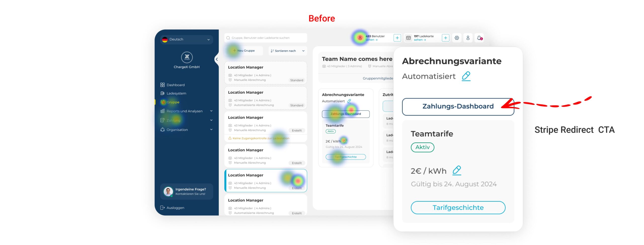
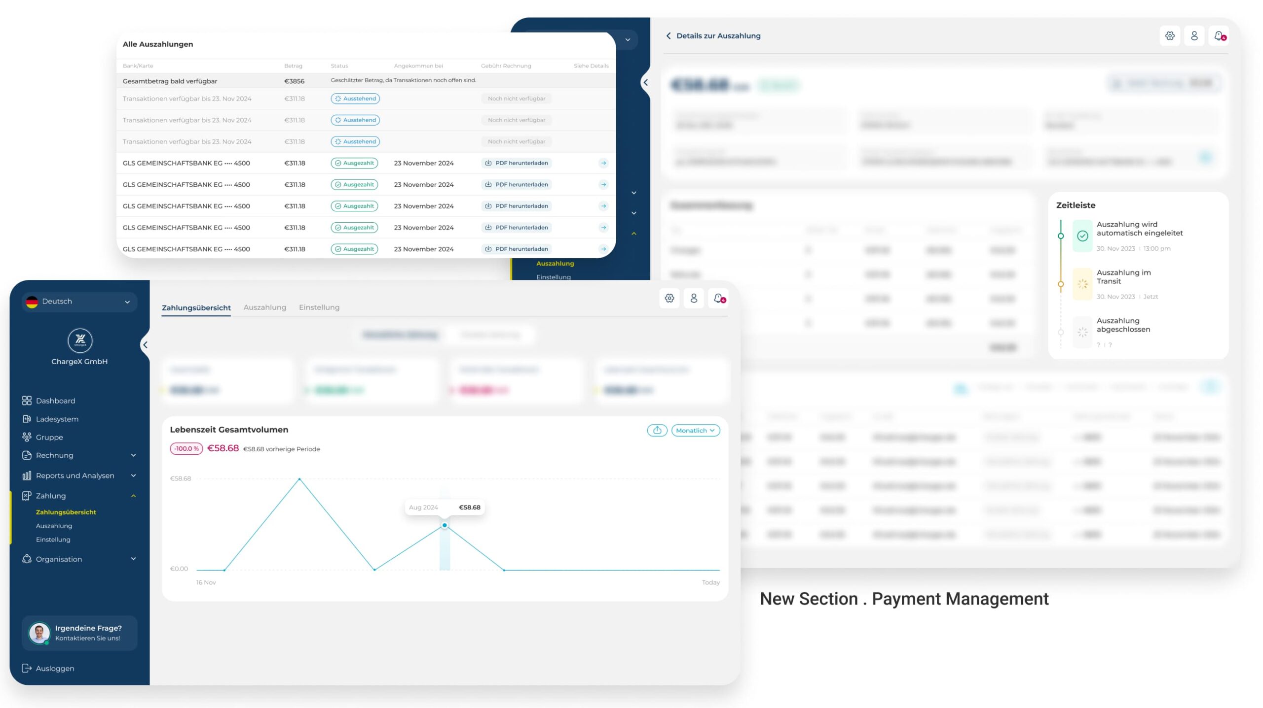
Admins Found Stripe Redirects Frustrating, So I Designed a Native New Payment Section Inside the Dashboard
During usability testing, admins consistently flagged the Stripe redirect as an unnecessary extra step. While it technically gave them access to payment data, it broke their workflow and forced them out of the ChargeX dashboard.
Acting on this, I created a dedicated Payments section where admins can see all transactions, track payout details, and adjust payment settings without leaving the platform. This change turned payments from an external dependency into a native, trusted part of the admin experience.
🤓
What changed after lunch?
I tracked metrics tied to the exact friction points the research had surfaced, and the structural changes moved all of them
Before launch I defined success as movement in the specific workflow metrics the personas had flagged as highest-friction. These weren't vanity numbers, they were the tasks that mattered most to daily operations. The post-launch data confirmed the structural investment paid off.
Persona-based dashboards allowed the platform to scale across distinct admin workflows.
🔍 Station Discovery: Much Faster Navigation
↓ 70% reduction in time to find a station
Structured lists and clearer hierarchy reduced station search time from 2+ minutes to under 40 seconds.
🎯 Module Identification: Higher Task Success
↑ Success rate increased from ~50% to 90%
Clear labels and visible module status made active modules easier to identify at a glance.
💼 Sales Enablement: Clearer Persona Fit
↑ 30–35% increase in new business revenue
Persona-based workflows helped sales position the product more clearly to different customer segments.
👀
Take a look at behind the scenes!
I Built a Scalable Design System with Smart Components and Variants to Ensure Consistency Today and Flexibility for ChargeX’s Future
While working on the ChargeX admin dashboards, I wasn't just focused on making things look good for today.
Behind the scenes, I spent time building a scalable design system, setting up smart components, variants, and clear foundations that could grow with ChargeX's future needs.
This approach made it way easier to maintain consistency across the dashboards, reduced chances of errors, and gave developers a much cleaner handoff for faster implementation.
👀
What I took from this!
The hardest part wasn't designing screens, it was making an invisible structural problem visible enough to act on
The work I'm most proud of isn't the final navigation or the persona cards. It's the moment where I reframed the problem from "we need more features" to "we don't have a user model", and then built the research, the evidence, and the stakeholder alignment to act on it. That's the kind of work that doesn't show up in a Figma file, but it's what made everything downstream coherent.
Looking back, the cross-team synthesis was the highest-leverage moment in the project, not because it produced a deliverable, but because it transformed the personas from a design artefact into something the whole organisation could navigate by. That's what gave the redesign staying power beyond launch.
What I'D do differently
I'd involve the sales team earlier, their segment intuition would have sharpened the personas faster, and their early buy-in would have made the structural case even easier to land with leadership.
Looking to purchase
Designer Assistance 01, 02, 03?
Please send me an email with your request, and I’ll provide you with instructions on how to buy the designer assistance files.