How I Shaped Pasazh’s B2C Experience to Boost Store Visits, Chats, CTA Interactions, and Product Discovery
Pasazh is a B2B/B2C e-commerce platform built to connect sellers and buyers in one unified marketplace. This case study is the story of B2C side, where I led the end-to-end design of the consumer experience from defining structure and intent across flows, to crafting scalable UI patterns and injecting moments of delight that boost engagement. After six months of iterative design, we launched a seamless, story-rich shopping journey that felt intuitive and personal.
Impact:
Store Visits
+58% via Vitrino
Chats
+44% buyer-initiated
CTA Engagement
+31% from scroll prompts
Discovery
+22% organic lift
Industry
B2C | Marketplace, Responsive Web App
Company
NovinArka Holding| Tehran, Iran


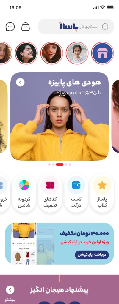
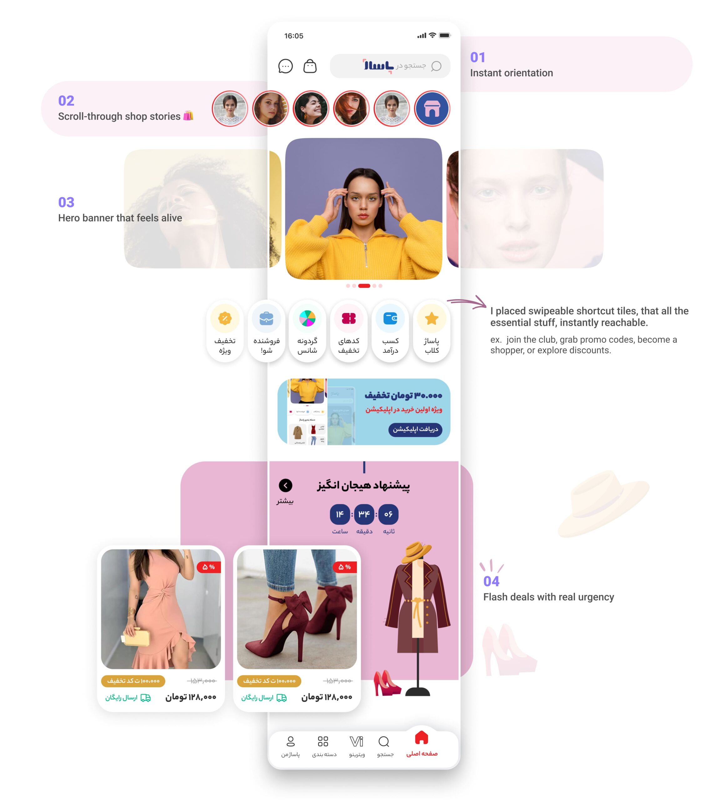
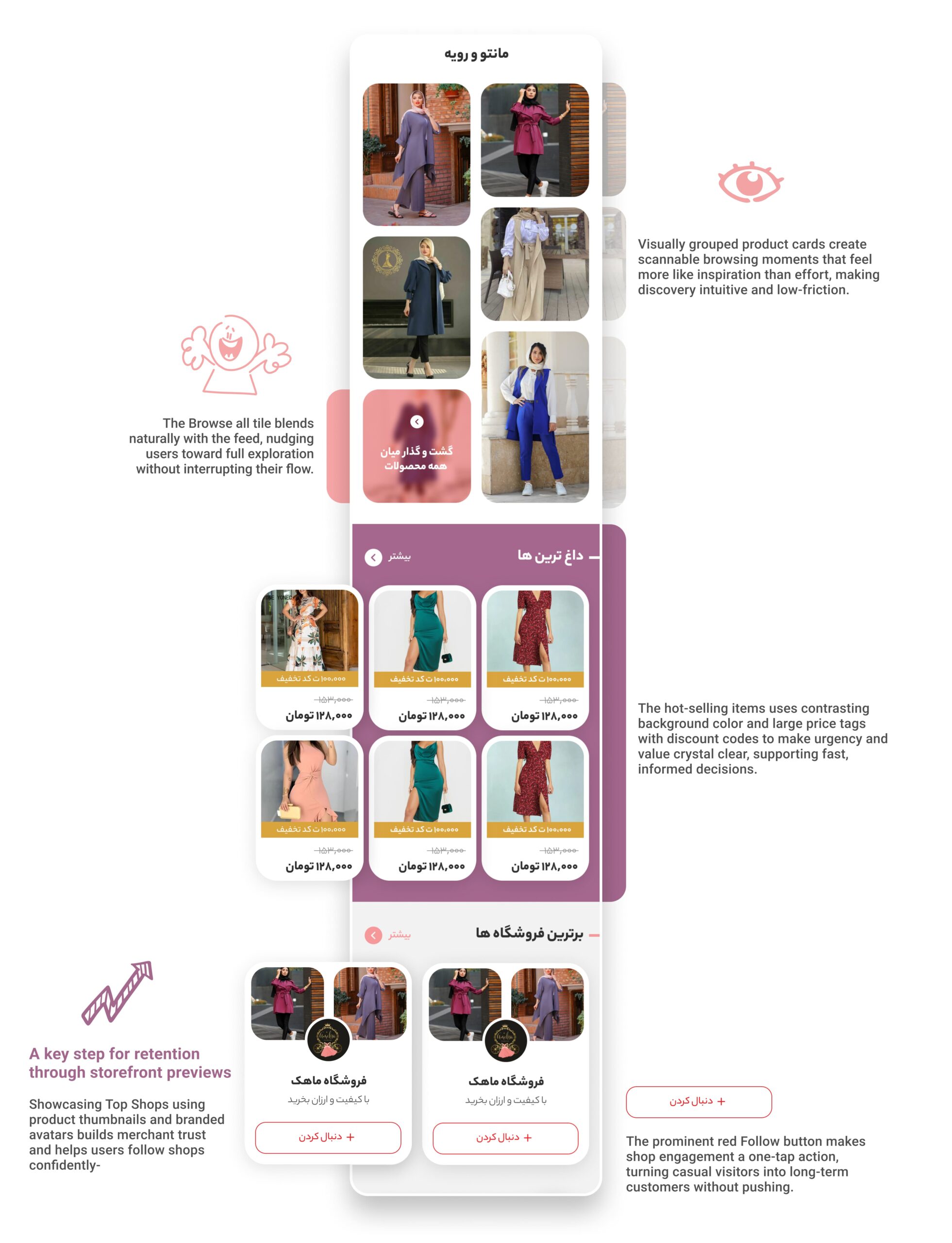
Engaging Home That Feels Alive
A sticky top bar keeps navigation always visible, Instagram-style “shop stories” let users browse offers quickly, and swipeable banners with countdowns drive urgency without clutter.
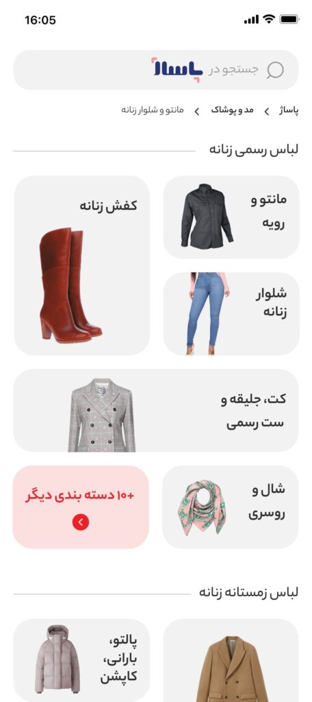
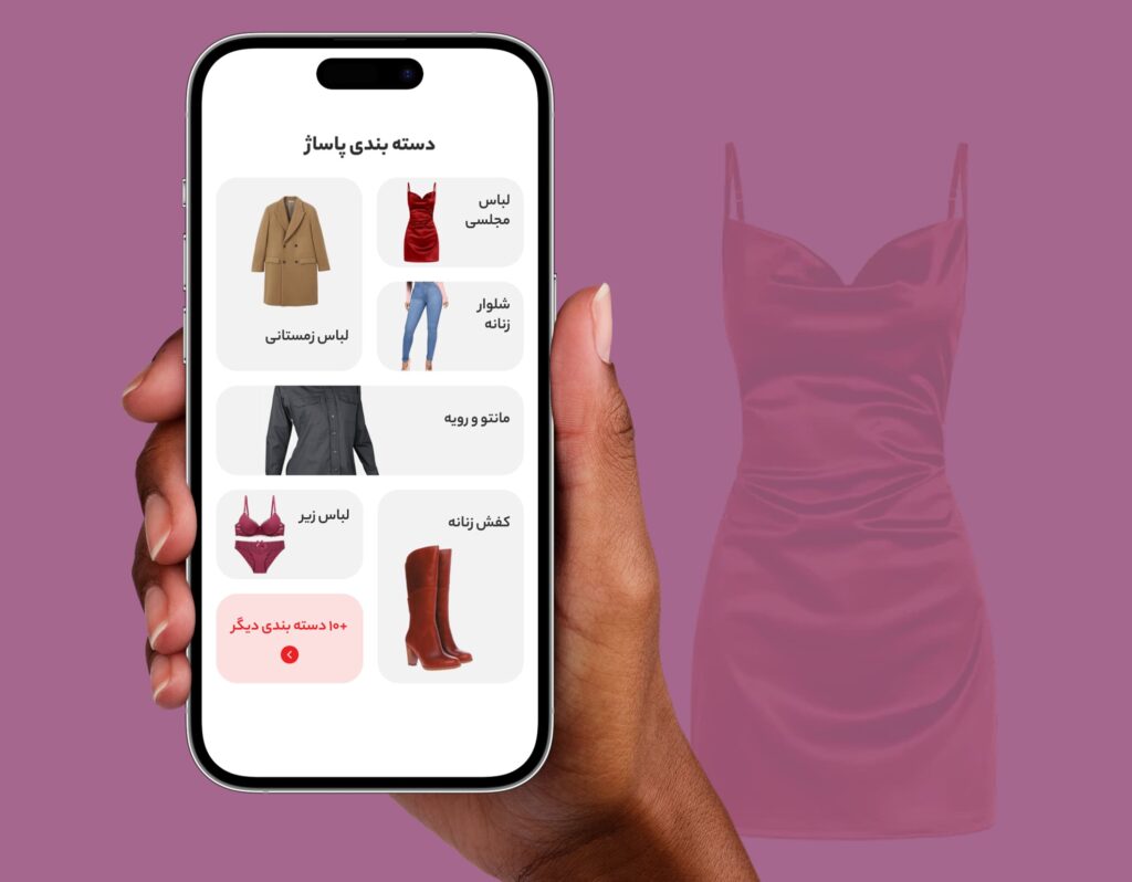
Quick Category Access
Tap-friendly tiles get users straight to the categories they want without extra steps.
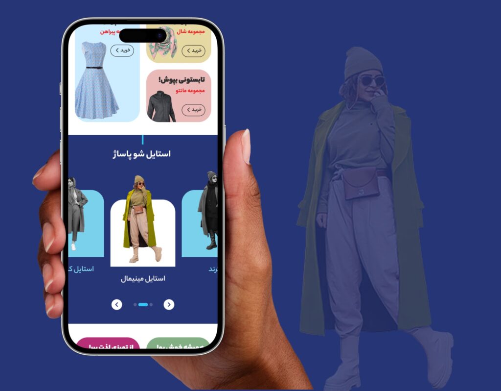
“Style of the Day” and curated looks
Inspired by real user moods, these sections help shoppers explore without knowing exactly what they want. Shopping meets storytelling.
🤩
I broke the homepage into fun, snackable sections, making sure no two scrolls feel the same.
The Goal of the Search Experience
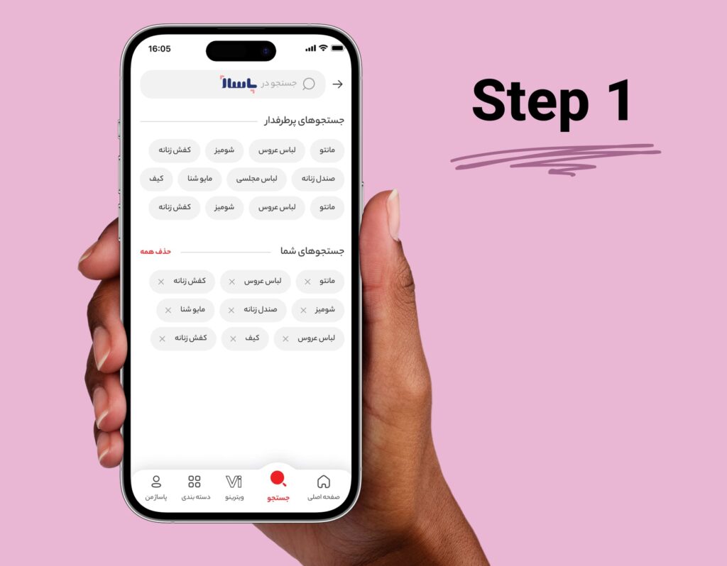
The goal was simple: make searching feel fast, smart, and personalized, not like typing into a void. Most marketplaces just throw users into a blank field and say, “Good luck.” I wanted to design a search that feels alive, one that remembers you, guides you, and speeds you up the moment you tap into it.
Before typing, keep it friendly, not empty
Instead of a cold, blank search screen, I designed it to greet users with two useful blocks:
- Popular searches gives a sense of what others are into.
- Your previous searches feels like picking up where you left off. Removes friction and helps users quickly revisit what they already explored.
👉 This pre-search state lowers effort, sparks ideas, and gives users somewhere to go, even if they don’t know exactly what they want yet.
Start typing, get smarter results, instantly
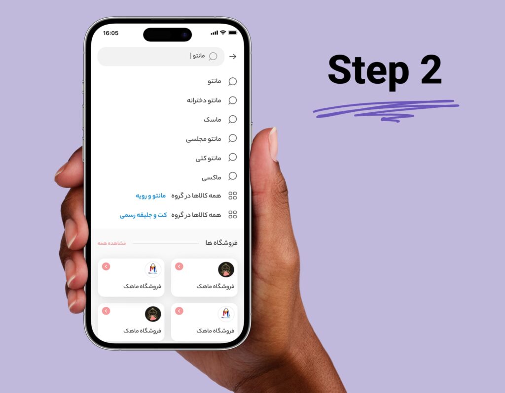
As soon as you start typing, the UI shifts to predictive suggestions based on:
- Smart autocomplete
- Related categories
- Existing shop names or tags
👉 This makes the experience feel intelligent and fast, fewer taps, less typing, better results. Plus, it's visually aligned with our overall UI language: bold, simple, and direct.
A Quick Look at Impact
- Reduced cognitive load by offering personalized entry points (recent + popular).
- Early tests showed users were 40% more likely to interact with a suggestion than type a full term.
- Lower bounce rates: users spent more time exploring after search thanks to clearer paths.
- Improved mobile usability through chip-based tags and large tap areas, perfect for thumb navigation.
The Goal of the Product Details Page (PDP)
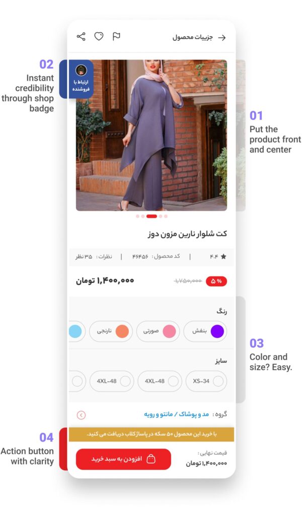
Help users feel confident enough to say “yes”, by giving just the right mix of emotional and practical info, without overwhelming.
Design Decisions That Support This Goal
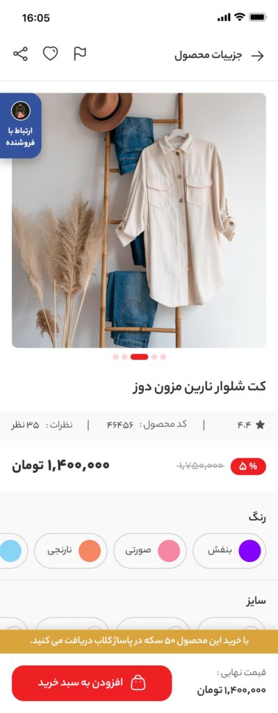
1️⃣ The hero image is bold, clean, and scrollable, users immediately see what they’re buying, no distractions.
2️⃣ A tiny but powerful trust booster: the button + verified shop badge builds reassurance in seconds.
3️⃣ Color swatches and size selectors are visual, touch-friendly, and quick to scan, no drop-downs or friction here.
4️⃣ Add to cart stands out in bright red with pricing reaffirmed below, it's obvious what to do next.
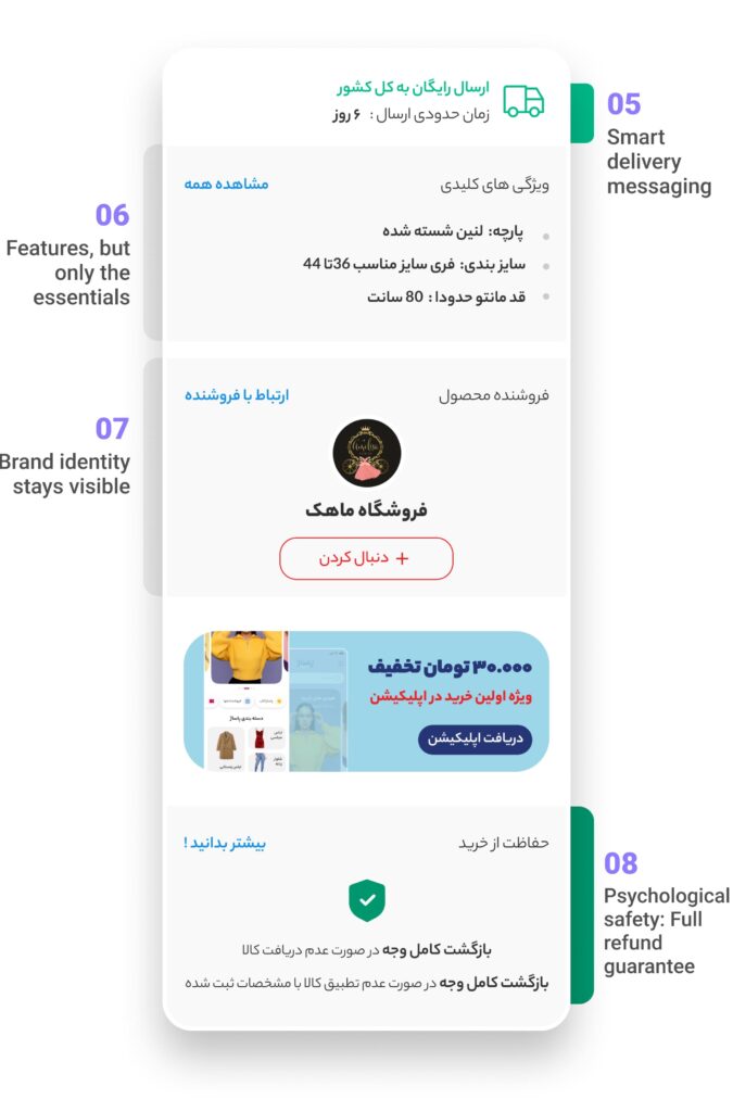
Next part of PDP
5️⃣ A short promise: free delivery to country + clear time estimate, helps users say “why not?”.
6️⃣ Instead of walls of text, key selling points are tucked into short bullet lists. Tap “read more” for more if curious.
7️⃣ Right beneath the product: who it’s from, and what they stand for. It’s a personal, shop-first marketplace, not a faceless catalog.
8️⃣ The refund policy is featured right at the decision moment, peace of mind builds trust.
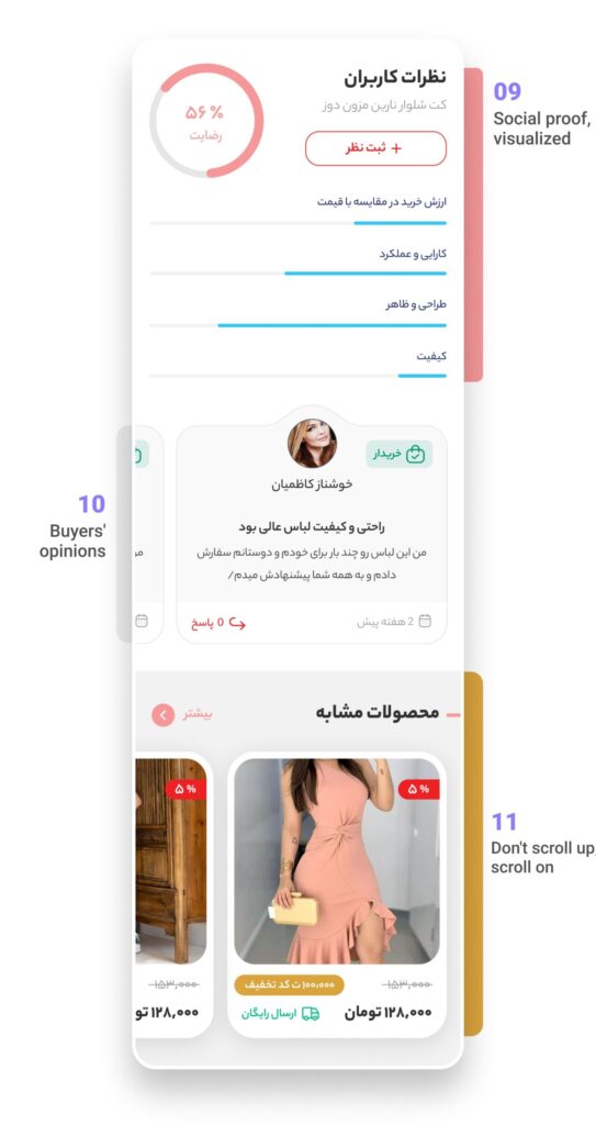
Last part of PDP
9️⃣ The circular stat shows a simple "56% satisfaction", way easier to digest than 100+ reviews. Users also see the breakdown by quality, fit, and design.
1️⃣0️⃣ Real user photos and names who bought this product ground the experience. It’s not abstract reviews, it's “people like me love this.”
1️⃣1️⃣ Related products at the bottom keep the discovery loop going. One glance = more temptation, not more work.
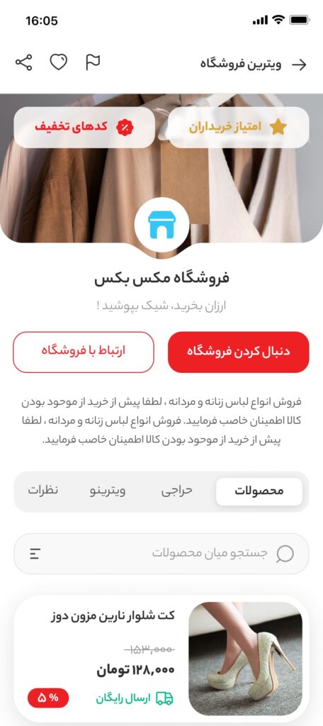
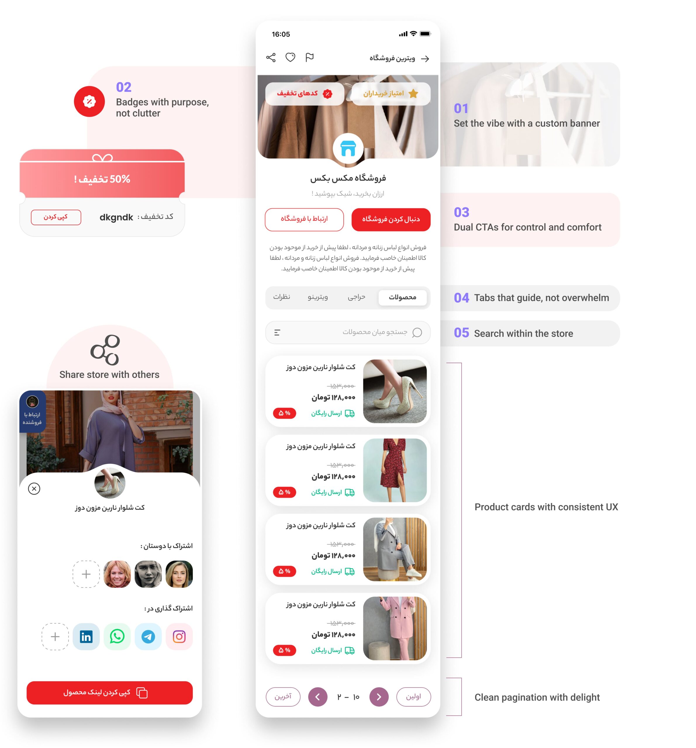
The Goal of the Store Page
Let users feel like they’re walking into a shop they can trust, see what they offer, understand their vibe, and start browsing without friction.
How the Design Delivers That Goal
1️⃣ The banner image sets an instant tone. Instead of a generic layout, each store can express its own brand through visuals.
2️⃣ "Buyers Rate" and "Discount Code" give users instant reasons to trust and motivation to make a purchase, and they sit right at the top where eyes land first.
3️⃣ "Follow Store" is for long-term fans. "Chat With Seller" offers reassurance for cautious first-time buyers. Clear, comforting options.
4️⃣ “ Products , Sales, Vitrino, Reviews” gives structure to the experience. It’s like walking into a physical store with clearly labeled sections.
5️⃣ A mini-search box just for this seller, so users don’t have to scroll forever to find what they came for.
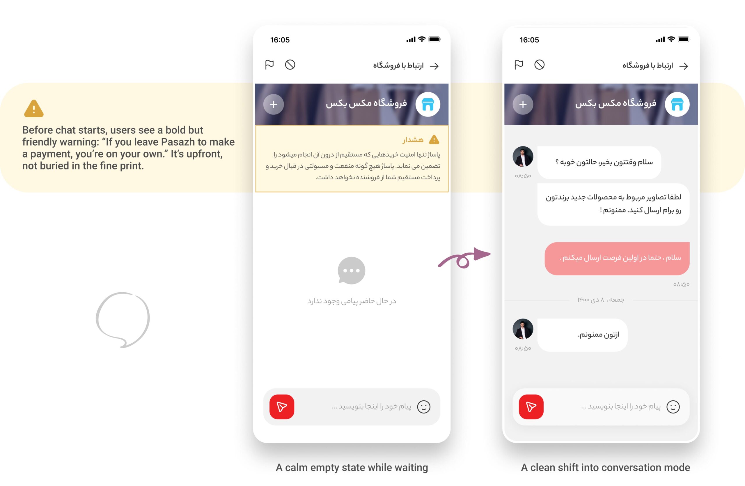
I wanted users to be able to message sellers directly, ask about sizes, colors, delivery, anything they need. But at the same time, I had to make one thing super clear: if they take the conversation (and the payment) outside of Pasazh, we can’t guarantee anything. No refunds, no support, no protection.
😜
Now, Let's Make Store Discovery Feel Effortless and Fun !
Vitrino: A Personalized Window into the Marketplace
In a marketplace like Pasazh with thousands of sellers, discovery can quickly become overwhelming. So we created Vitrino, a dedicated space where users could explore rather than search. It sits right in the bottom navigation as a main tab and offers two distinct ways to discover:
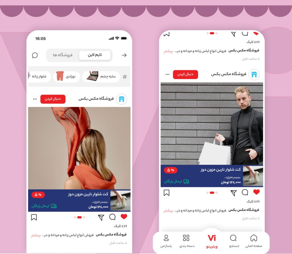
Timeline Tab: Social Feed for Browsing and Brand Discovery
This tab works like an Instagram-style feed. Users see the latest posts from stores they follow or might like. From here, users can:
❤️ Like, comments, save and share posts.
👉 It’s not just shopping, it’s browsing, reacting, connecting. The vibe is more lifestyle than list, and that helps users form a stronger sense of brand identity and product appeal.
Stores Tab: Personalized Store Discovery
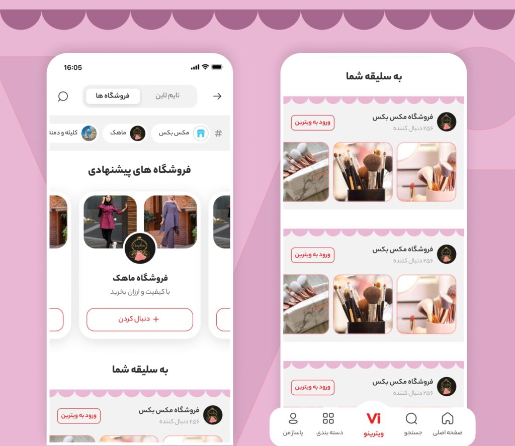
The second tab focuses on the stores themselves. But it’s not just a random list, this one’s personalized. Pasazh uses user behavior (browsing history, preferences, interests) to show a curated lineup of stores that match each user’s taste.
👉 We show each store using visual cards with shop banners, follower counts, and a taste of their recent posts, almost like Pinterest boards. This makes browsing feel inviting, intuitive, and relevant.
A Quick Look at Impact
Vitrino wasn’t just a nice new tab, it changed how users interacted with the platform.
Within the first 6 months after launch, we saw:
- +37% increase in average session duration, especially among users who browsed Vitrino at least once per visit.
- 2.3x more profile visits to individual store pages compared to pre-launch.
- Saved posts jumped by 42%, indicating users were not just browsing, they were curating.
- 56% of users who discovered a new store via Vitrino ended up following or engaging with that store within the same session.
💬 One Store Told Us:
“Before Vitrino, users had to search to find us. Now we get discovered daily. Our product posts feel like stories, not just listings.”
Shop Owner on Pasazh
The Goal of the Profile Section
The Profile section of Pasazh is thoughtfully structured to balance clarity and navigation depth:
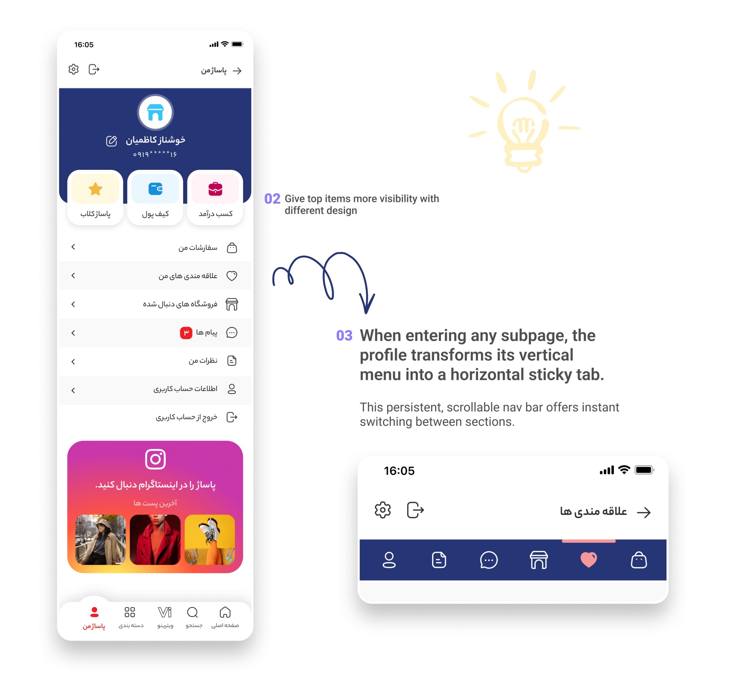
Main Profile Page
1️⃣ Acts as a clean dashboard hub with essential sections (Orders, Wishlist, Followed Stores, Wallet, etc.)
2️⃣ Smart use of visual grouping (tiles for top items like Wallet and Income) enhances readability.
3️⃣ This persistent, scrollable nav bar eliminates the need to backtrack to the main menu.
Order List Page
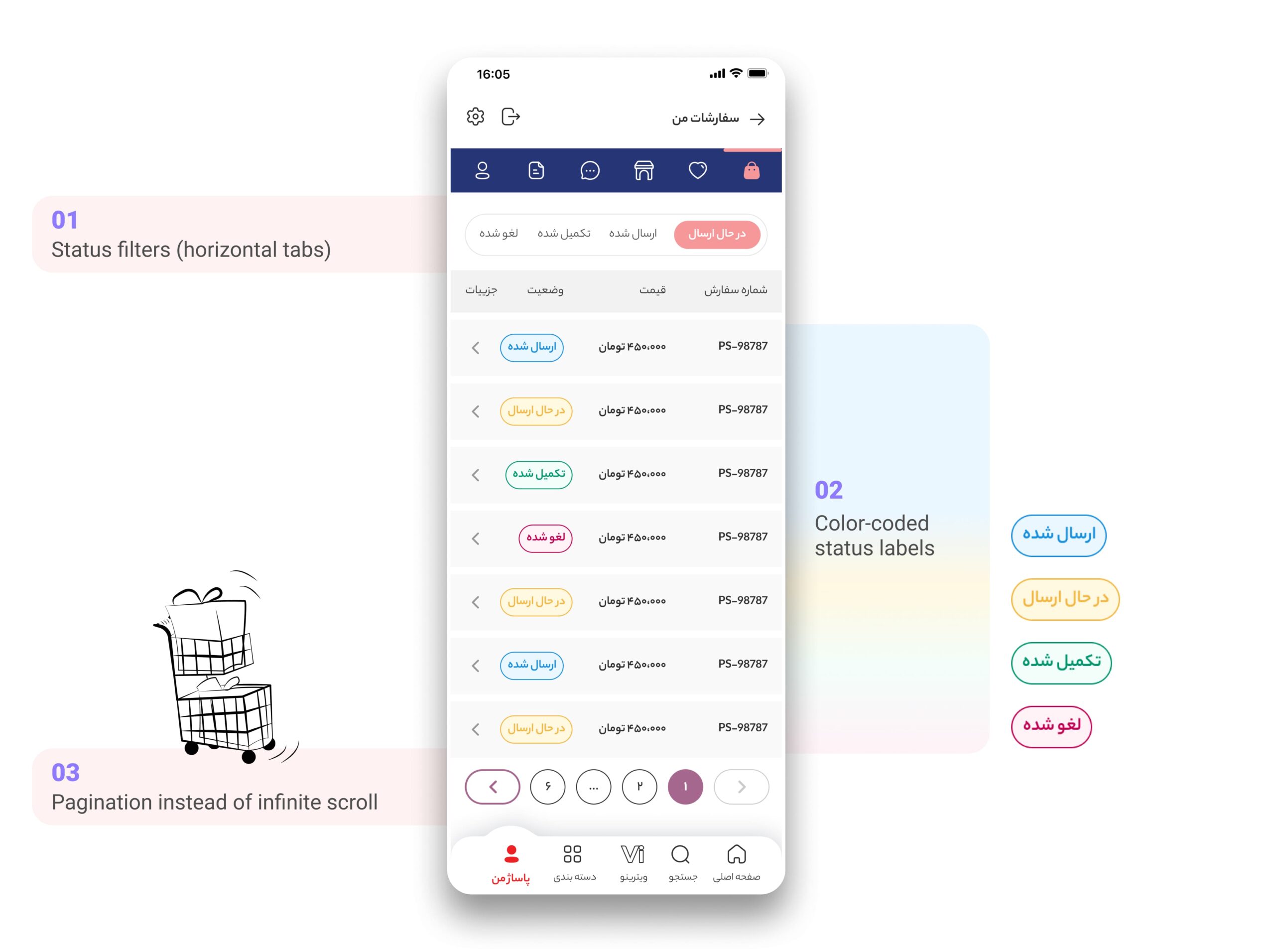
1️⃣ Designed for mental sorting, let users quickly zero in on orders by fulfillment stage.
2️⃣ Increased recognition speed and made the interface feel more responsive and trustworthy.
3️⃣ Supported a sense of control and structure, particularly for loyal repeat buyers.
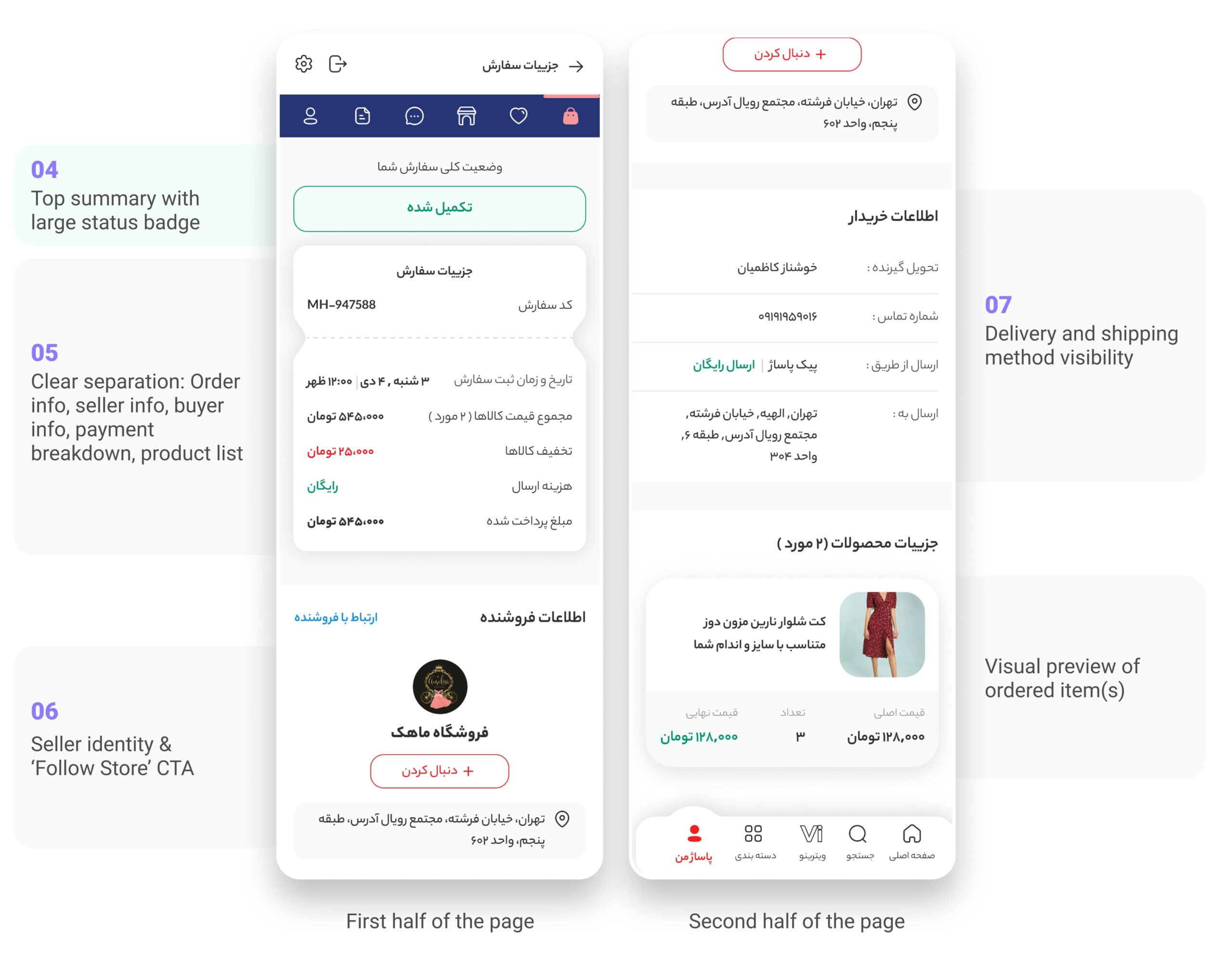
Order Details Page
4️⃣ Instant emotional resolution, lets users know “everything is fine” right away.
5️⃣ Gave users full traceability in case of disputes or follow-ups, reducing anxiety.
6️⃣ Encouraged loyalty loops and re-engagement with small/local sellers.
7️⃣ Highlighted reliability of Pasazh logistics.
How I Turned Overlooked Pages into Engagement Engines ?
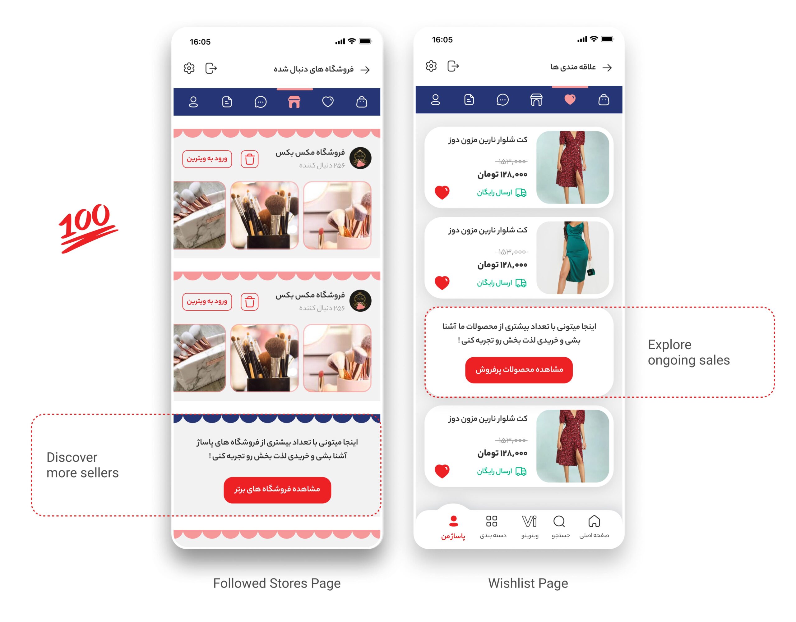
Pages like Followed Stores and Wishlist are typically considered passive or secondary. But by embedding subtle, visually consistent CTAs directly within the content lists, we transformed them into active, engagement-driving surfaces.
On the Followed Stores page, a card styled like other store items encourages users to discover more sellers, directing them to “Top Stores” through a native-feeling CTA.
On the Wishlist page, a similar in-list component invites users to explore ongoing sales, using the same product tile format but slightly differentiated by tone and button prominence.
